Eni is a global energy company founded in 1953 and operating in nearly 70 countries. Over time, it has undergone a major transformation, evolving from an oil company into a broader energy company. Starting in 2006, this shift led to a rethinking of its identity, culminating in a 2009 rebranding developed by Inarea. This rebranding marked the move toward a unified organization, able to work across different sectors but represented by a single brand. Through this process, Eni has positioned itself as a global leader in sustainable energy, combining tradition, innovation, and an international outlook.
Brand Identity. Moving toward a monolithic model
The rebranding was driven by the strategic concept of “open energy,” which brings together the values of sustainability, culture, innovation, efficiency, and partnership. Eni chose a monolithic brand identity model, capable of representing the entire company across all its activities—from refining to electricity production, and even its presence on the stock market. The decision to use the Eni brand, which conveys the idea of energy more effectively than the traditional Agip brand, was the result of a process that first involved the company’s management and then its main international stakeholders. The brand mission was to position Eni as the true interpreter of its mission: to be “your best partner in energy.”
Brand and Type Design. Balancing heritage and innovation
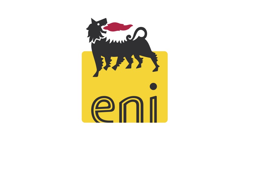
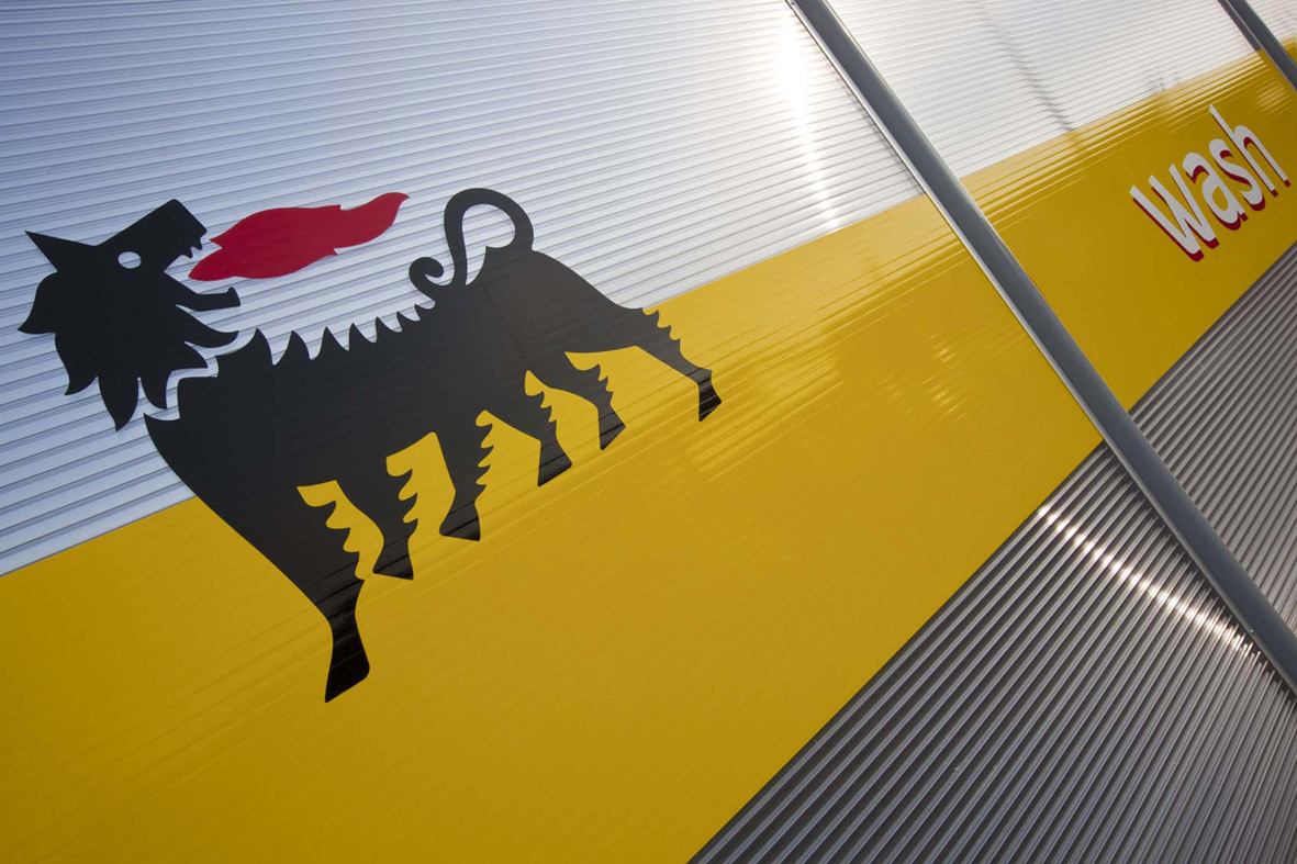
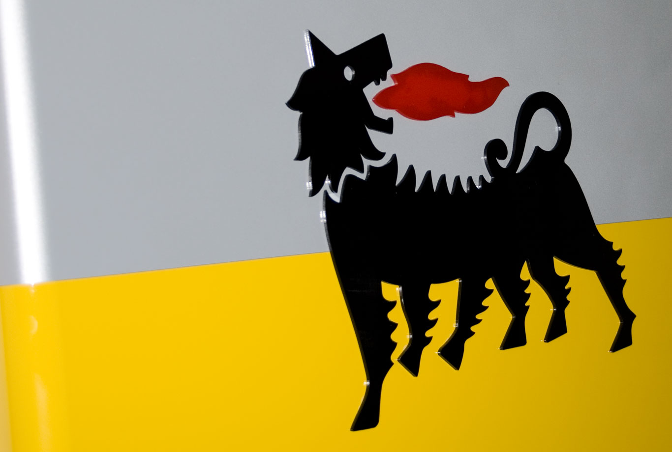
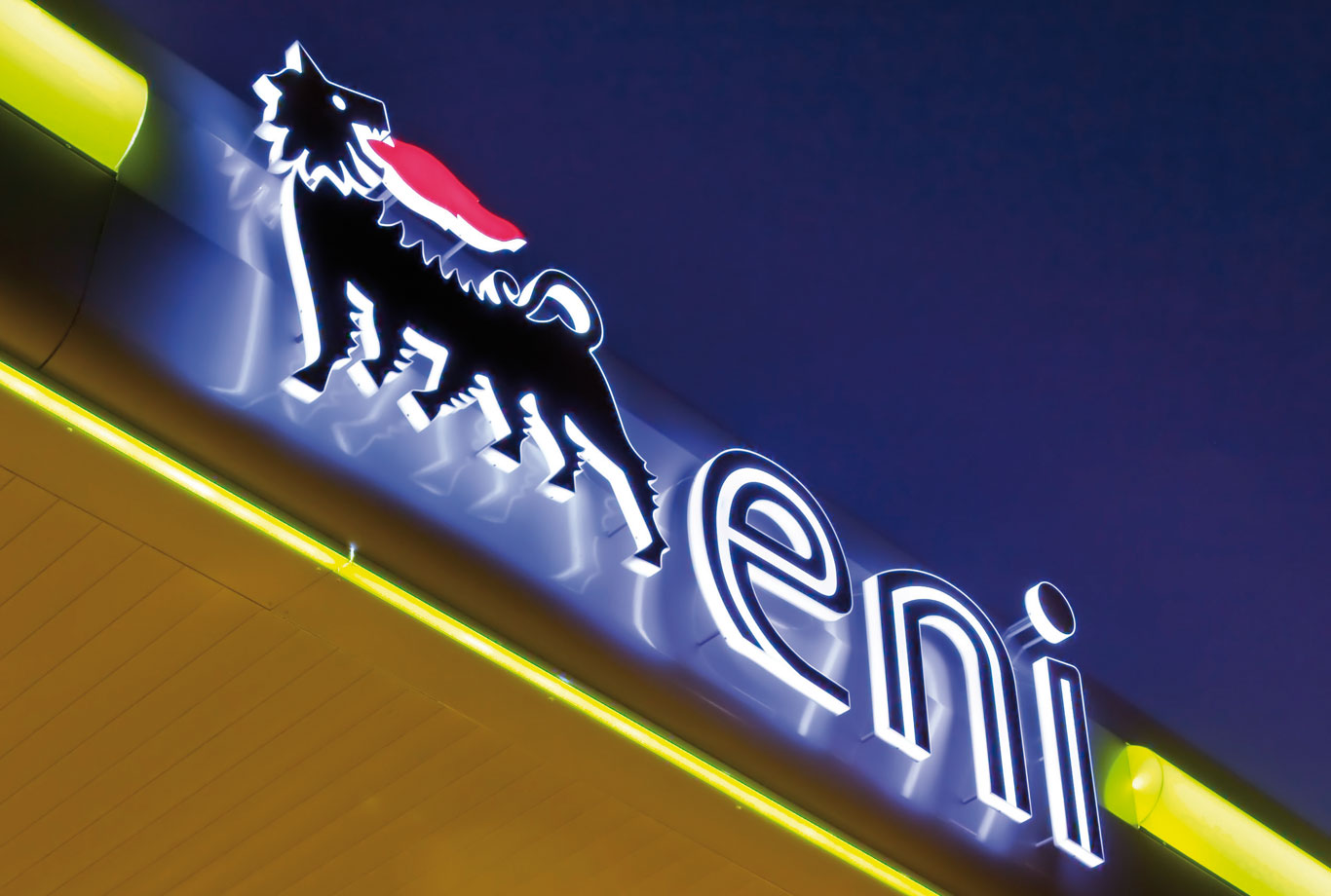
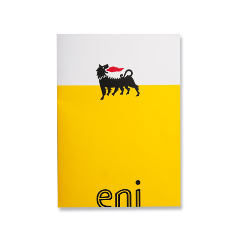
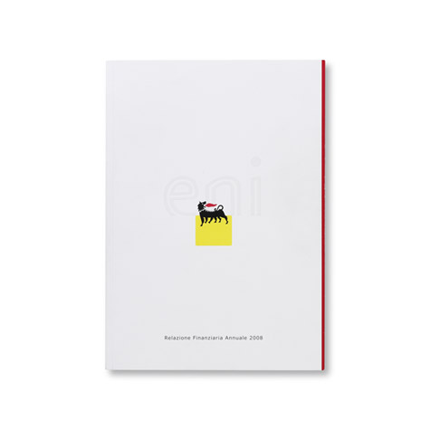
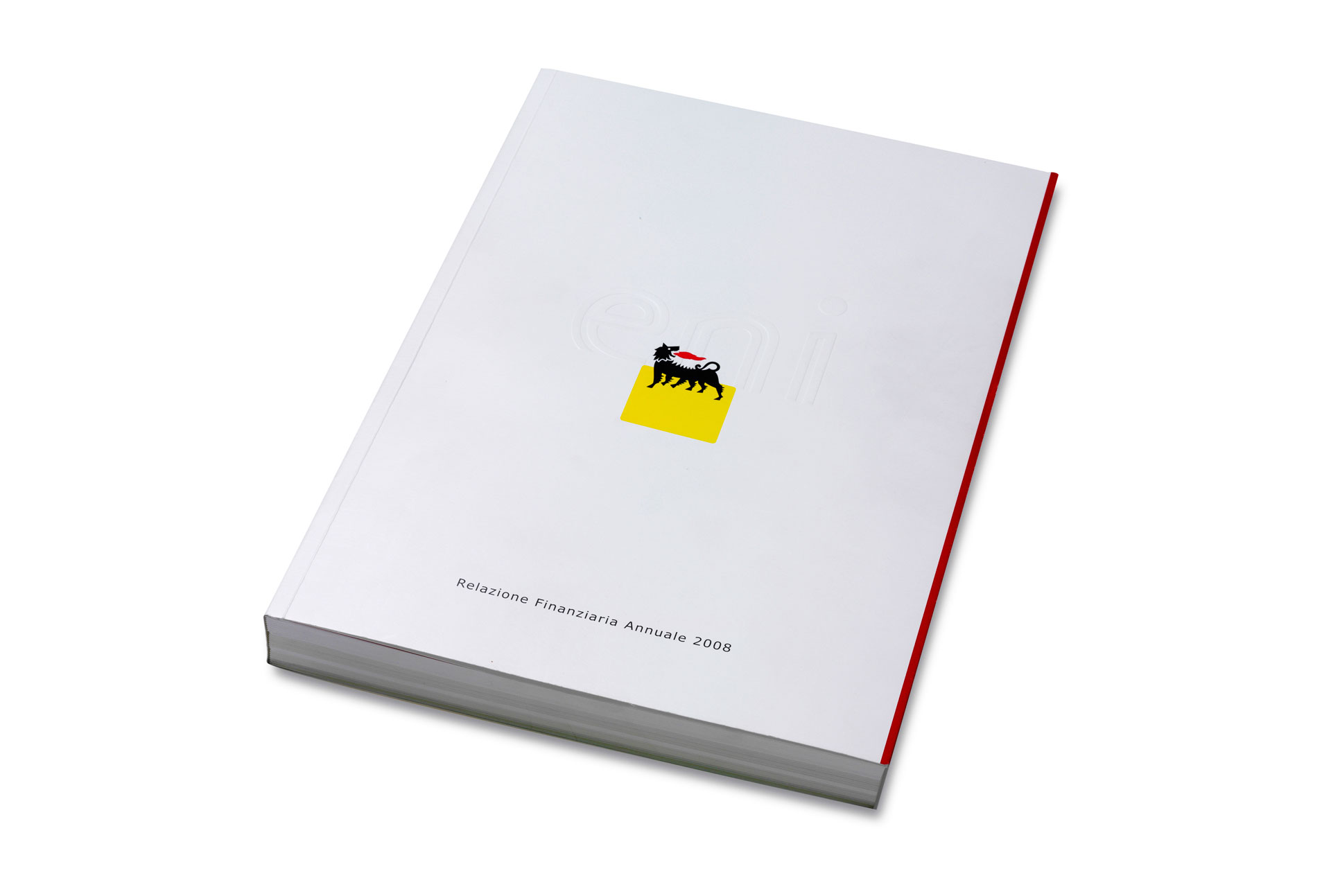
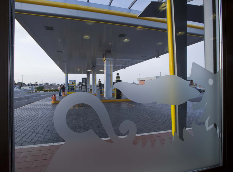
A key element of the rebranding was the redesign of the six-legged dog, the historic symbol of Agip and Eni. Originally created by Luigi Broggini, it was freed from the graphic frame that once contained it, giving it a more open and dynamic presence.
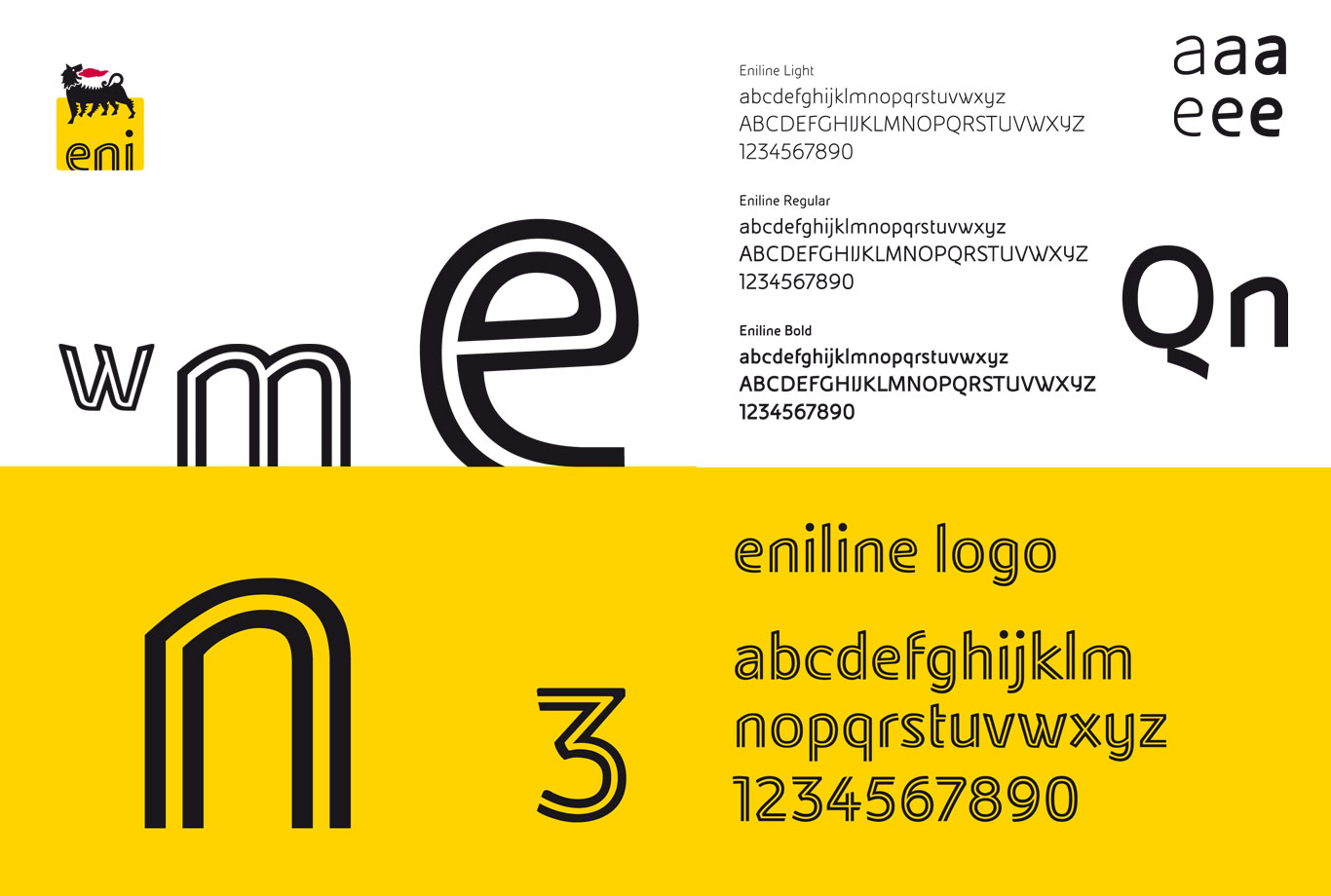
The yellow square and the horizon line were redesigned to improve clarity and add a sense of movement. In addition, the “eniline” typeface was created, developed in continuity with the historic corporate typeface but made more expressive and distinctive: lowercase, with a white inner line.
Communication and Editorial Design. The visual grammar
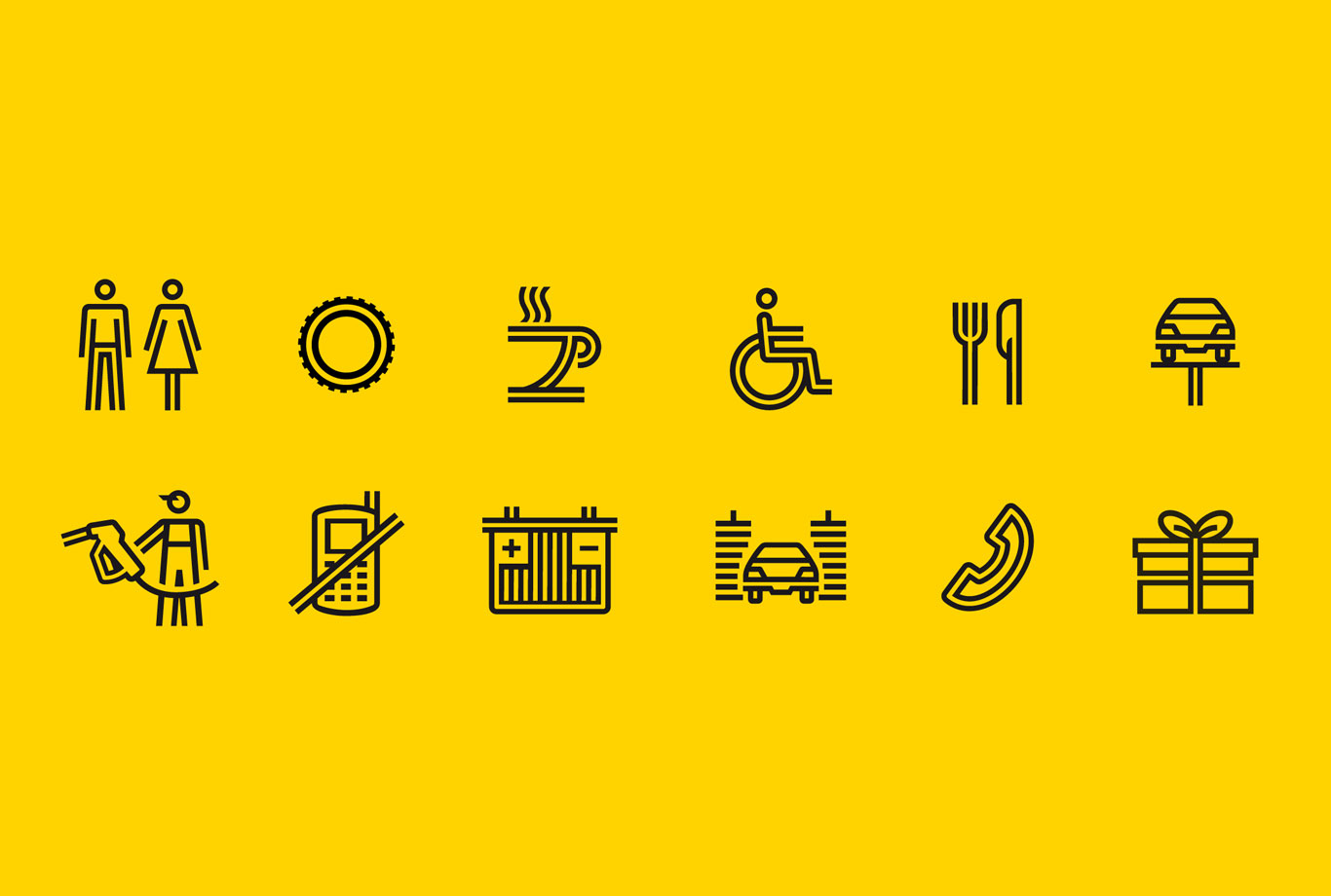
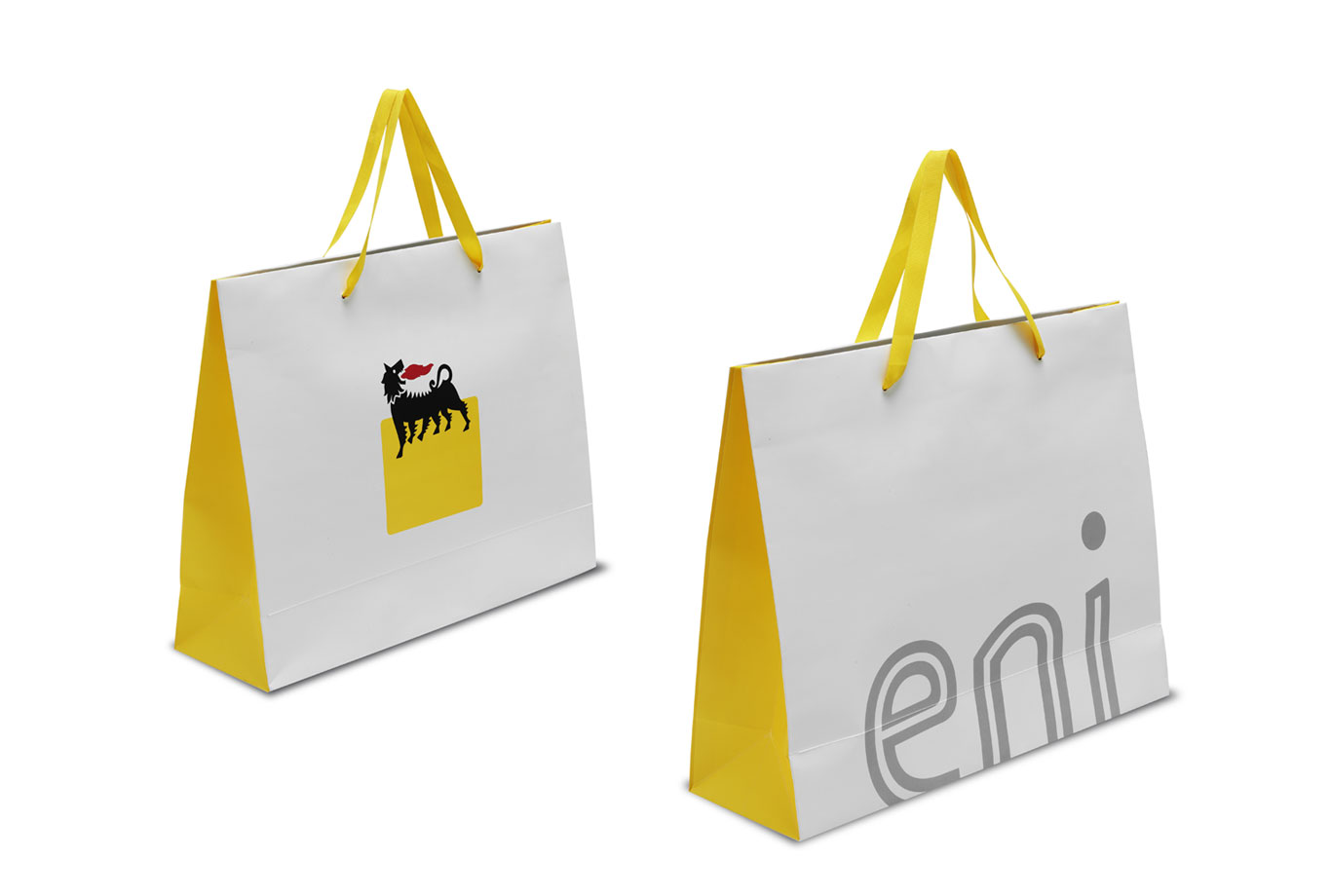
The new identity system is not just a logo but a true generative grammar. The “eniline” typeface is used across every touchpoint: advertising, websites, brochures, corporate documents, and editorial materials. The institutional colors — Eni yellow, black, and silver gray — support and strengthen the visual identity, ensuring recognition and consistency across all media. To complete the system, a set of pictograms was also created, consistent in style and using the same typographic principles to guarantee uniformity and visual coherence in signage and communication.
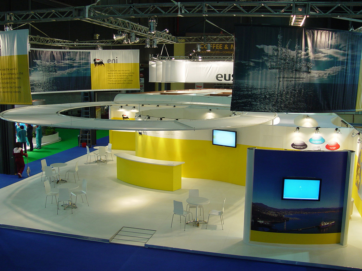
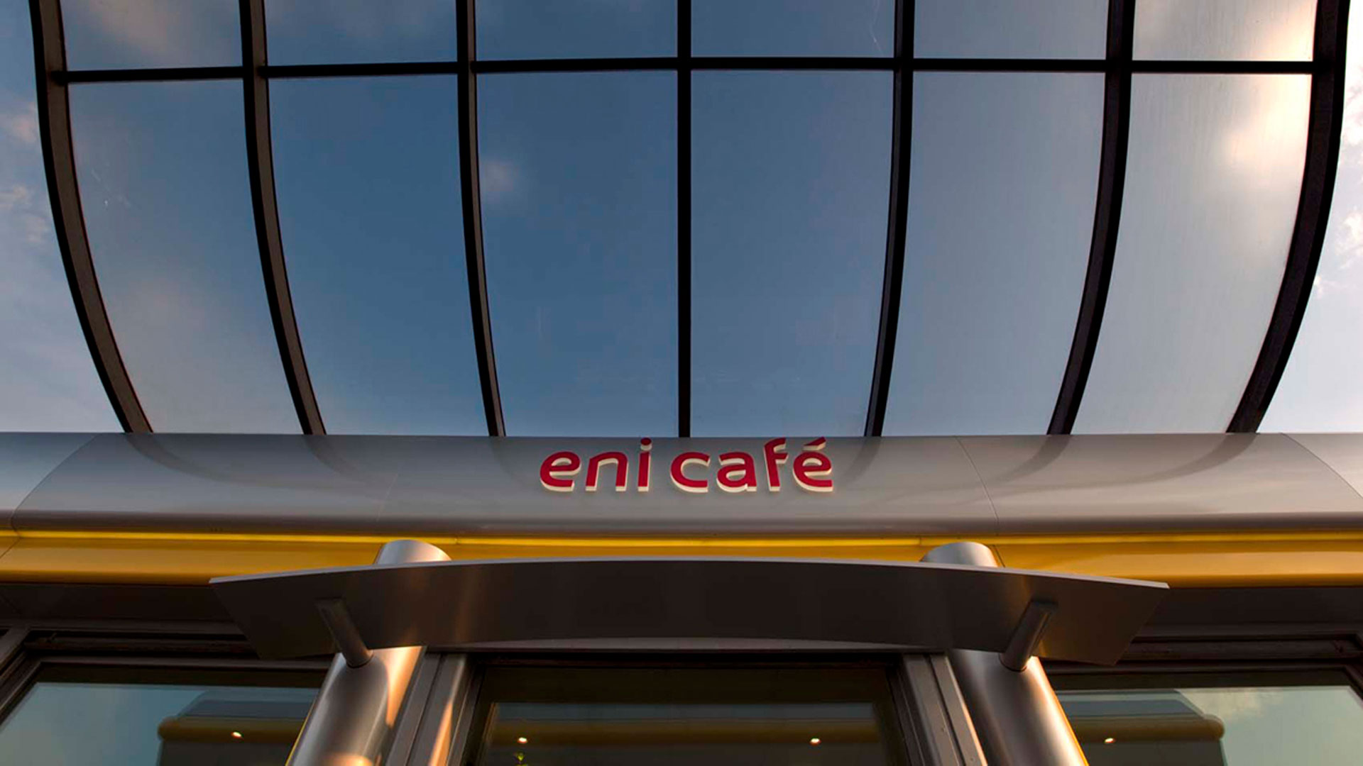
Environmental and Exhibition Design. Where architecture meets branding
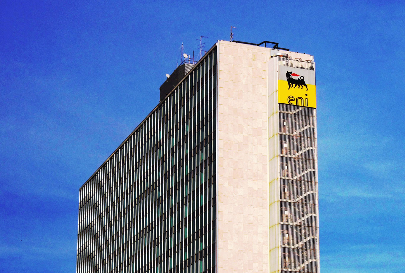
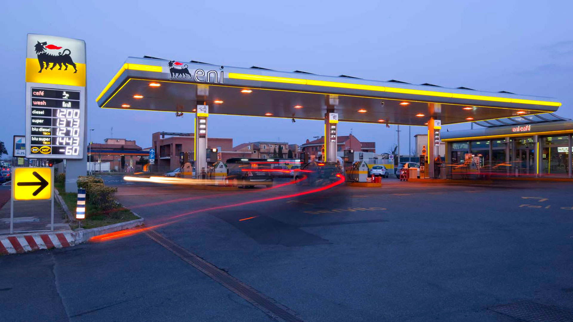
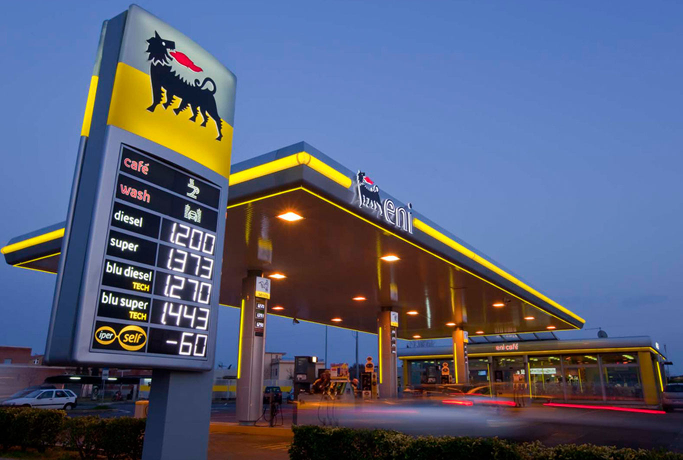
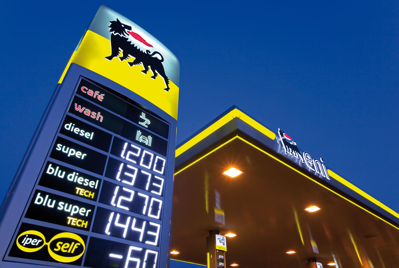
Inarea also extended its work to Eni’s physical spaces: from revamping Agip service stations to prototyping Eni Gas e Luce stores, redesigning office receptions, and organizing and standardizing the signage totems and large signs across the company’s various locations.
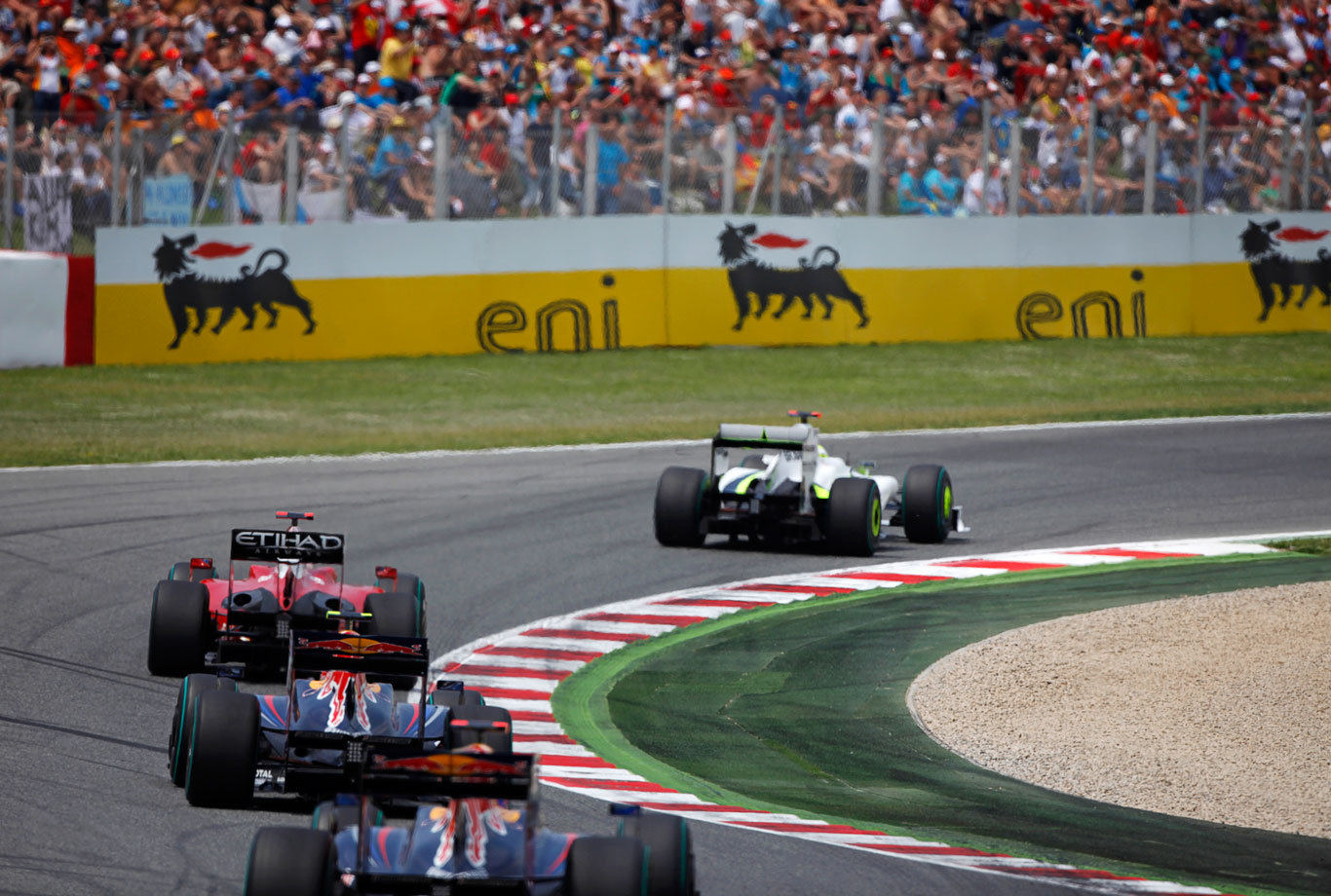
In this context, Eni’s participation in trade fairs and conferences was also reimagined through innovative exhibition design strategies. The Environmental and Exhibition Design project, thanks to its ability to connect architecture and branding, represented the final step in the transition from a world defined by two main brands — Agip and Eni — to a single, coherent, and contemporary ecosystem.