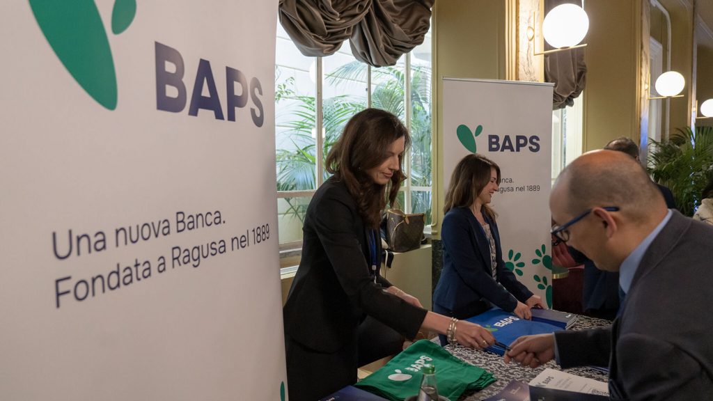
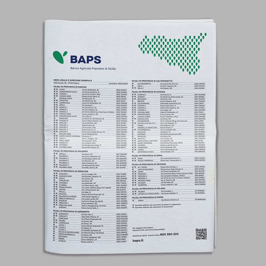
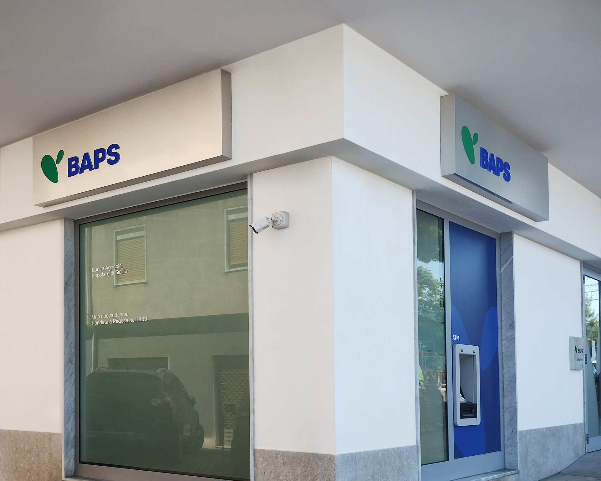
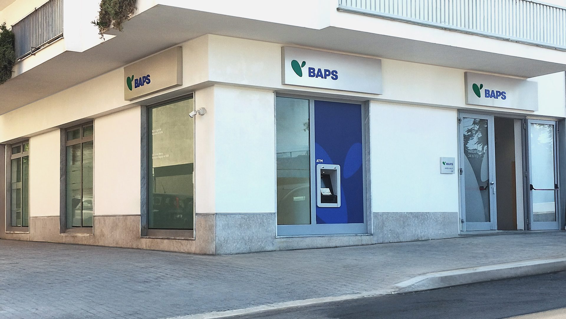
A story that began in Ragusa in 1889 and that, through progressive mergers and more generally through growth, now includes around 900 employees, distributed across more than 100 branches, almost all located on the Island.
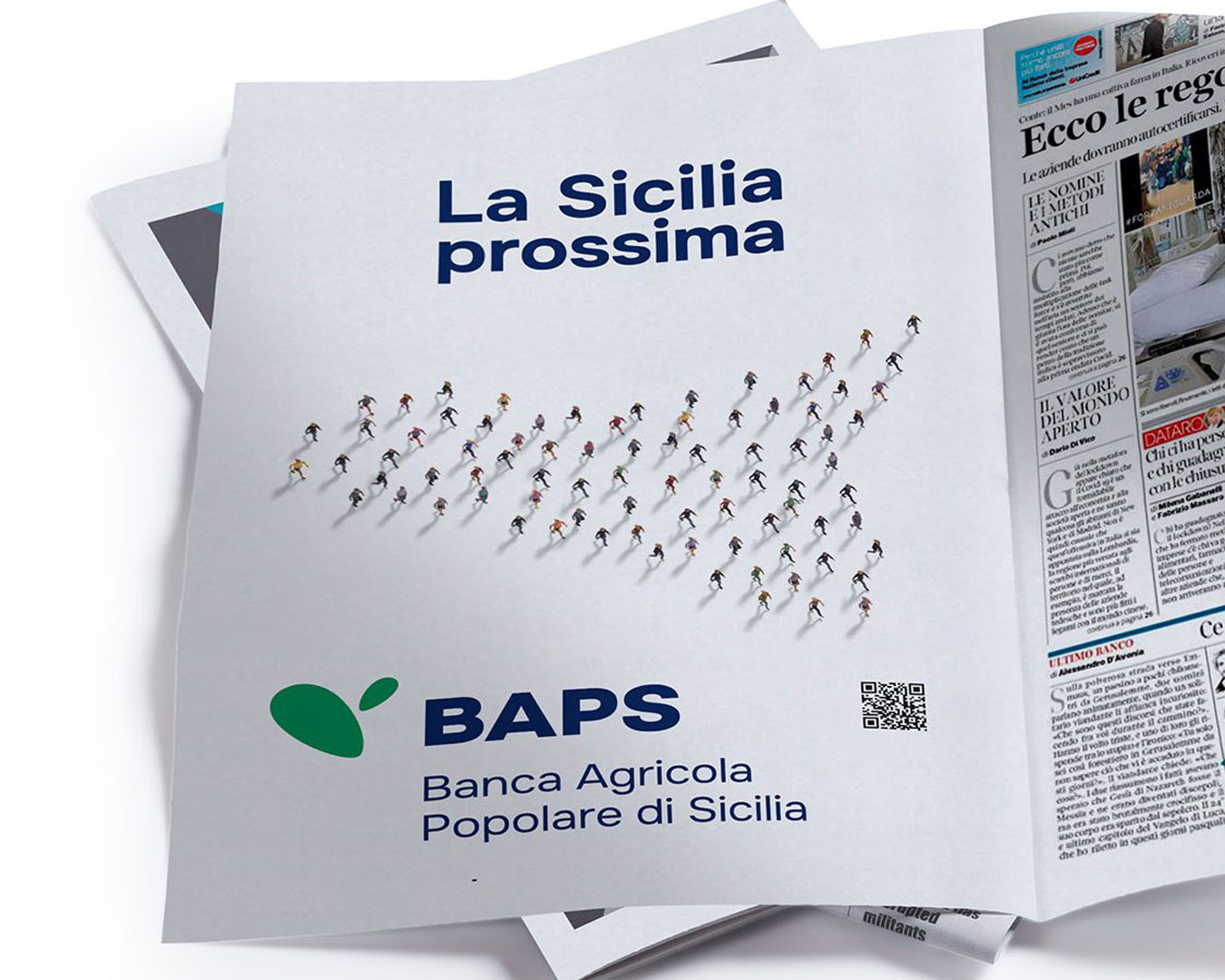
Local presence is therefore the defining characteristic of the bank, encapsulated in the positioning statement ‘We are the Sicily of tomorrow.’ It’s a way of being that manifests through closeness to businesses, families, and most importantly, individuals—aligning its actions with a vision of a connected and forward-looking Sicily.
Brand Design and Architecture: where tradition meets contemporary vision
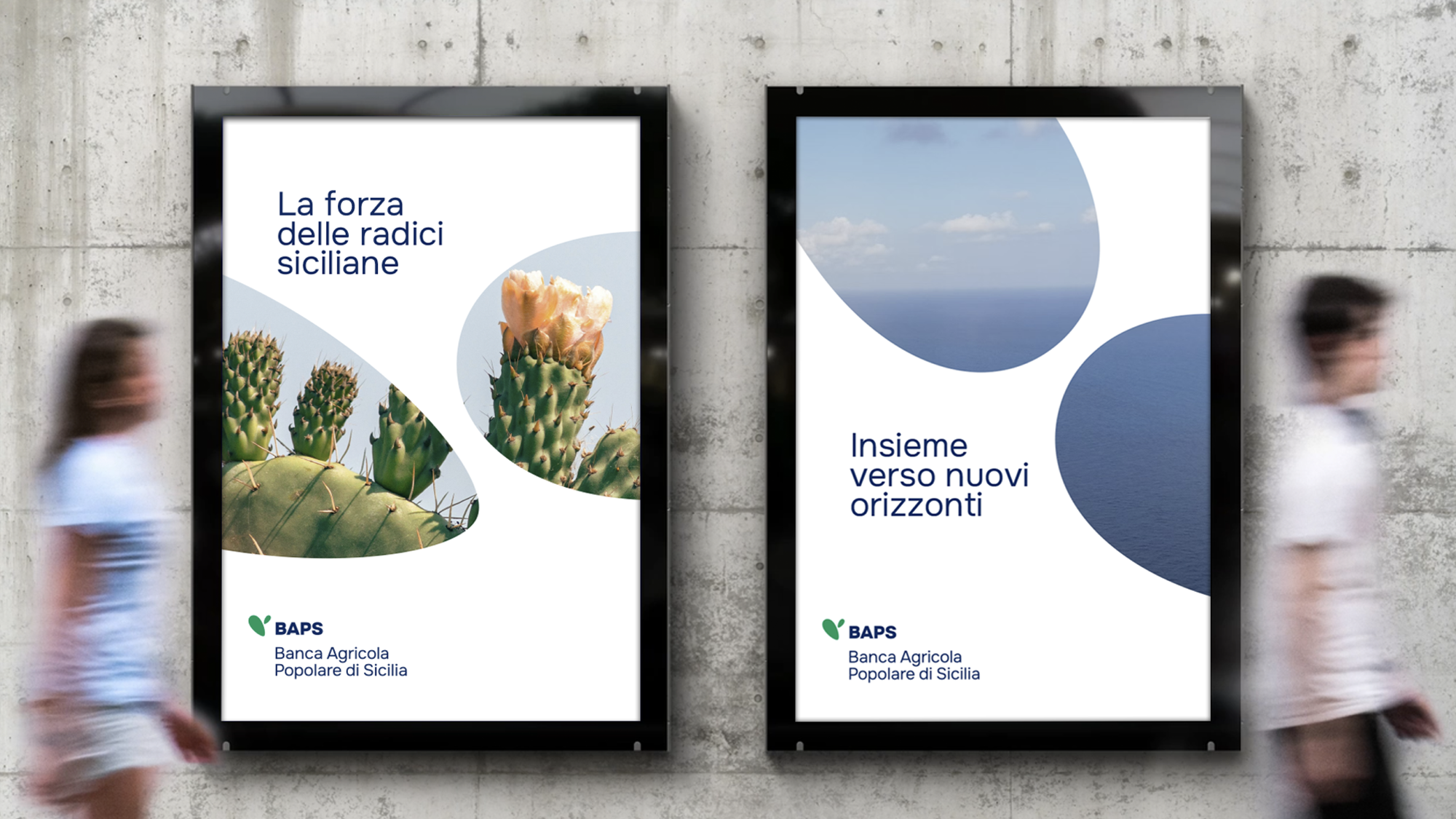
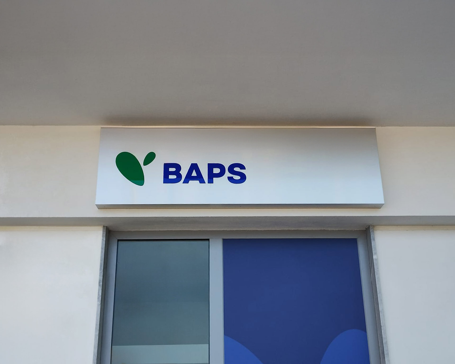
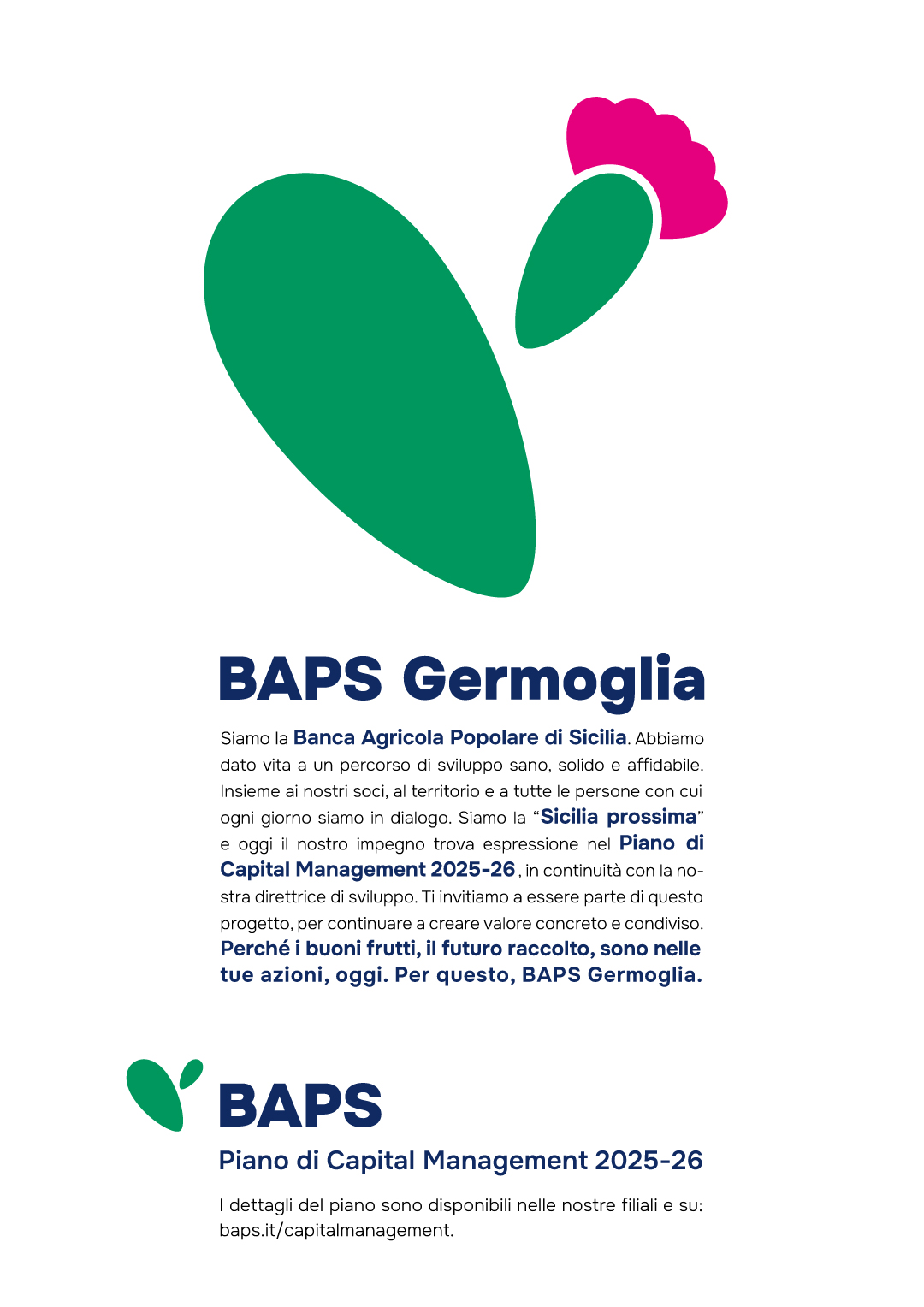
The new identity of BAPS is built around a symbol that honors the Bank’s deep roots while looking toward the future. A graphic synthesis that conveys strength, resilience, and a renewed commitment to the region and its values.
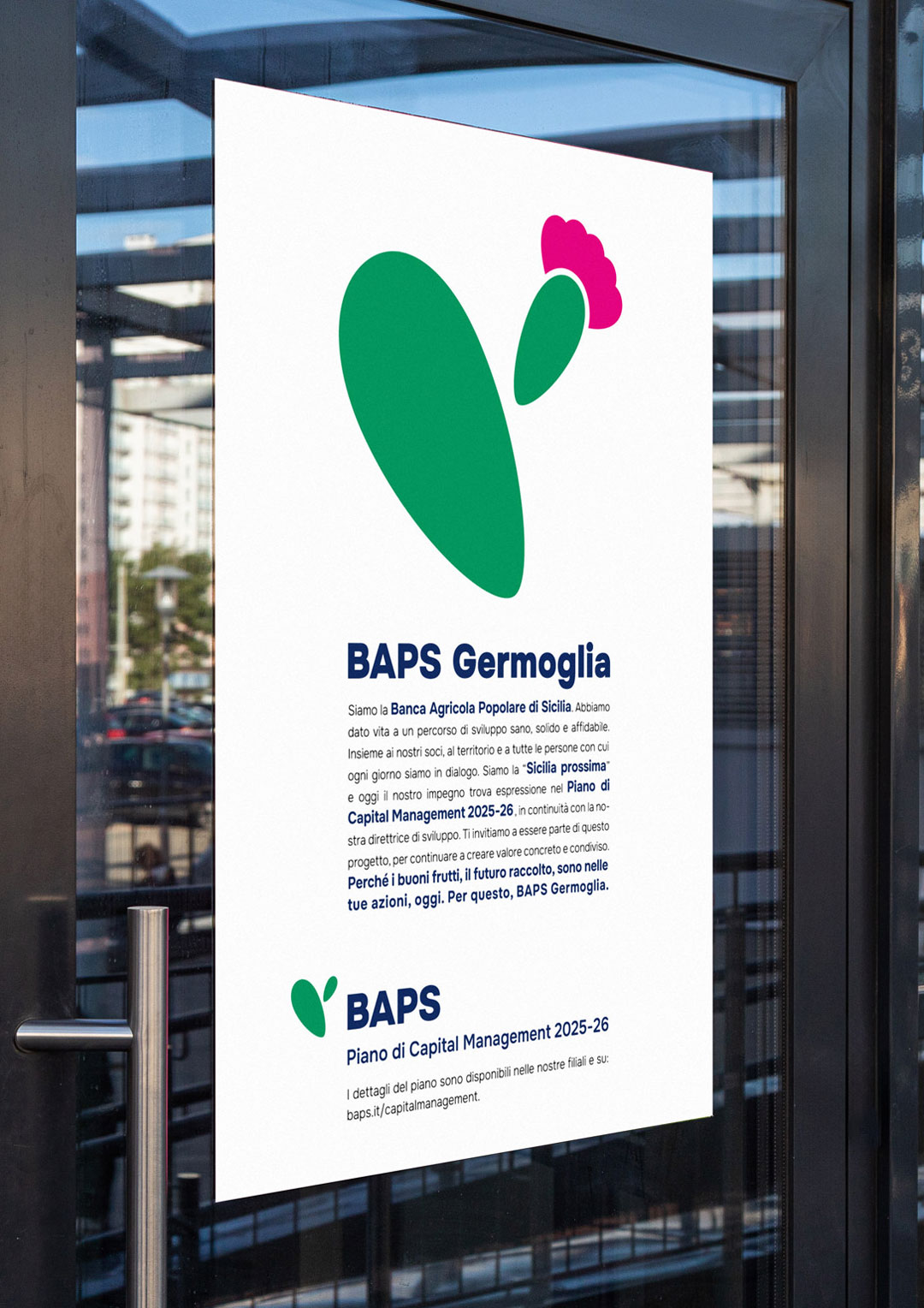
The identity begins with the oval shape of the historic logo of the Ragusa-based bank: the ellipse is transformed and duplicated, shifting from blue to green to evoke the paddle and fruit of the prickly pear cactus. A distinctive feature of the Sicilian landscape, this plant thrives even in harsh conditions, symbolizing resilience and vitality. It stands as the perfect emblem of resilience and productivity, cooperation and mutualism—values rooted in the agricultural world and central to BAPS’s philosophy. The logotype design, set in the Onest Black sans serif typeface, ensures clarity and visual impact, especially in digital communications.
The brand architecture aligns every context around the centrality of the BAPS brand, ensuring not only consistency and coherence in its presentation, but also effectiveness in enhancing the overall critical mass of the system.
From digital to retail, it is synthesis that guides the identity system
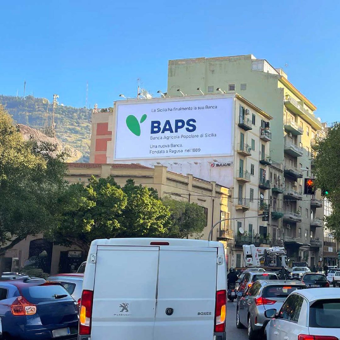
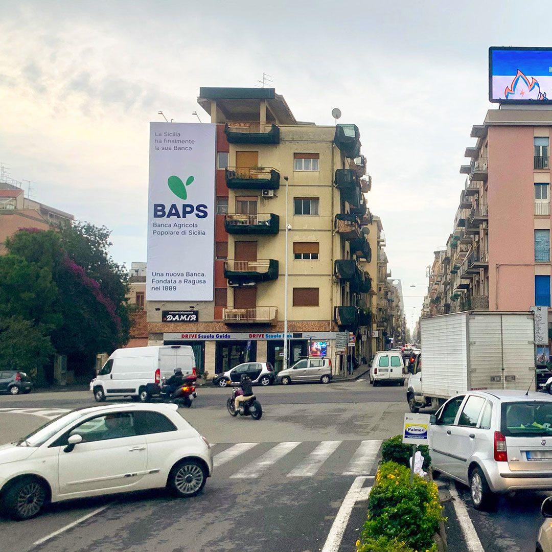
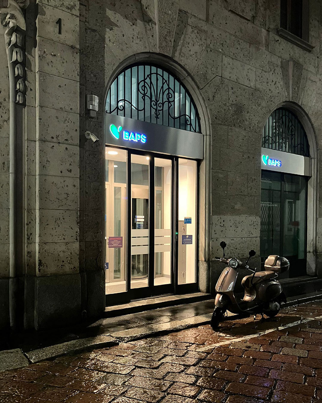
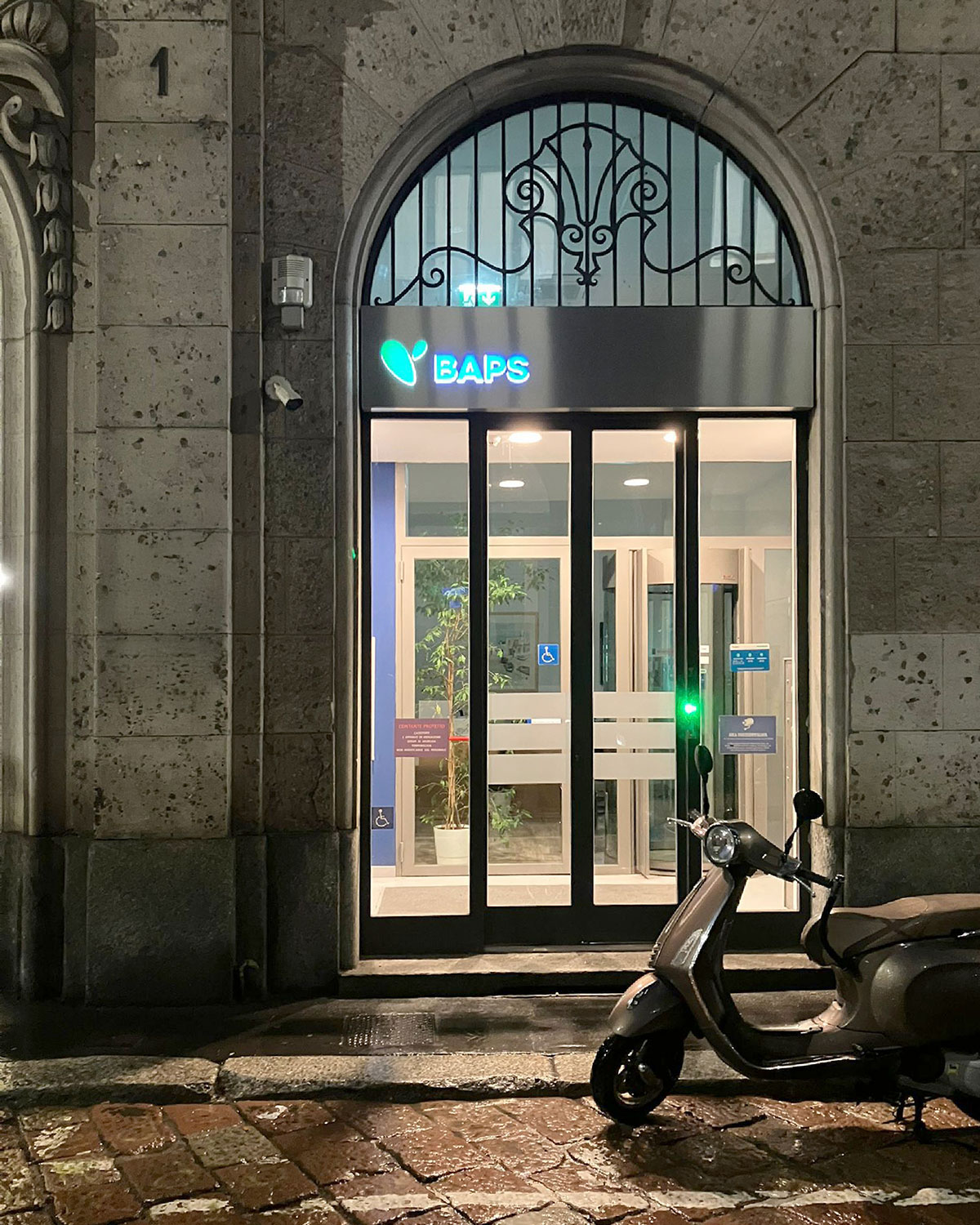
Rigor and simplicity form the conceptual and formal foundation of the identity system. Every touchpoint has been redesigned and reinterpreted with the goal of making the BAPS ecosystem instantly recognizable. This process involved a deliberate reduction—both formal and informational—across all applications: from the new branch signage to forms, from the communications for the launch of the new bank to digital platforms, and even publishing. Within this framework, to ensure a variety of expressions, a comprehensive set of brand languages has been developed to support diverse messaging while maintaining the consistency of the overall brand proposition.