The Bambino Gesù Children’s Hospital, an institution of the Holy See, is the largest pediatric hospital and research center in Europe. Founded in Rome in 1869 by the Salviati family, it was the first Italian hospital dedicated exclusively to children. Today it is an international reference point for the health of children and young people, combining specialist care with intense scientific research.
Brand design and brand architecture. The child who embraces the world
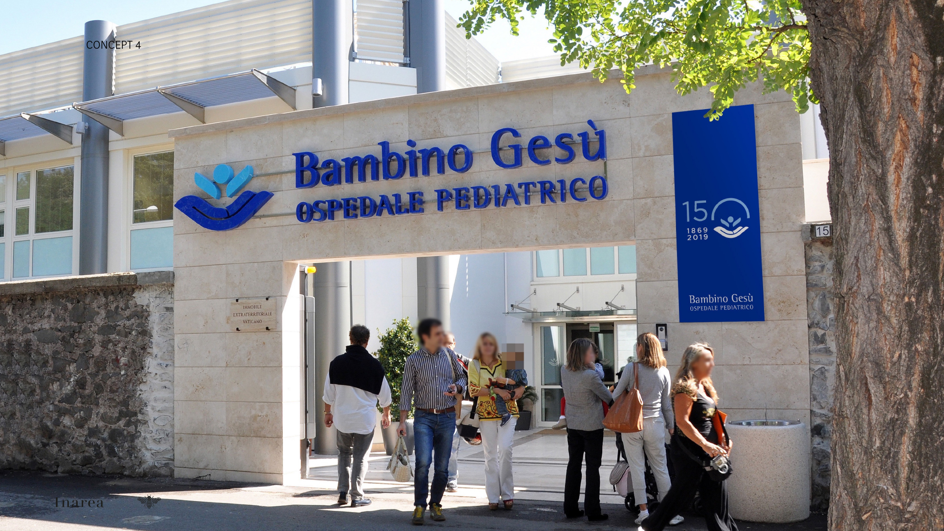
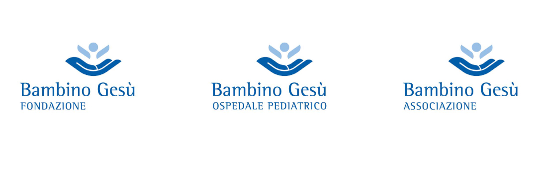
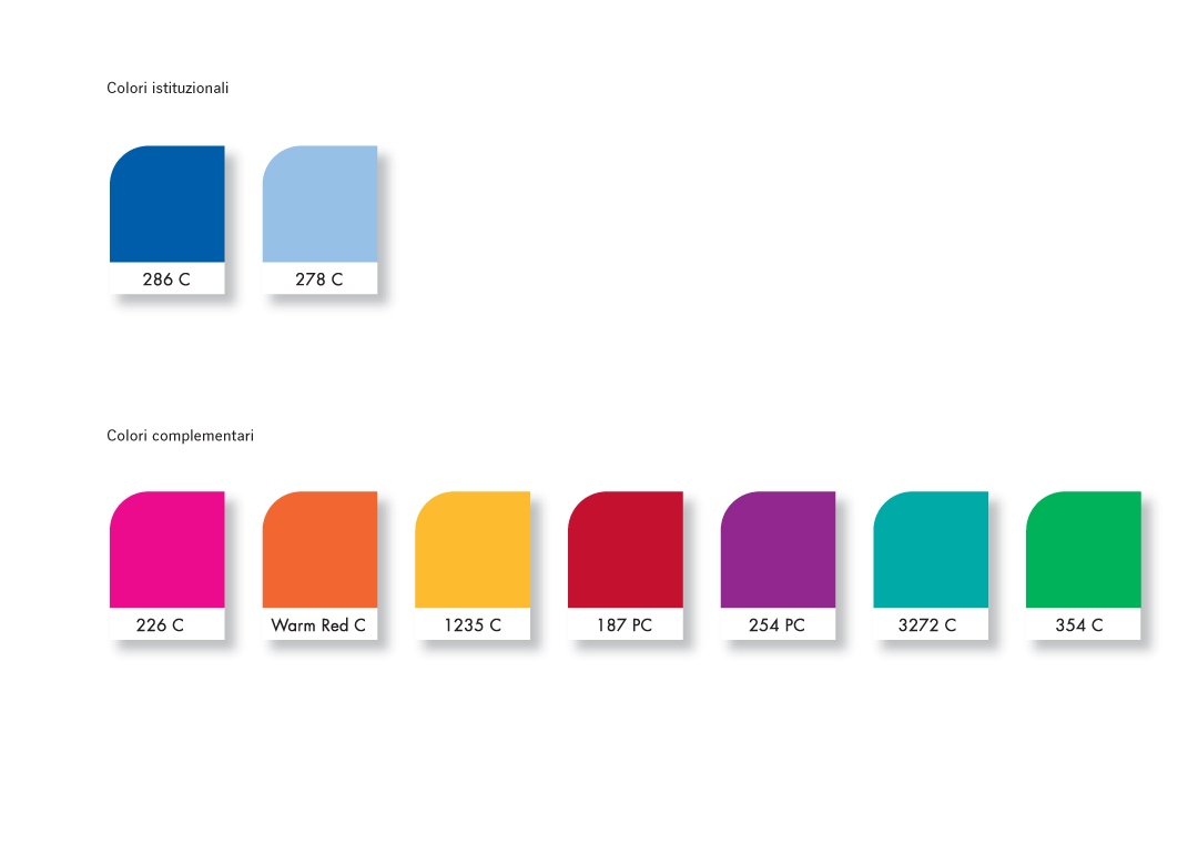
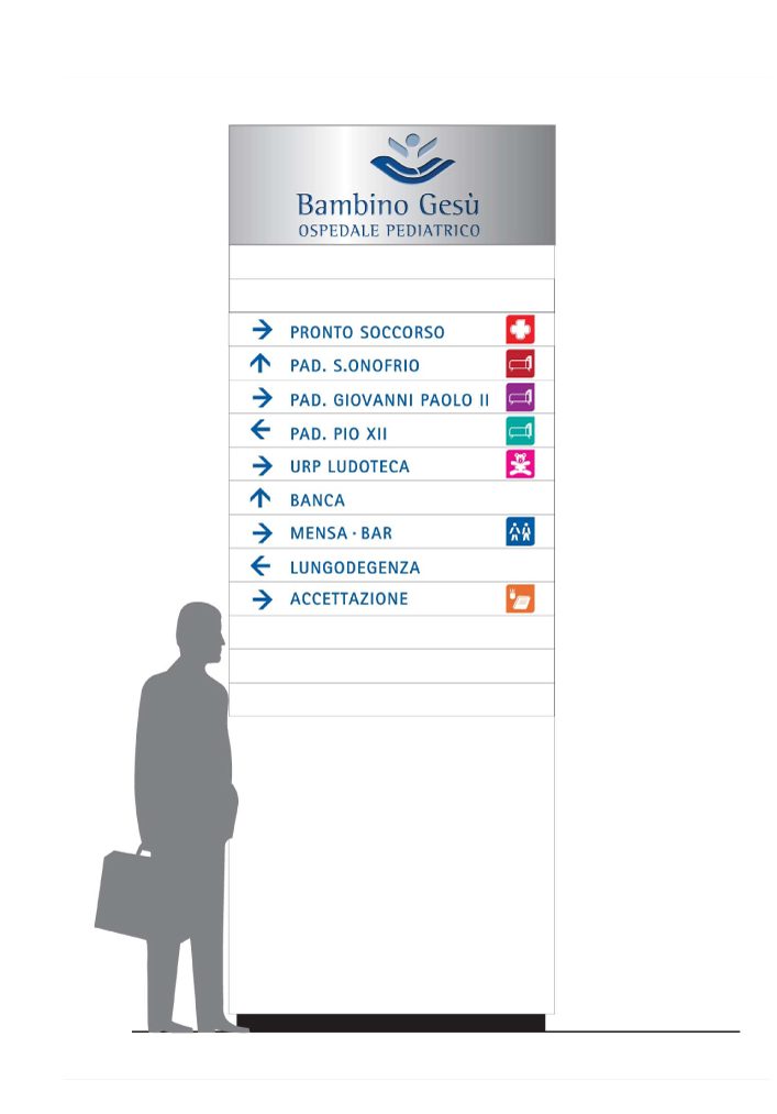
At the client’s express request, the brand identity project had to be an evolution of the pre-existing one. Inarea has redesigned the pictogram-symbol: a child embracing the world, with a design that communicates welcome, protection, and a global dimension. The image not only reflects the hospital’s mission to care for children internationally, but also underscores its connection to the Vatican and its role in pediatric excellence. The figurative element is flanked by the “Bambino Gesù” logo and the descriptor “Ospedale Pediatrico”. The brand architecture is clear, distinguishing the different entities linked to the institution: the Pediatric Hospital, the Foundation, and the Association, each with a visual interpretation that maintains the consistency of the master brand. The color palette is centered on light blue or blue shades, which convey serenity and confidence. It is balanced by complementary colors, suggesting an environment that is both professional and welcoming for children. The typography, chosen for its readability, adopts an institutional yet friendly character, essential for a medical-social context that works in contact with the youngest children.
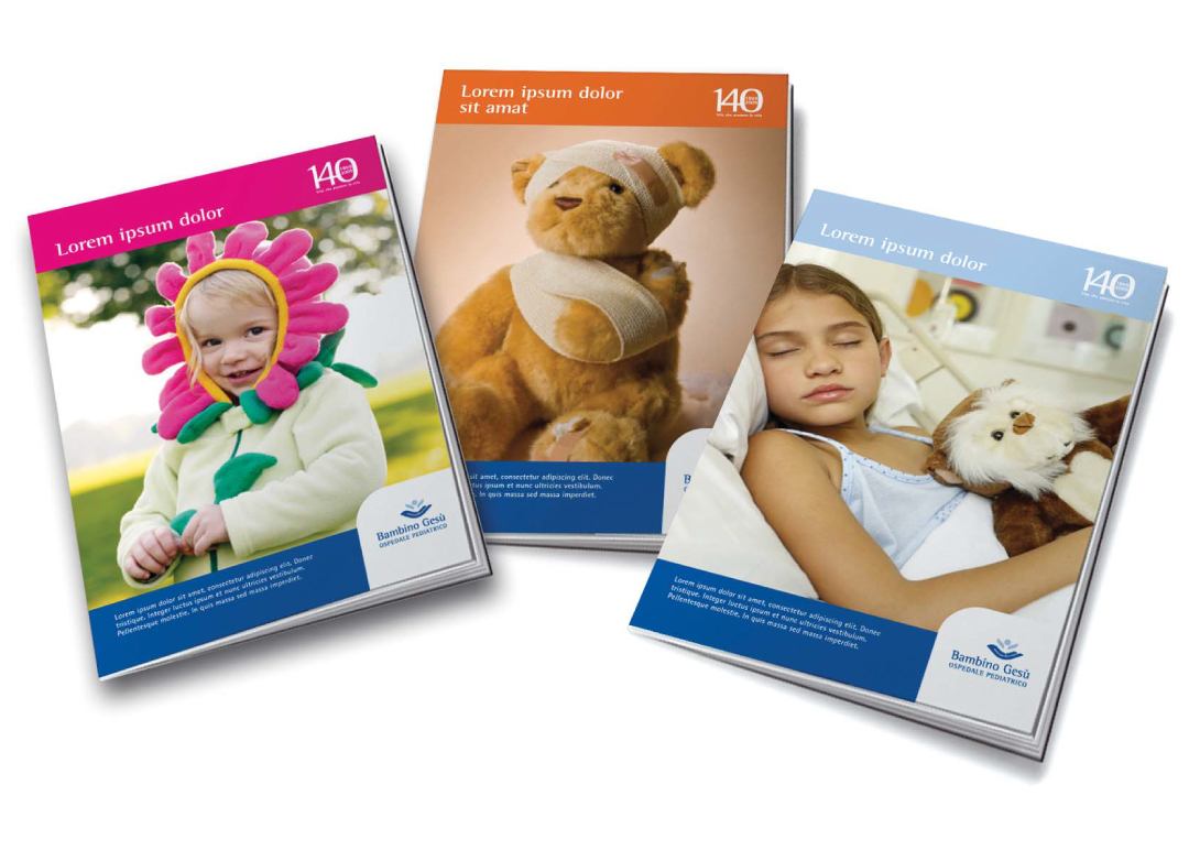
Anniversaries as brands.
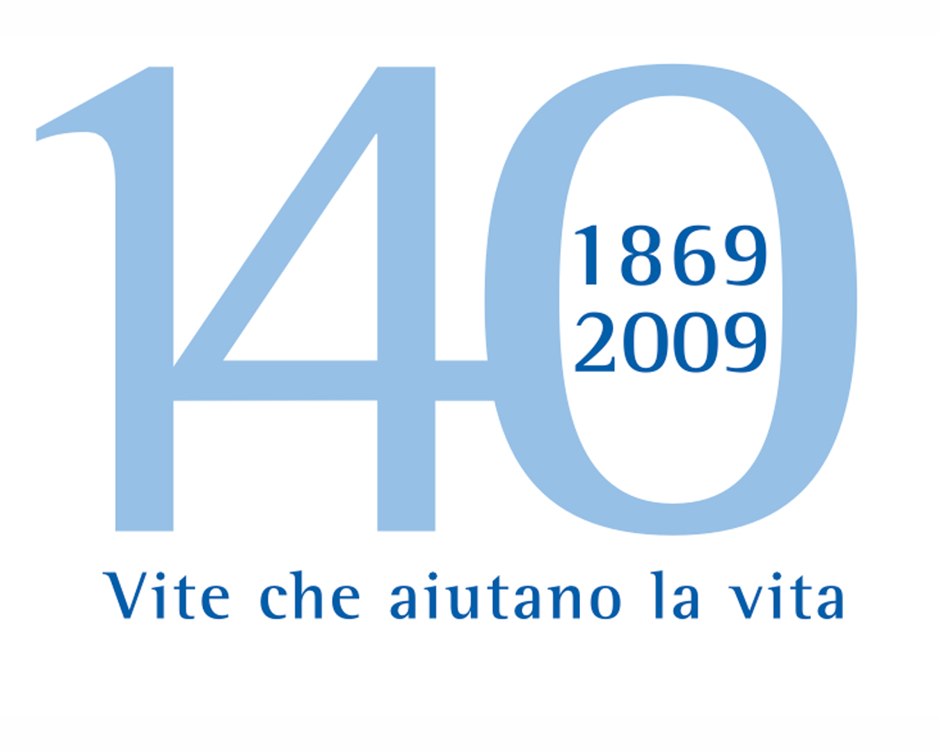
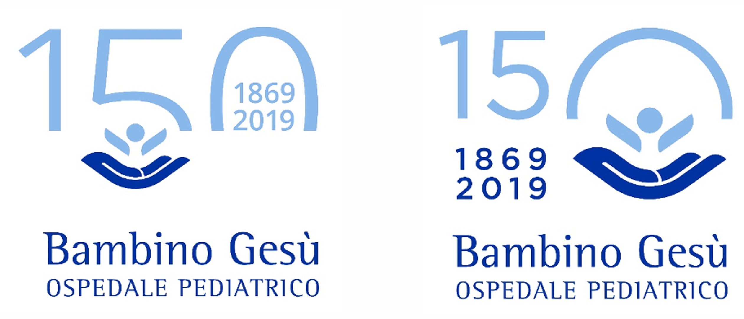
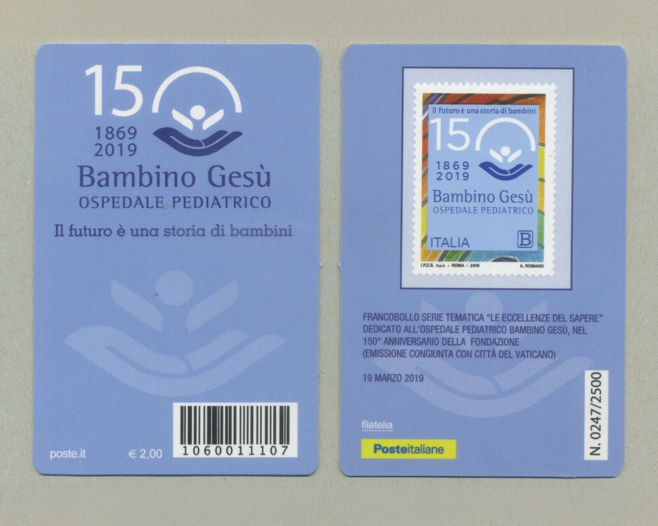
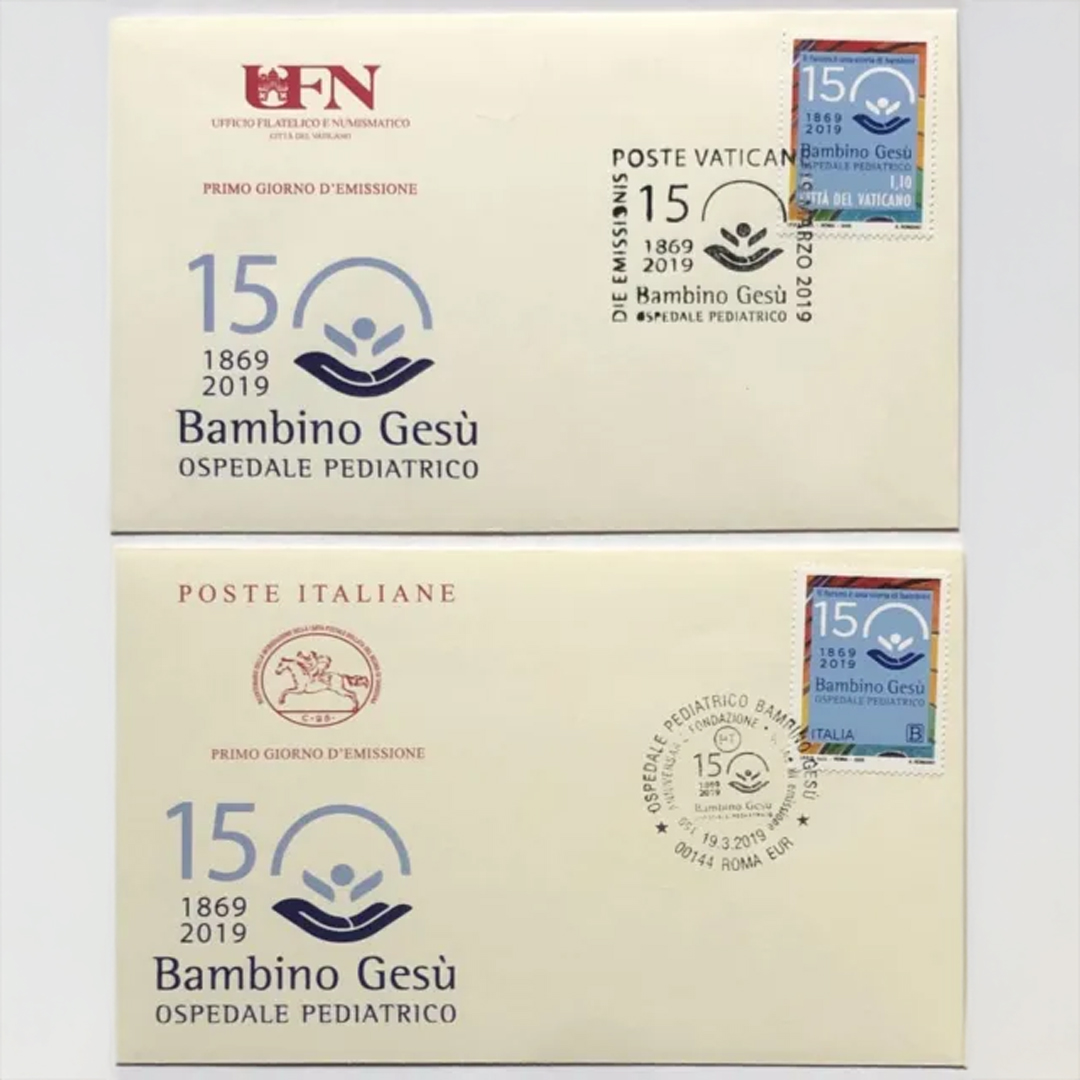
Inarea was also involved in the creation of the commemorative logos for the institution’s 140th and 150th anniversaries. The 140th anniversary logo incorporates the founding year (1869) and the anniversary year within the “zero,” as if in a frame, highlighting the hospital’s long tradition. The tagline, “Lives that help life,” links the past to the present, emphasizing the hospital’s ongoing mission and vital impact. The 150th anniversary logo, also reproduced on two stamps, one issued by the Holy See and one by the Italian Republic, intersects the zero with the hospital’s logo, adding the evocative and powerful tagline, “The future is a story of children,” uniting historical heritage with a forward-looking vision.
Communication Design: The Voice of Humanity and Science
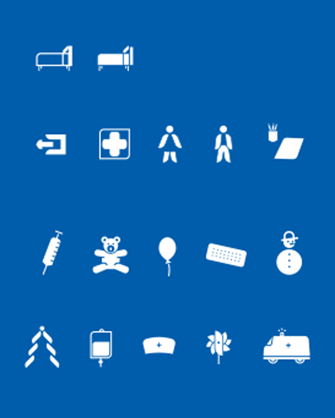
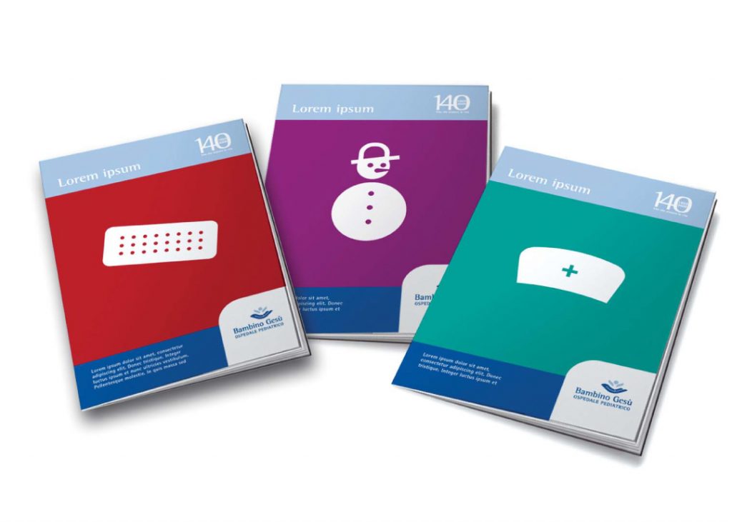
Bambino Gesù’s communication style balances scientific authority with sensitivity to children. The brand identity, present across all touchpoints, alternates institutional elements with images that convey humanity and solidarity, in line with the institution’s values.