Aventis Pharma was one of the world’s leading pharmaceutical groups, founded in 1999 through the merger of Germany’s Hoechst Marion Roussel and France’s Rhône-Poulenc. The group focused on ethical drugs and clinical research, with a strong international presence in oncology, metabolic diseases, cardiovascular treatments, and vaccines. In 2004, Aventis merged with Sanofi-Synthélabo to form Sanofi-Aventis, which became one of Europe’s largest healthcare players, combining R&D, manufacturing, and global distribution capabilities.
Packaging design. Simplicity and visual consistency
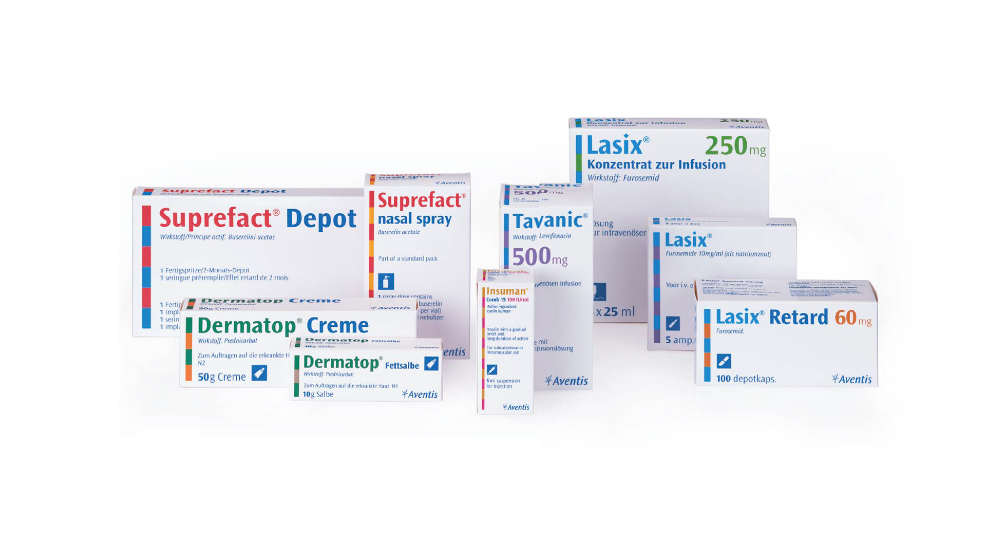
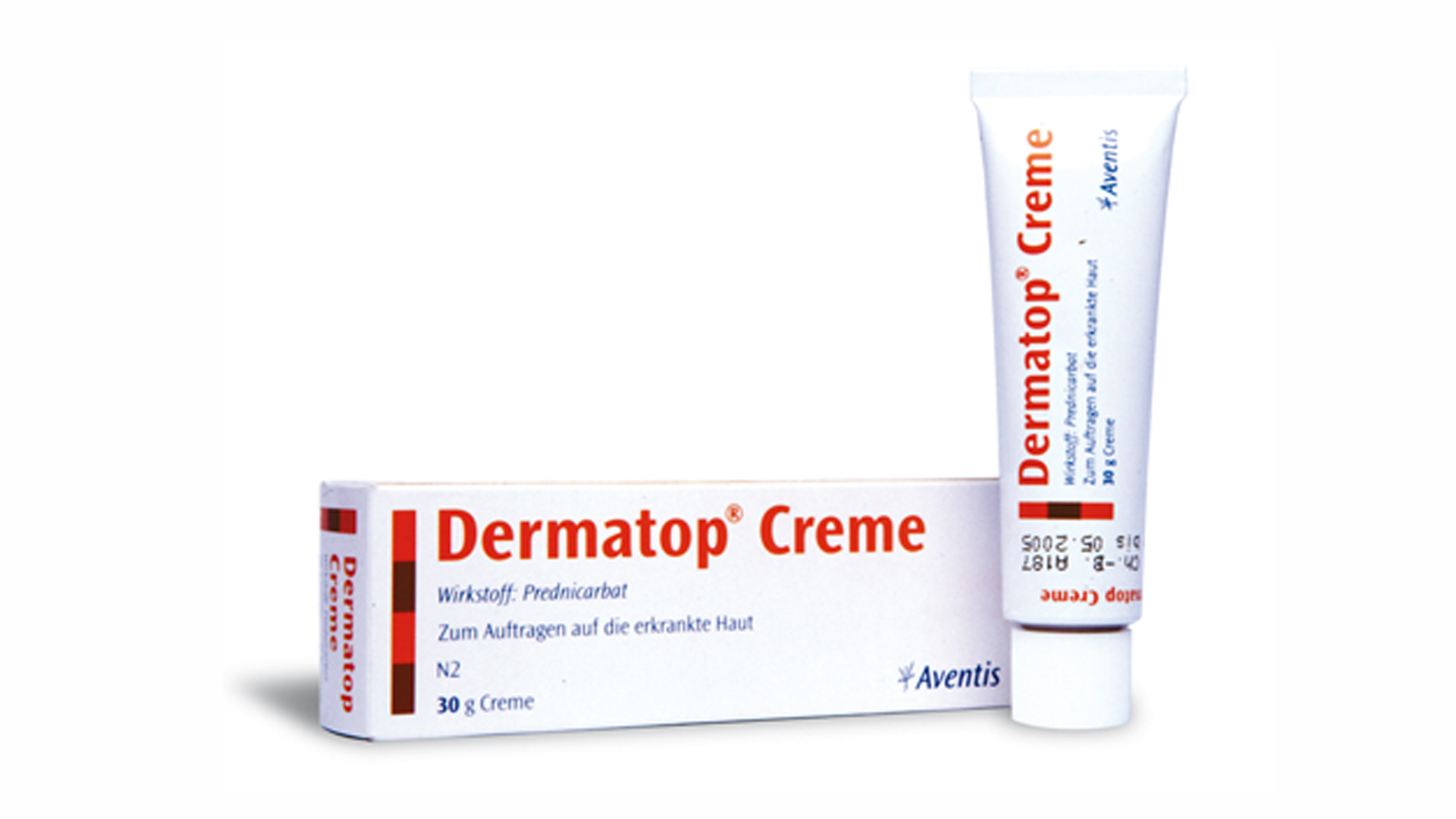
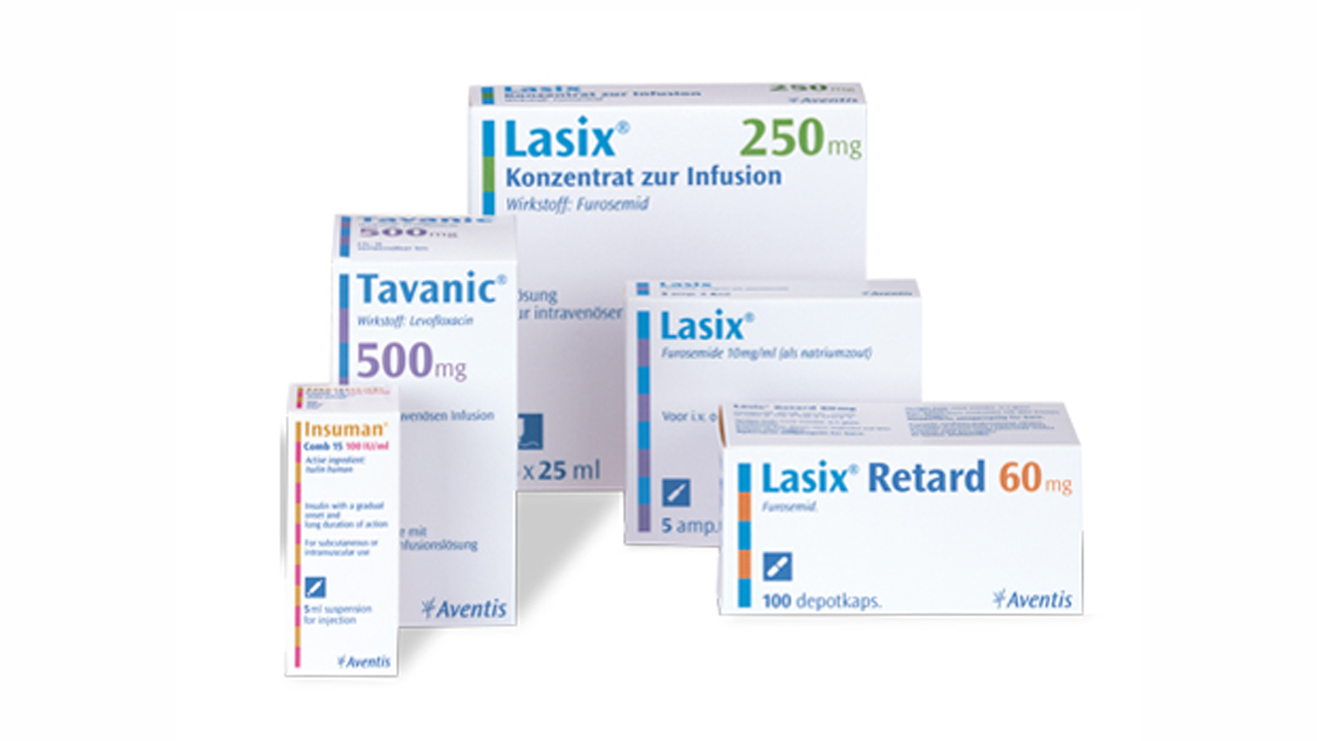
When Aventis Pharma decided to rationalize its portfolio of ethical medicines, starting from six distinct brands, the goal was clear: to bring them all together under a single brandmark to ensure greater recognition, consistency, and trust. In this context, packaging was not merely a container but a strategic element.
The guiding principles were simplicity, rigor, and compliance with the strictest standards of pharmaceutical prescription. The proposed system needed to organize essential information—active ingredient, dosage, indications, and warnings—in an orderly and legible way, while maintaining a unified identity across all products and countries.
The graphic structure of the packaging was designed to be highly rational: clear typography, strong visual hierarchy, and a restrained use of color to differentiate therapeutic lines while preserving a distinctive overall look. The unique brand color had to be easily recognizable by professionals and patients, even in low-light or stressful conditions. At the same time, regulatory requirements demanded strict control over space and format: readable labels, chromatic contrast for warnings, and international symbols where required. The new design allowed pharmacists, physicians, and end users to quickly identify key information, reducing the risk of errors.
The brand unification process, therefore, was not merely an exercise in brand design but became a tool for safety and transparency: it clarified therapeutic differences under a single brand, strengthened the corporate identity through visual coherence, and built trust among stakeholders based on clarity and reliability.