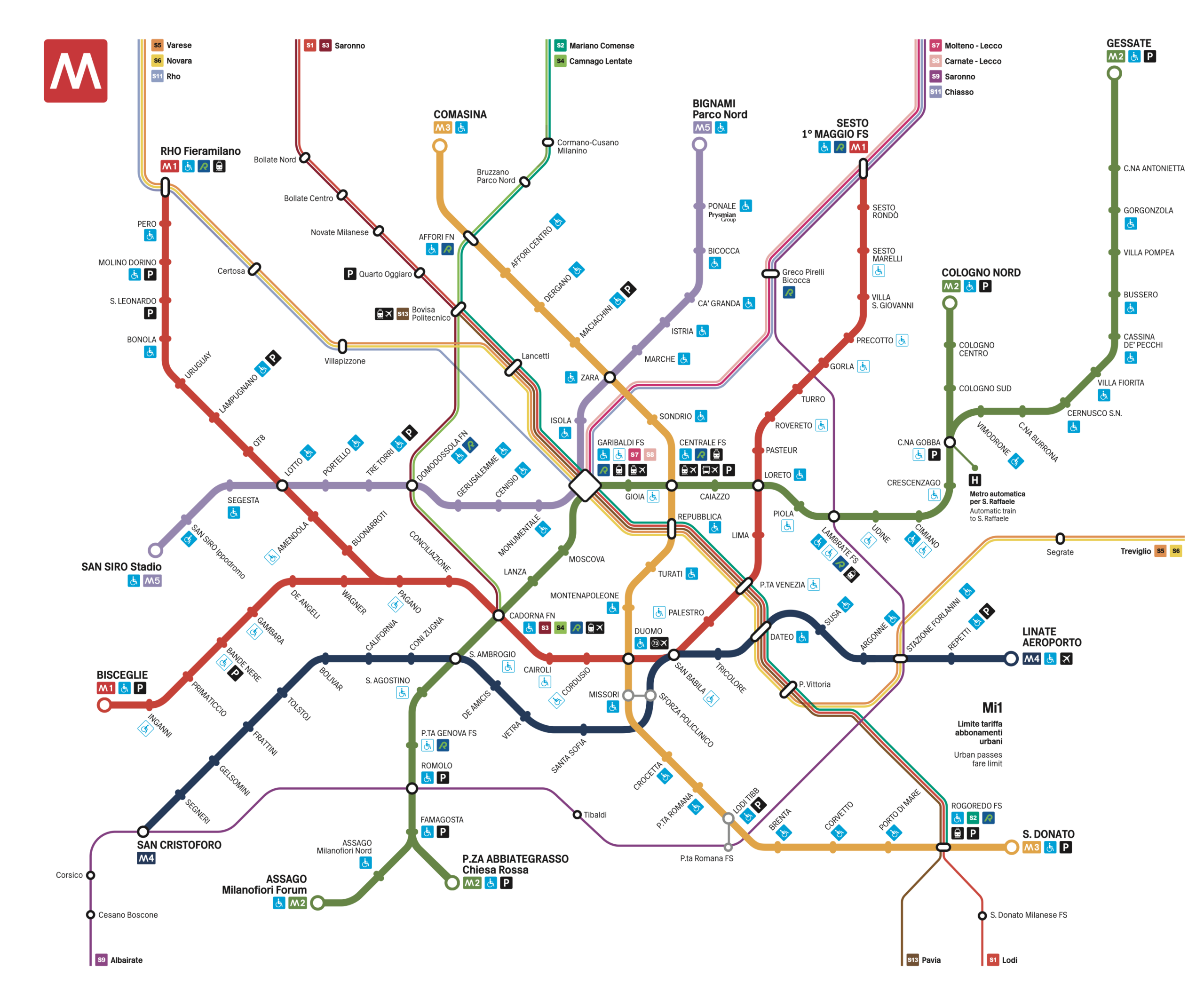
The Milan Metro is a key pillar of the city’s mobility infrastructure and local public transport network. It opened in 1964, designed by Franco Albini and Franca Helg, with visual identity by Bob Noorda. That same year, the project earned ATM the Compasso d’Oro ADI award. The first line, M1, was followed by M2 in 1969, M3 in 1990, M5 in 2013, and M4 in 2022.
Type Design: A symbol born from an icon
Inarea began working with ATM in the early 2000s, during the redesign of the key transit hub at Garibaldi Station.
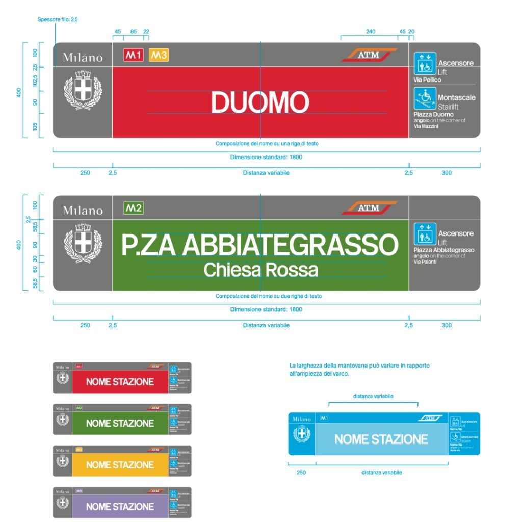
The type design project, created in 1964 by Bob Noorda, was based on a reworking of Helvetica and originally didn’t include the use of lowercase letters. The signage focused on the platforms, with station names placed inside a continuous red (or green) perimeter band.Over time, the introduction of new stations with longer names and evolving safety regulations created the need for a more functional and adaptable typeface.
Inarea went on to design a proprietary typeface, Metro Type, developed as a faithful and respectful interpretation of Noorda’s original work. Today, it’s used for the text elements on panels, informational signage, and station regulations.
Wayfinding for clear and consistent navigation
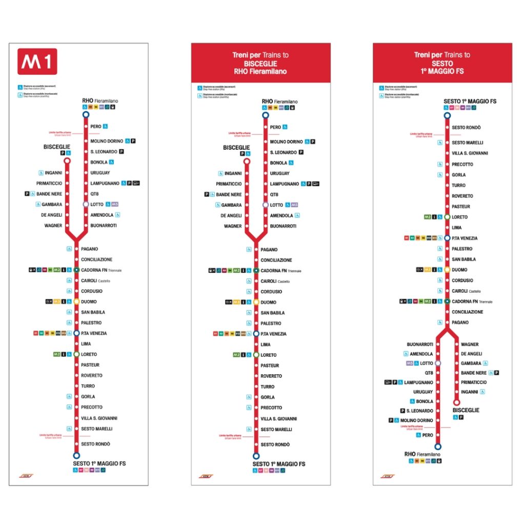
The increase in stations and lines, along with the adaptation to new services, led ATM to undertake a comprehensive process of refreshing its signage and wayfinding, which began nearly 20 years ago. Inarea developed a set of guidelines, a manual, to ensure a consistent and uniform distribution of signs throughout the space, optimizing the flow within the different stations.
Inarea also redesigned the system of pictograms and more technical signage related to regulations and standards, as well as the updated map of the transit routes following the launch of the new M4 line.