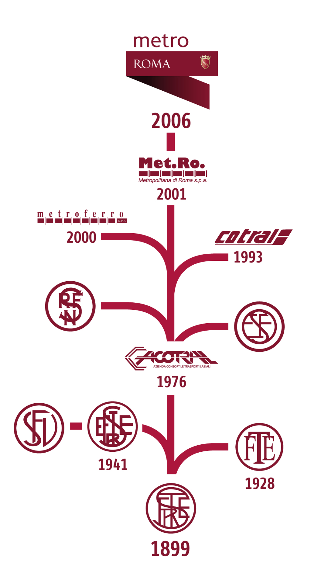
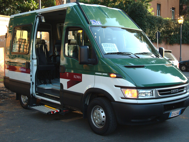
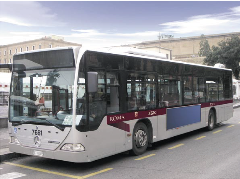
Atac has always been a familiar name for the citizens of Rome: a symbol of everyday urban life and the complex vitality of the Capital. Founded in 1909 as a public transport company, Atac has gone through many transformations, becoming in 2010 the Mobility Agency with a more strategic role in planning, managing, and overseeing Rome’s mobility system. From the historic center to the outskirts, Atac’s network covers an area of 1,300 km² with a fleet of over 2,300 vehicles – including buses, trams, trolleybuses, electric vehicles, and metro trains; more than 8,200 stops across bus, trolleybus, tram, and metro lines; 495 terminuses, 267 surface routes, and 3 metro lines.
From the local public transport network to ticketing management, from providing information to citizens to integrating public and private services, Atac has become a multi-profile organization. The rebranding process began in 2004 as part of the broader “ROMA” project, while the company’s 100th anniversary was an opportunity to celebrate its long history and relaunch its identity as the single point of reference for mobility and, even more, as a shared asset of the city.
Brand Strategy. A new urban narrative
The rebranding project for Atac was born from an in-depth analysis of the metropolitan context and its services, interpreted as tools for building relationships between the company and citizens. The strategy aimed to overcome the fragmentation of past touchpoints, creating a unified and recognizable language. Within this framework, Atac aligns with the masterbrand of Roma Capitale, contributing to the vision of a city with a single, strong, and shared identity. The Atac brand narrative is built on a systemic approach, capable of bringing together the many expressions of mobility into a single, coherent story. The brand thus becomes a “vehicle” of trust and a sense of belonging, both inside and outside the company.
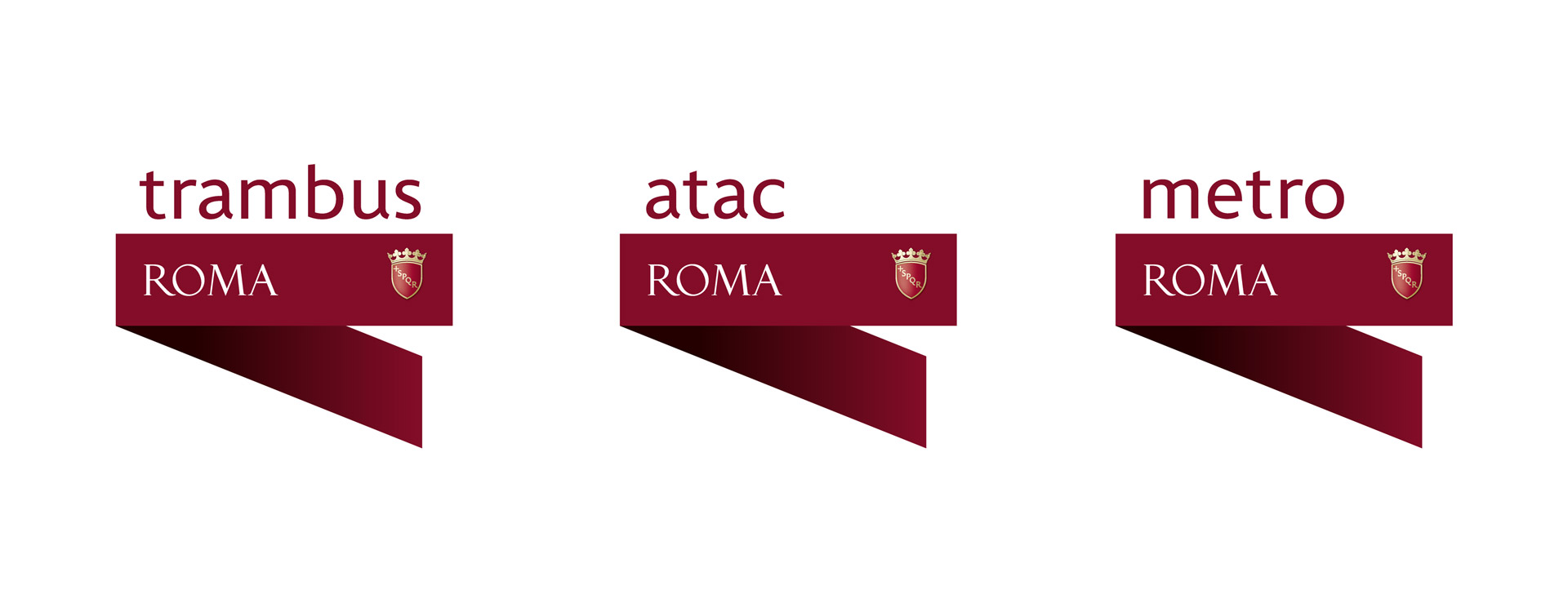
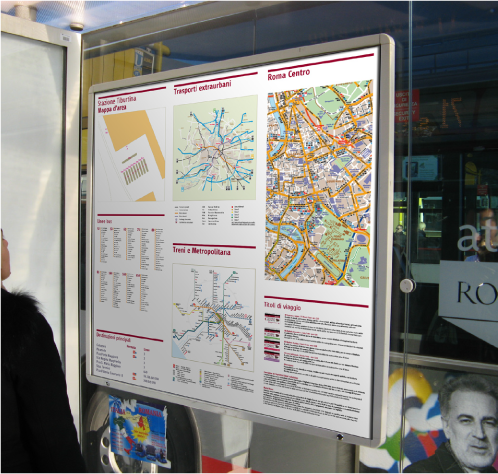
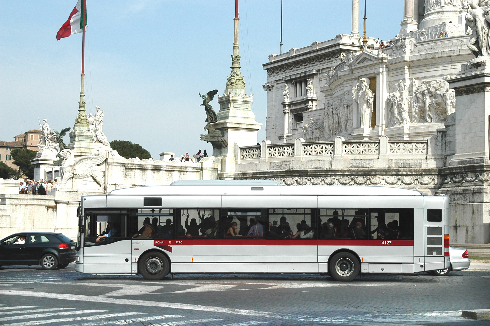
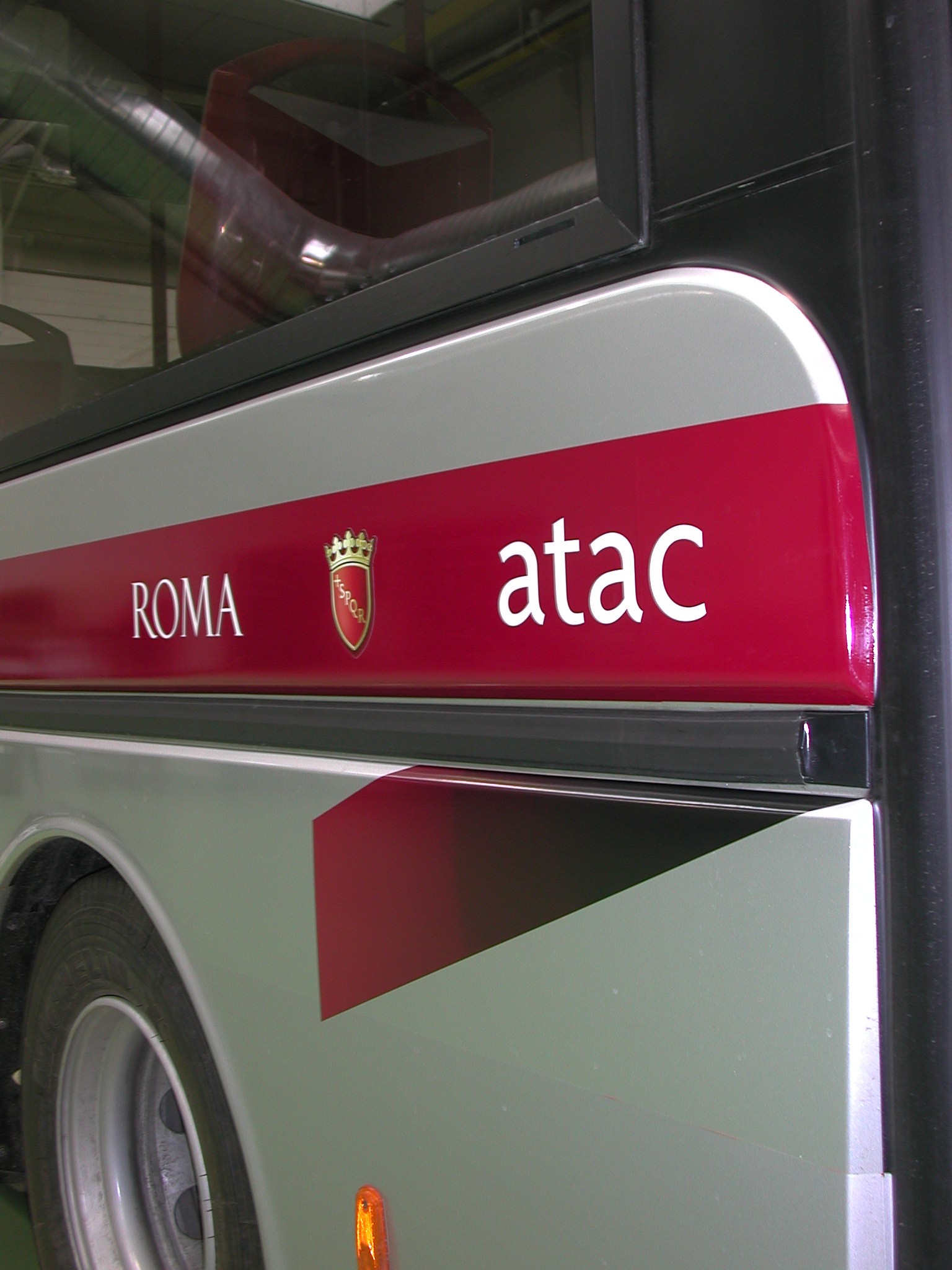
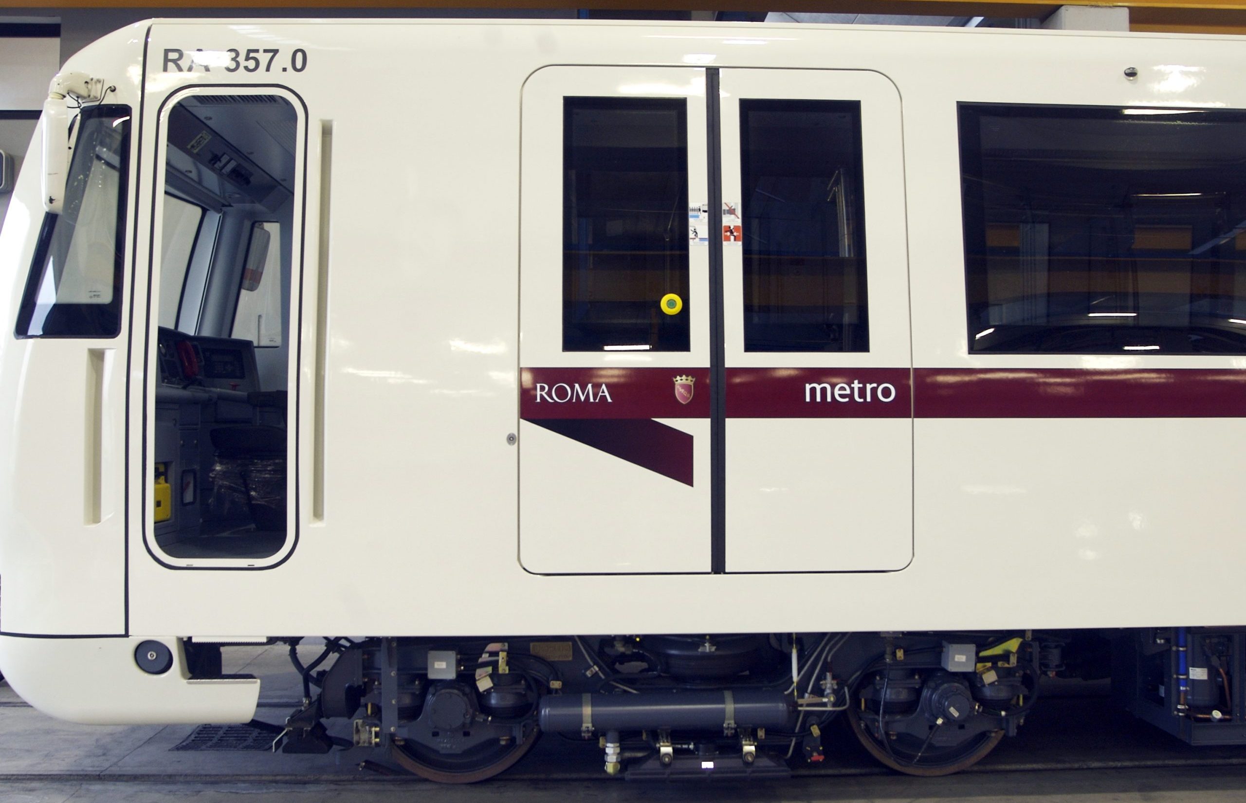
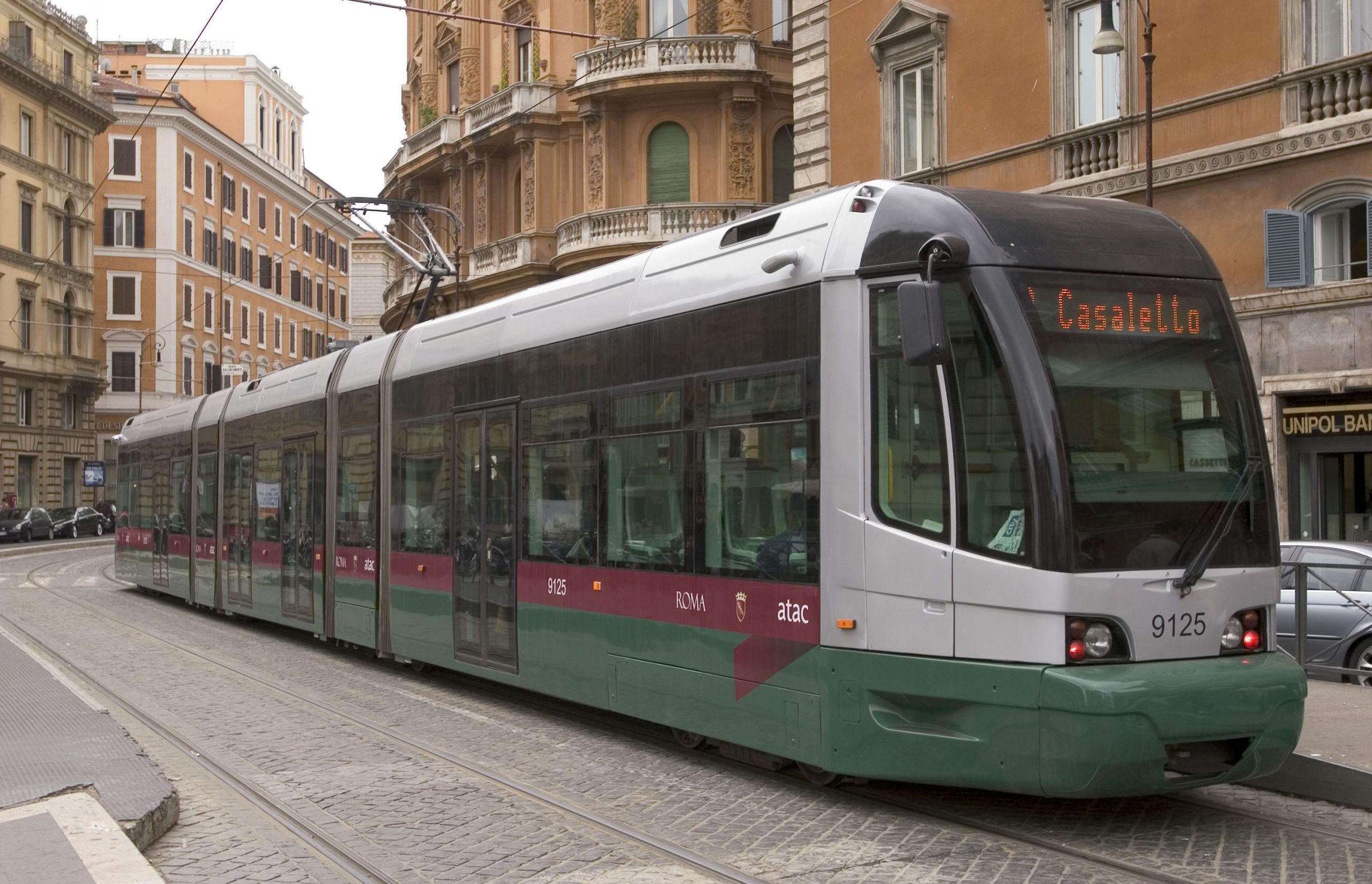
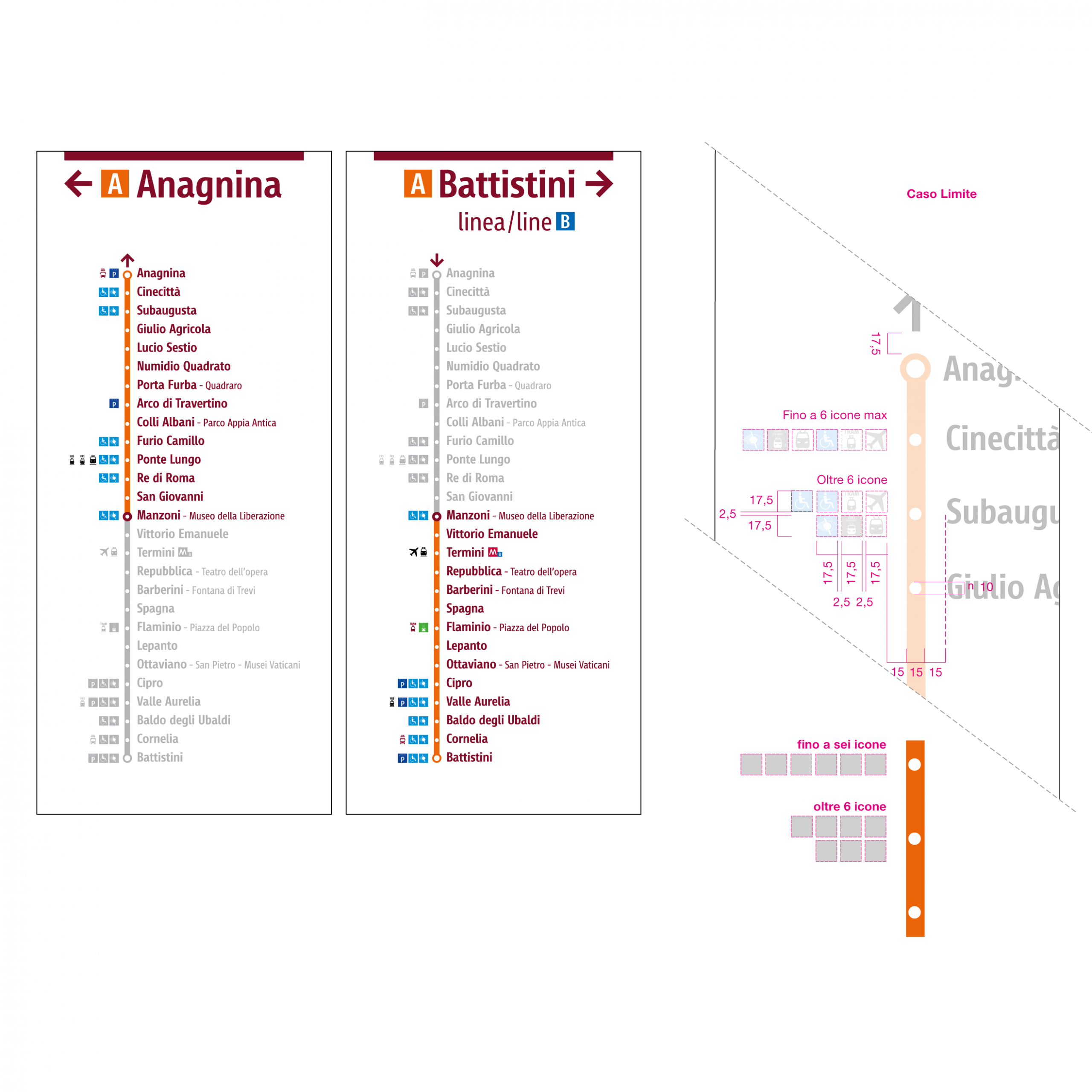
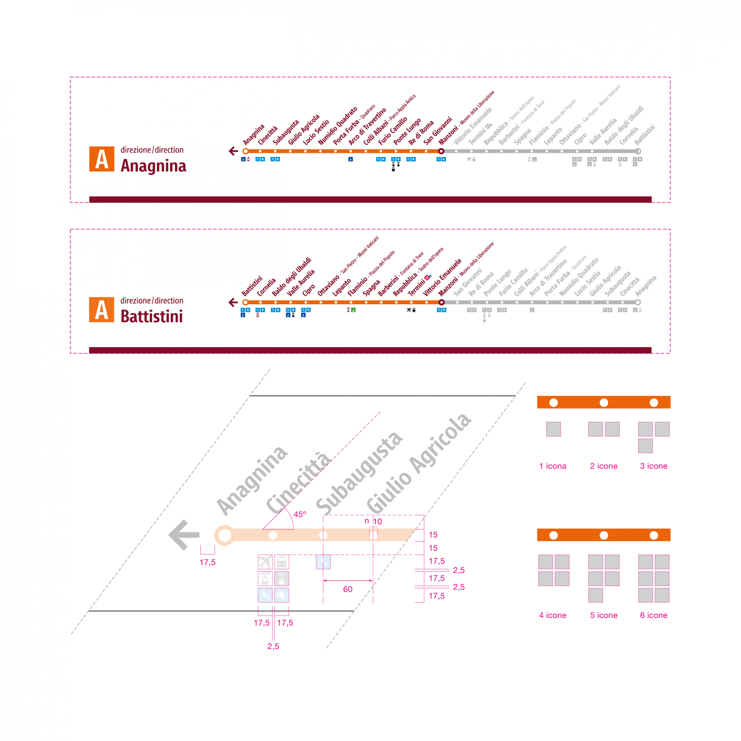
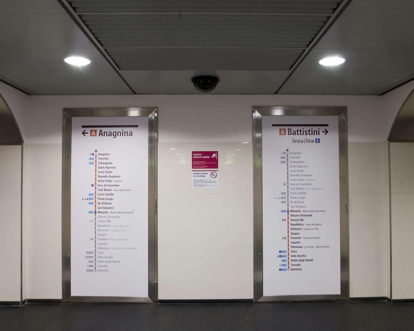
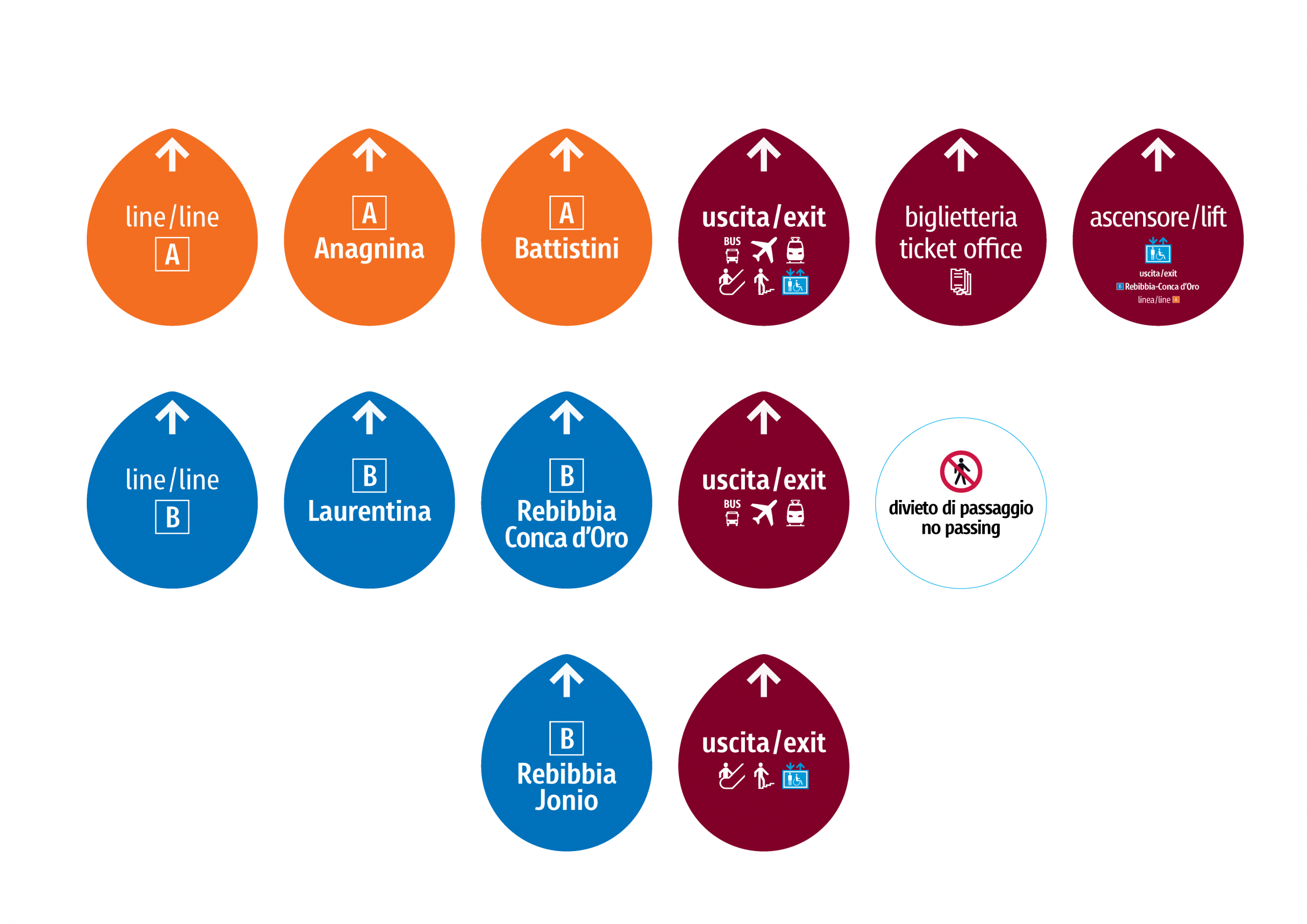
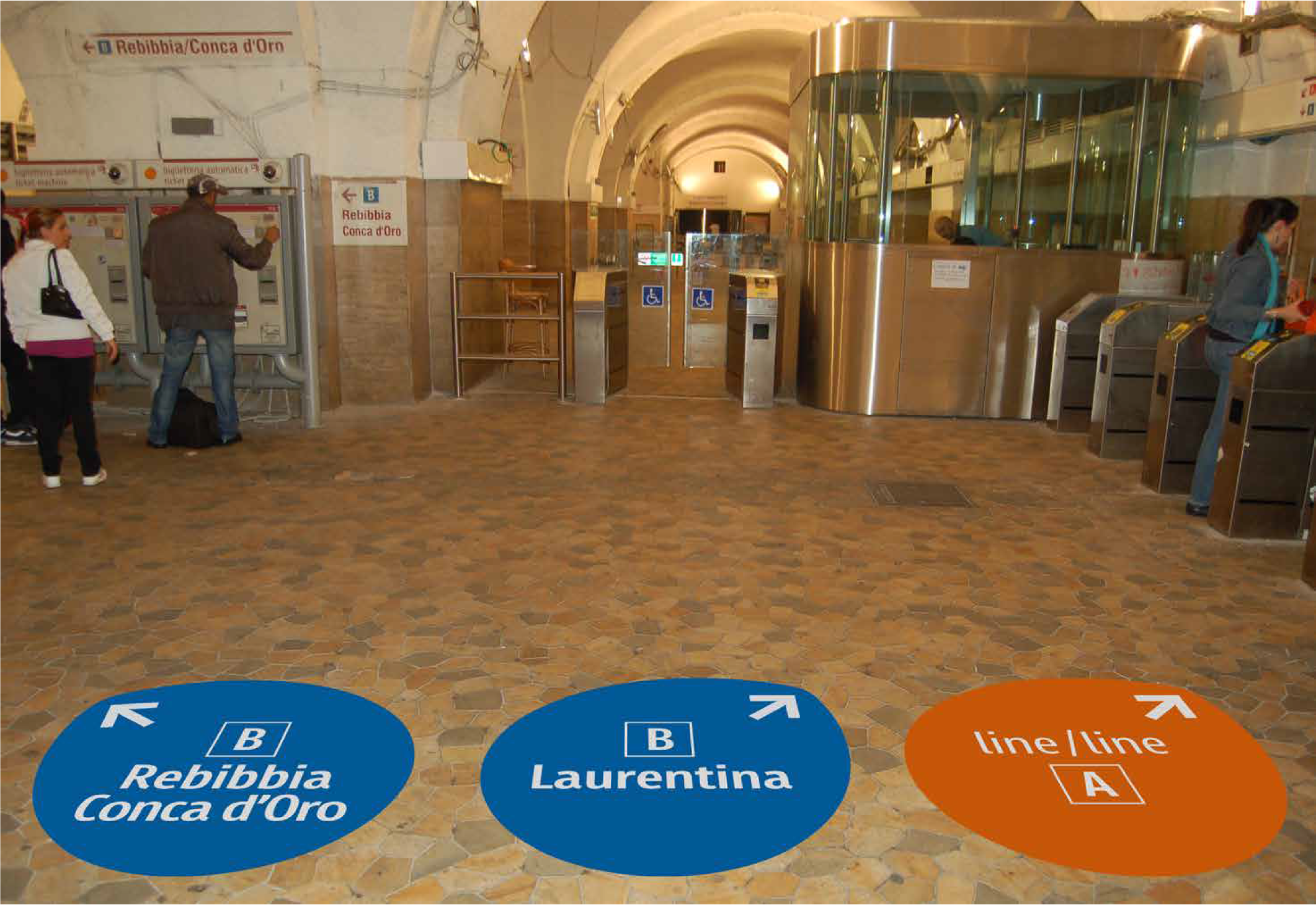
The brand architecture was initially structured around Atac, Metro, and Trambus, along with the city’s symbol: the “Roma” logo with the “SPQR” shield, placed within the institutional purple band. Following the corporate restructuring, the name Atac became the sole element of identity for all provided services. As part of the urban mobility rebranding project, Manzoni station on Metro Line A served as the pilot case for the revamp of an existing facility, redesigned architecturally according to the same organizational and linguistic principles of the brand identity.
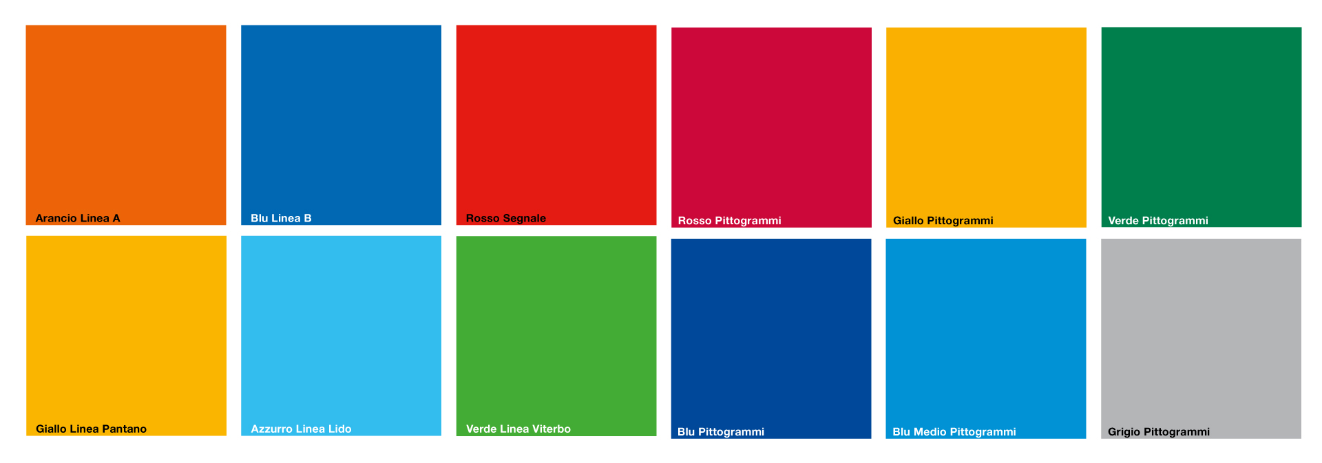
Brand Design. Signs and colors in harmony
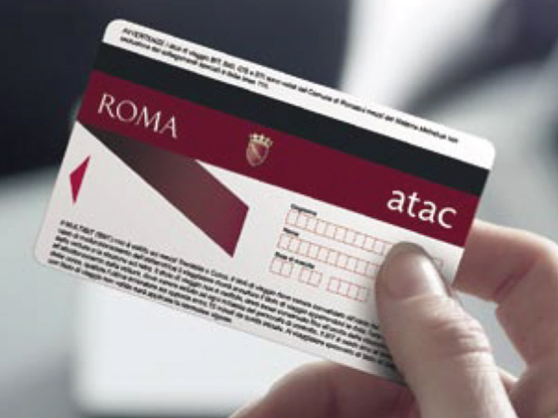
The Atac logo is a direct extension of the brand identity created for the City. It consists of a combination of elements: the ROMA logo, the shield with the famous acronym “SPQR,” and the name Atac, written in lowercase letters. All of this is contained within a purple band featuring a slanted end element that recalls the shape of an arrow. There is also a simplified version of the logo, consisting of an arrow topped by the name Atac. To bring consistency across the wide range of touchpoints, the design extended to vehicle liveries (buses, trolleybuses, trams, and metro trains), signage, stops, ticket offices, and even travel tickets, as well as staff uniforms. Thanks to its widespread presence across the metropolitan area, the Atac logo has quickly become both a directional and symbolic reference point — not only for local citizens but also for the large number of visitors (especially tourists) who stay temporarily in the Capital.
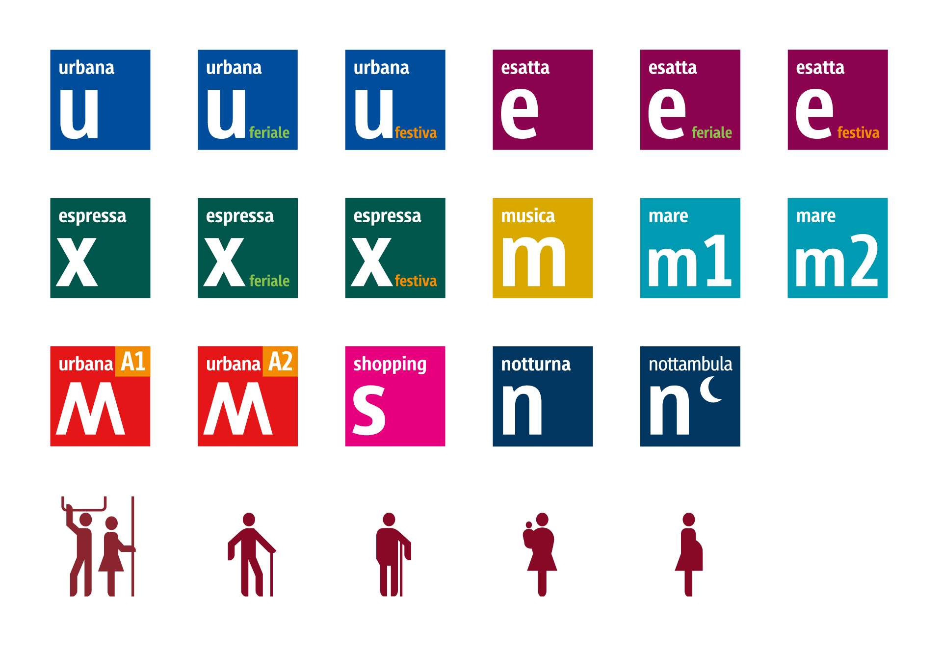
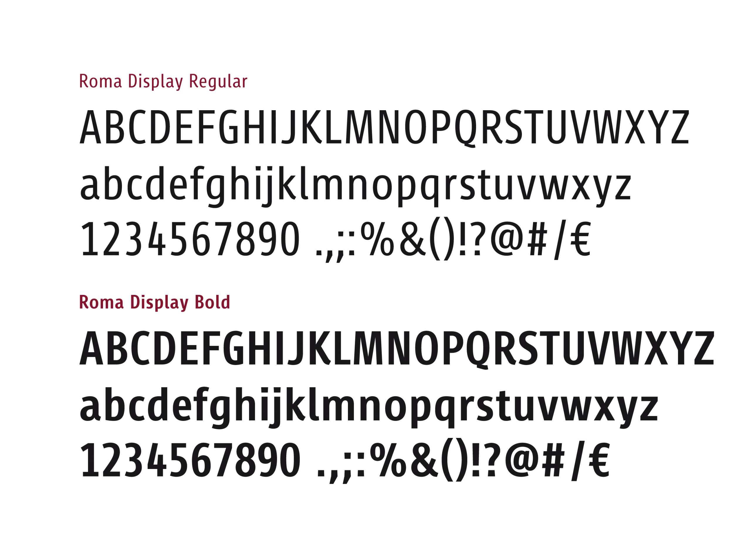
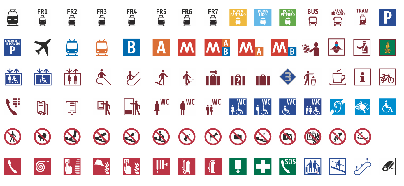
Type and Wayfinding Design: typefaces and pictograms for orientation
The brand identity project for Atac was naturally completed with the development of a proprietary family of display typefaces called “Urbs.” This type design was created specifically for signage applications (whereas conventional typography is typically aimed at editorial use). As part of the project, all pictograms were redesigned to help users find their way — including those who may not read the local alphabet or understand the language.