Mario Suglia, General Manager. Why companies need kind leaders

Why Companies Need Kind Leaders Mario Suglia, general manager “Gentle leadership in companies evolves into collaborative leadership. We discovered the importance of relationships, precisely when physical presence and proximity were taken away from us.” We could say it all started with an elephant. Probably an elephant mother. And with her “gentle” push to the little one – who, to be fair, weighs a ton as soon as he’s born – perhaps using her trunk, guiding him on the right path, teaching him social habits, and encouraging him to make decisions, without wasting time. Above all, to prevent the little elephant, if he were ever aware of it, from asking: why are you treating me badly? The question is the one posed by Guido Stratta, Human Resources Director at Enel, when discussing his book “Ri-evoluzione. The Power of Gentle Leadership,” co-written with psychotherapist Bianca Straniero Sergio (Franco Angeli Publisher). It’s a question he often asked himself at the beginning of his career and one that he has frequently heard from some of his younger colleagues when dealing with their “superior.” Corporate machismo should be put aside, especially when we draw inspiration from pachyderms. The image of the elephant mother and her calf is the one that stays with us on the cover of “Nudge” (the gentle push, indeed), published in 2008 by Richard Thaler and Cass R. Sunstein. Behavioral economics has broken through the barrier of hierarchical and assertive habits that for a long time seemed like the only way to organize and lead work. It is the awareness of fallibility – Thaler’s behavioral economics is based precisely on the “limited rationality” of the decision-maker – that should make us kinder. Stratta is keen to emphasize – in his book and in the conferences, almost always webinars, over the past year and a half, of course – that the kindness he talks about and wants to attribute to the new leadership has nothing to do with etiquette, nor with biology (in the sense of an individual’s more or less natural propensity for cordiality and courtesy). Gentle leadership is a choice. An intelligent choice, meaning a beneficial one. It may seem like a discovery of the post-pandemic era, when we had to adapt to distanced relationships, somehow more diffused, where the outburst of anger – the slammed door or the voice rising by two octaves – is less feasible and even less effective. In “distant” relationships, there is an apparent slowness that rewards kindness; the choice to avoid exacerbating situations, rather, to foster understanding already weakened by communication that had to do without much non-verbal communication. Less instinct and more thought. It takes a bit more time to listen, and time imposes softer choices, ones filled with “positive energy,” as the authors say.In the era of rediscovered sustainability – environmental, social, and organizational – relationships between people who work together are once again central, especially if they are sustainable. Even psychologically. Relationships make and will continue to make all the difference. Without going to the extremes of Johan Huizinga – the great medieval historian argued that friendship was the key difference in relationships between rulers and the ruled – it can be said that in the post-Covid era, relationships are fundamental in the connections between collaborators. One must fiercely compete with oneself, but always collaborate with everyone else. Gentle leadership in companies becomes collaborative leadership. We have discovered the importance of relationships, precisely when physical presence and proximity were taken away from us. We discovered connection when we had to reinvent it beyond the screen of a computer. Kindness is the trait of the relationship rediscovered in its essence. The relationship – between people, between brands and consumers, between brands and stakeholders, between companies and local communities – is growing stronger. Therefore, it requires care, attention, kindness, and, of course, beauty.It is the fate of design. Design is the representation of essence, of the soul once of the object and now of the relationship. It is the representation in a process dimension, and thus in a continuous state of becoming. In this context, brought about by the digital age, brand design combines both material and immaterial dimensions, redefining the sense of community in a contemporary way. It is a much more complex process, impacting everything, and recovering the value-based meaning as the point of connection between those who propose and those who choose, according to principles focused on dialogue. This is why, today, the brand plays a very important role. In a time of crisis, many companies are looking to the future with the desire to reinvent themselves. They are redesigning themselves, placing more and more importance on their values, and rediscovering their identity. And this is precisely where the brand comes in: to represent the idea of the future, values, and aspirations. The brand shapes the relationships between the company and its stakeholders, and among all internal collaborators, and like the elephant mother, provides the gentle push to make the company a… kind leader.

Enrico Giaretta. What is Sound Design?

“In a world saturated with images, sound is one of the most powerful attention triggers—even with eyes closed,” begins Enrico Giaretta, musician, composer (or rather, “cantaviatore”) and Sonic Brand Director at Inarea. After various experiences with overseas agencies, Giaretta brings to Inarea a unique approach to sound design, centered around a core concept: a ‘pure sound source’ as the foundation for multiple outputs. The goal is to provide the brand with a communication tool that seamlessly integrates into its identity world, much like a symphony. In general, creating a sound is not complex; what is challenging is crafting one that can integrate across all levels and forms of corporate communication. It’s similar to the red used by Valentino Garavani, which, regardless of the garment it’s applied to, is always associated with the designer. How is a brand’s sonic identity built? “Once we understand the content, values, and meanings associated with a brand, as well as its existing sonic elements and characteristic phonemes,” Giaretta continues, “we then identify the physical and digital touchpoints where the brand can be perceived. For example, sounds below 80 Hz are not audible on all mobile devices, while in environments like a stadium, frequencies can drop well below 80 Hz. Next, we define the brand’s sonic DNA: that unique and recognizable source that allows the brand to be instantly associated with its sound. For example, the sound essence of Banca Ifis is characterized by a “glissando” that recalls its payoff “the value of growing together.” For Bauli, we selected the A3 note (at 440 Hz), the tuning reference for nearly all instruments, which we associated with the animation of the letter “i” at the end of the sound logo.” The sound logo is usually less than two seconds long. The shorter and more essential it is, the more effective and memorable it becomes, and consequently, the more enduring over time. Towards a Sonic Future: Inarea’s Musical Alphabet If words are increasingly intertwined with sound, and sound itself is deeply connected to perception—since the human brain reacts more quickly to auditory stimuli than any other, interpreting a sound in just 0.146 seconds—then the next step could be enabling a brand’s communication through music alone. With this goal in mind, at Inarea, we are developing the concept of a “sound alphabet,” which assigns a musical note to each letter, creating a universal language. This is a pervasive and engaging tool that, starting from a simple identifying sound cell, can transform into small melodies and even into complex brand themes. A prime example of this is Beethoven’s Symphony No. 5, which emerges from the evolution of a simple rhythmic cell composed of just four notes.

Sonic Branding: The power of sound in Brand Identity

Who hasn’t experienced hearing a melody or a sound and immediately associated it with a brand? The concept of sonic branding has its roots in radio jingles, which helped connect music with a product in the absence of visual cues. However, in 2023, there was a 24% increase in investments of sonic brand identity by both local and global companies. This is a response to the rise of audio platforms, podcasts, voice assistants, as well as streaming services and digital communication channels. Consequentially, the touchpoints between brands and customers have multiplied, making sound a key element in enhancing brand recognition and recall. According to a Spotify survey (November 2023), 49% of millennials and Gen Z report paying and retaining more attention when listening than when watching something. This finding comes as no surprise, as sound is the element of the brand experience that interacts most directly with emotions. Inarea’s approach to sound design Inarea sound design combines creativity, technology, and acoustics, supported by neuroscientific testing in collaboration with BrainSigns, by-product of the University of Sapienza in Rome. These tests scientifically demonstrate how sound can influence emotions and brand perception. Through these processes, the audio concepts behind Inarea’s sound logos and brand themes are qualified and quantified through EEG, HR, GSR sensors, and Implicit Association Tests (IRT). Sonic branding is not an accessory element; it is a strategic lever for building a memorable and engaging brand identity. In an increasingly digital landscape dominated by audio content, companies that invest in a sonic brand identity are able to stand out, strengthening the emotional connection with their customers and leaving an enduring mark over time. Case Studies Bauli The sound logo and logo animation have a harmonious interaction with the visual and sonic elements. The logo animation focuses on the dot above the ‘i’ in the logo, accompanied and amplified by the A3 note at 440 Hz, known as the ‘chorister’ note because of how it harmonizes all other sounds and instruments. This note resonates and prevails, creating a strong element of recognition. FITP The track ‘Di Campo in campo’ (‘From Court to Court’) marks the first step in the construction of a sonic identity. Presented at the Grand Opening Show of the Nitto APT Finals in Turin 2024, it is an anthem of resilience and the will to overcome- qualities and characteristic of racquet sports. The concept is inspired by Nelson Mandela’s quote: ‘I never lose. I either win or learn. FIGC From the online world to the live atmosphere of the stadiums, this ambitious endeavor seeks to capture in sound the spirit, values, and attitude of Italy’s football culture. The brand theme ‘Azzurri’ features a driving, emotional progression built around just two notes, highlighted by the use of choruses and the soprano voice, evoking the Italian opera tradition.

When the Future Honors the Past – The new Identity of Treccani

When the Future Honors the PastThe New Treccani IdentityAntonio Romano In everyday conversation, “it says so in the Treccani” means there can be no doubt about a statement because it is ‘certified’ by the most important cultural institution in the country. For us Italians, Treccani is not just the famous Encyclopedia or the Dictionary, but something much broader, familiar enough not to need further explanation. The term branded refers to anything that needs no other argument than the name (of the brand). From these simple observations, it follows that the Treccani brand is recognized, loved, respected, remembered, and therefore chosen. It is, in short, a brand. However, as we all discover over time, identity is not a static dimension; it is not something fixed once and for all. It is a process, requiring constant updating. There is a demand for contemporaneity that applies to each of us and is not only for individuals but also for organizations (which, in turn, are made up of individuals). Five years remain until Treccani’s centenary. The Istituto della Enciclopedia Italiana was founded in Rome on February 18, 1925, with the vision of its founder Giovanni Treccani and Giovanni Gentile, who was involved in the initiative. The goal of publishing the Encyclopedia and the Biographical Dictionary of Italians was to provide Italy with its own cultural identity, following the example set by other great nations. Although somewhat delayed, our nation-building found its highest expression through this project, bringing together the greatest minds of the time. The new logo in the two possible configurations. The first edition of the Encyclopedia was published in 1929, and the 35 volumes it consisted of (plus one index volume) were completed in 1937. The publication turned out to be a success, and since then, the work became an “indoor monument”: professional studies, public offices for top management, and homes of the middle class displayed the volumes as a true status symbol, able to communicate implicitly and immediately the cultural and social prestige of those who owned them. Over time, other works were added to the Encyclopedia, always produced thanks to the efforts of the best scholars in their respective fields. An extraordinary quantity and quality of content were effectively disseminated on the pages of these prestigious volumes, all signed by Treccani. Since 2009, much of that content has explored an alternative channel, the digital one: the Treccani Portal reaches 600,000 unique users per day. The guiding framework of the new Treccani design and its application methods. But the changes go beyond just this. New thematic areas are being explored to engage audiences that would otherwise be distant from the traditionally understood world of Treccani. Other companies or branches are being acquired to enable effective development of these new activities. Treccani Reti, Treccani Scuola, Treccani Arte, Treccani Libri, Bottega Treccani… these are all initiatives that align with the development plans put in place to secure a future for this prestigious history. In these almost hundred years, Treccani has changed, is changing, and will continue to change, all while remaining true to the spirit with which it was founded. Therefore, thinking about a renewed identity representation has meant revisiting this history and aligning it with the vision of the future that is intended to be established. To achieve this, a process was started involving a steering committee with resources from the various companies and areas of activity. This approach allowed the needs of each unit to be evaluated, while also finding pathways for a shared convergence. Treccani is now a unified brand, capable of representing even very different areas. In terms of design, it directly derives from the previous one created by us in 2005, ensuring continuity in its identity. The ‘tree’ or ‘source’ T (as it is called) has been modified to improve readability, even at very small sizes. Similarly, the Treccani name has been restructured, shifting from the classic Bodoni font to a more modern, yet very simple, typeface: Avenir. Avenir is a Sans Serif font, meaning it lacks serifs, making it easy to read even when displayed in very small text sizes. The reason for these design choices comes from the fact that we are increasingly reading on ‘glass’ and less on paper, and while smartphone screens are bright and have stunning definitions, they are still small in size. Unlike the previous one, the new brand will be presented as a single signature for the entire system: it will not be used in association with the names of the various companies or areas of activity. These, in fact, serve an organizational function, which is not of interest to the public, whose priority is instead being part of the Treccani world, regardless of the choice of a particular product or service. The brand plays its signaling and symbolic role all the more effectively when it is part of a homogeneous and coherent ecosystem, and in this sense, the project has drawn heavily from the history of the Institute. All the volumes of the great works have in common the presence of frames on the cover and spine, almost always embossed and in gold: this almost constant feature sparked an association of ideas, summarized in the concept ‘Treccani, the frame that encloses Italian culture.’ A compositional scheme (a format, as it is called) was therefore developed to host any message. Since it is no longer just the book that conveys content, the concept of the frame has also been extended to that of a ‘window onto contemporaneity and the future’: a portrait closely aligned with the new Treccani, called to face the complexity of this era. To ensure variety in the compositional scheme, a detailed palette was selected, composed of sixteen colors plus black (the typographic color par excellence), allowing for an extraordinary number of combinations, both of different colors and of colors and images (photographs and illustrations). One last defining linguistic element is the use of letters from the alphabet, composed in a pattern: a tribute to typography as … Read more

A 100-year-old encyclopedia in the digital age.

“A century ago,” begins Antonio Romano, “Giovanni Treccani and Giovanni Gentile brought together the brightest minds of the time to create a ‘national’ identity, expressed through the unity of Italian cultural heritage.” The first edition of the Treccani Encyclopedia was published in 1929 and completed in 1937: 35 volumes, plus one of indexes, which have served as a backdrop to many portraits of important figures. It became an ‘interior monument’ that has grown over time and enriched the knowledge of many. Then, with the advent of digital technology, this heritage became dematerialized but did not lose its authority. The entries in Treccani represent the most credible and accurate source, even in Google searches: a certification that provides certainty in contrast to the randomness of Wikipedia or the approximation of social media, or, more generally, the internet. What is the significance of an online encyclopedia in the digital age? “Although the vision of encyclopedic, unified knowledge may seem rather outdated in the age of Google, the true contemporary significance and value of the Treccani Encyclopedia lies in being a universally recognized reference. This is a crucial merit in an era of fake news, where we are no longer able to interpret phenomena through cause-and-effect relationships. The digitization process of Treccani was initiated in 1993 by Rita Levi Montalcini, then president of the Institute of the Treccani Encyclopedia, with the goal of making it a reference point for new generations. What was then unforeseeable, and what makes its online accessibility even more relevant today, is that with digital technology and social media, we have transitioned from a visual culture, typical of the last century, to one centered on written words. Everything is consumed through Google search strings, which, to quote Alessandro Baricco, has changed our posture towards life.” “How can the heritage of an encyclopedia be translated into a multimedia format?” “At the core of the rebranding developed in 2020 was the desire to establish a connection with an intangible identity that carries authority. We had to realign the brand architecture, which had been structured around a system of editorial products (and more), making it unified and adaptable to the multimedia nature of the digital world. We modified the ‘tree’ T and replaced the previous font with a Sans Serif (bastoni, without serifs) to ensure better readability, even at smaller sizes. Finally, we translated the theme of the frame, which defines the structured composition of Treccani publishing and draws from both rationalist culture and the tradition of bookbinding, into recurring frame motifs across all new editorial formats, from digital to print.” “Read Antonio Romano’s description of the visual identity for Treccani.”

40 Years of metaphorical images

The defining characteristics of our Calendar can already be traced back to our early works in the 1980s: still-life photography, sculptural mock-ups made from everyday objects, a white background, and an effective, two-way relationship with words. Then as now, the project’s logic is based on subtraction, reducing elements to their purest form. Initially, many creative choices were driven by technical and economic constraints: the images were designed for billboard posters, solid backgrounds required an accuracy that printing houses of the time couldn’t guarantee, and the edges of figures had to remain within the margins to avoid trimming. Since 1991, when the first edition was released, we have established a recognizable language, always true to a principle of quality. The charm of our calendars still lies in the craftsmanship with which they are created and in their compositional structure—the mock-up, which reproduces something tangible rather than a mere combination of pre-existing, digitally reworked images. It is not just the impact of the forms that matters, but also the photogenic quality of the composition and its three-dimensionality—the magic of an image so striking that it tempts you to reach out and touch the page. The Calendar is a metaphor, or rather, a collection of metaphors. The first is conveyed through the images themselves; the second, more subtle, refers to the dedicated people who, with passion and patience, take on this challenge every year; the third represents the vision and mission that underlie our work. Our goal is to bring to life the idea of the future that a business, organization, institution, product, or service seeks to establish. Calendarea 2025. A Dive into Thought Aquarium is the theme of the 2025 Calendar: a deep dive into thought and exploration, searching for what best embodies a good omen for the future. A fantastical and visionary aquarium, where one can feel as comfortable as a fish in water—all year long! It is a visual journey through joyful, vibrant, and ironic icons, infused with life and serenity, just like the wonders found in seas, rivers, and lakes. Yet, beneath its surface, Aquarium holds a subtle metaphor in its name: in a world that constantly observes us, what if we were the fish in the aquarium? As with every edition, the distinctive language of the Calendar reveals Inarea’s guiding principle: the ability to see what already exists through plural design, to start from reality and recombine elements, generating unexpected associations that inspire new perceptions. DISCOVER OUR INAREA CALENDAR

Monica Solimeno. Reflections and behind the scenes of the Inarea Calendar

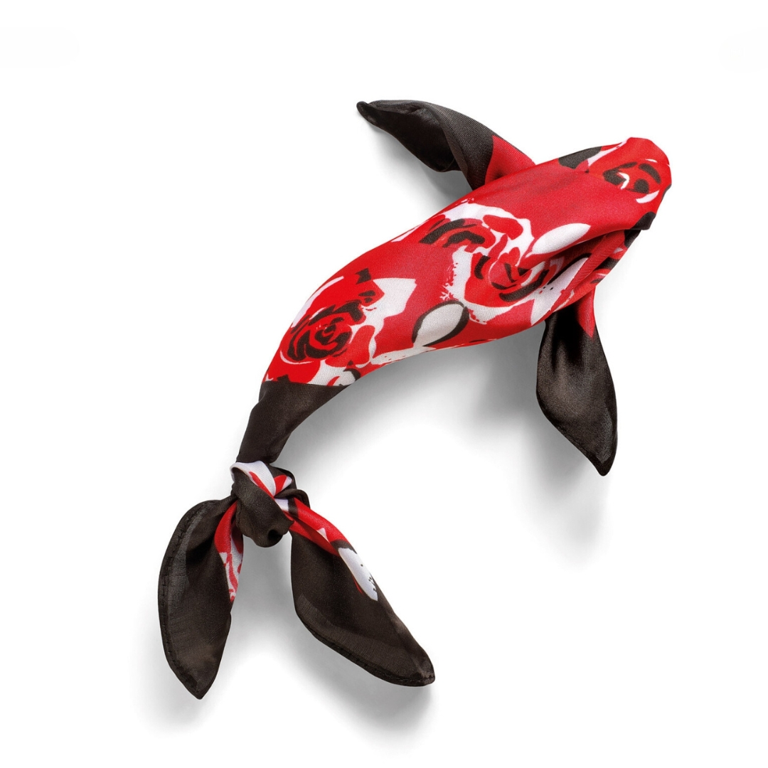
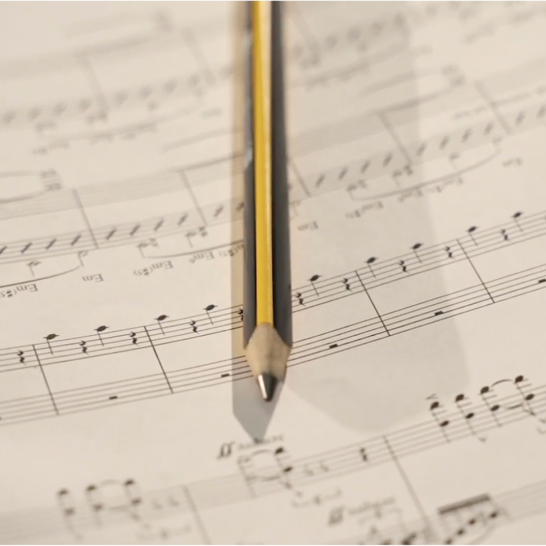
With a poetic and ironic language, the Inarea Calendar has been capturing contemporary themes for over thirty years, addressing topics such as sustainability and interpreting aspects of everyday life, from our relationship with pets to the tools of various trades—contrasting with the unstoppable digital dematerialization.

Yet, despite its ability to be a synthesis of thought and lightness in expression, the Calendar’s production process is anything but simple: each edition involves approximately seventy preparatory sketches, thirty semi-final drawings with material indications, over twenty mock-ups to be photographed, numerous photo shoots with post-production (cut-outs, retouching, two or three layout proposals, and print tests), as well as packaging and shipping.

The theme is conceived at the beginning of the year to be released at the end of the same year. A dedicated team of around ten designers, the same ones year after year, ensures continuity and depth of understanding in this complex project. If in 1991, the first Calendar was sent to approximately 1,500 people, by its twenty-fifth edition in 2016, it had reached 16,000 recipients worldwide.

Irony and Surprise: The Secret Ingredients of the Calendar

The Inarea Calendar pursues an uncompromising standard of quality, reflected in its format (48.5×34 cm), white background, and high-end typographic printing.

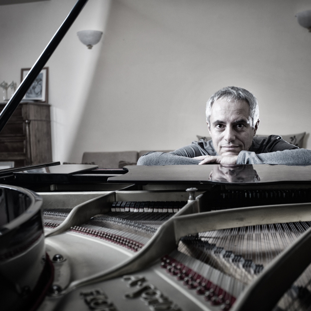
“Surprise is its key element,” says Monica Solimeno, Project Director at Inarea, who has been overseeing the project for over fifteen years.

“The unexpected effect comes from semiotic play and the decontextualization of everyday materials in the creation of each subject. The figures emerge from the formal correspondence with these materials or from the composition of multiple elements. The more essential the shape, the more effective the result.

This visual language is rooted in a systematic communication method, first developed in the 1980s, which organizes images through ready-made abstraction.

The Calendar embodies synthesis, essentiality, and meticulous attention to detail—qualities that form the very DNA of Inarea and its interdisciplinary approach (known as plural design). For example, despite the different visual outcomes, the essential shape of the tulip in the Sara Assicurazioni logo follows a similar use of metaphor and sign abstraction, surpassing the conventional language of its industry.

How Can the Calendar Evolve?

Considering that in over three decades, the Inarea Calendar has built a strong and loyal following, can this project be reinterpreted through new tools without losing its identity?

If the mock-ups are still crafted by hand, could artificial intelligence assist in this phase or facilitate the creative layout process?

“A few years ago,” Solimeno continues, “we experimented with objects like mugs and placemats featuring some of the calendar subjects. However, these designs live best on a white background, printed on high-quality paper with top-tier typography. Transferring them onto plastic supports did not yield the same result.”

The only successful adaptations outside of the Calendar itself have been notebooks and shopping bags, where the use of paper preserved the quality and visual impact.

Recently, an app was launched to showcase 34 years of work. For now, it serves as an image repository, but it has the potential to create an interactive and immersive experience for users—something that cannot be achieved on paper—thus bridging the gap with younger, digitally connected generations.

More than three decades of Calendar production have generated a vast archive of sketches, discarded subjects, work-in-progress mock-ups, and both analog and digital photographs.

A creative treasure trove that retains its ironic and playful essence, offering endless possibilities for new associations and interactions. Once again, everything is already there—just waiting to be rediscovered.

A moveable feast

Furniture, fickle, mobile and moveable are the same word in Italian (“mobile”), and in 1961, three years before  Ernest Hemingway’s book of memoirs “A Moveable Feast” was posthumously published, the first Milan Furniture Fair (Salone Internazionale del Mobile) opened. At the time nobody could have imagined what long-term effects it was going to produce. The story actually began in the immediate post-war period: the homes that were being rebuilt needed to be furnished and to this purpose a group of visionary architects (who had thus far only a few contracts to their name) convinced a number of artisan cabinet-makers (these, in turn, would later go on to become industrialists) from northern Italy’s Brianza district to mass-produce furniture from their designs. The functionality that characterised those projects soon became the stylistic code of what later came to be known as “Italian design”. A formula that evidently worked and that in 1972 led to “Italy: The New Domestic Landscape”, the famous exhibition at the MoMA in New York which consecrated the international success of our way of designing home space – and not only. Everything has changed since then, but still today for Italians the profession of designer is by definition that of designing furniture… No doubt a matter of chronology or maybe just a synecdoche, a part made to represent the whole, but there it is! Design is the most “adjectivized” of nouns in English, preceded by attributive nouns such as: industrial, fashion, car, graphic, product, service, food, sound etc., with Italian design being the leader in Europe when it comes to value-added and number of jobs. An important achievement, which constitutes the backdrop for today’s opening of the 62nd Salone. The Fair takes up 210,000 square meters of the Rho Fairgrounds and, at the same time, the “Design Week” having begun yesterday, transforms all of Milan into a mega space event. This is the “Moveable Feast” of an entire country which ideally celebrates its resurgence from the meagre conditions it was in when this story began: a tale of ‘rags to riches’, culminating in nothing less than European supremacy! The times they are a-changing, as the song goes; however, as the famous Verdi aria goes,  it is no longer true that “la donna è mobile” (of course, the librettist here meant “woman is fickle” – though we could also read it, literally, as “woman is furniture”). No, indeed: Furniture is Woman! As from 2020, the President of the Furniture Fairis  Maria Porro who has breathed in wood since birth, her family business being almost 100 years old; in addition, she has also been a set designer for the theatre and for grand events.  Today, after the long period of the pandemic, this is Maria Porro’s  real first “Festa Mobile”…. Moveable Feast. Congratulations and break a leg!

Spring cleaning

At times, all we need to do is dust off the meaning of words. In English, the word vacuum cleaner contains a reference to an empty space which, in a way, describes the mental state of those who are asking themselves where artificial intelligence is going to lead. Who knows if we’ll manage to turn this soufflé into something edible or if it’s going to collapse inside the oven…  An Italian don, Luciano Floridi, Professor of Philosophy and Ethics of Information at Oxford University, has provided a rudder to steer us. In short, Floridi makes a distinction between syntax and semantics, which as we know deal with meaning, suggesting that every new idea is a fruit salad made up of the right ingredients (some of which tossed in by pure chance), plus a dash of coincidence: a process that links Newton’s apple to panettone, and will probably remain an all-human domain for a long time to come. AI comes across as more reassuring if we think of it as a data vacuum cleaner, sucking up valuable time as required. With spring well underway and Easter over, how far have you got with your cleaning? Raise your hand if you’re not already asking a robot.

Easter tales, Bunny tails

Beliefs and cupboards: it’s the same word in Italian and, coincidentally, both have a relevance to Easter. The latter, because at this time of the year a cupboard often contains a stash of chocolate; the former, because it comprises symbols and legends such as the one surrounding the rabbit. Our furry, long-eared friend has multiple identities depending on the context: from fearful, quivering leporid, to the most shamelessly prolific of animals. This week, however, the rabbit’s persona is quite simply that of the Easter Bunny. Originally, the role used to be the prerogative of its cousin the hare, an animal that was sacred to the Germanic goddess Eostre… a name from which that of “Easter” is but a hop, skip, and jump away to the members of the Leporidae family. In other words, the last hundred years of Easter marketing stand rather shakily on an erroneous belief, a bit like a wobbly cupboard on unstable legs. But little does it matter if we’re talking here about rickety kitchen furniture or a spurious tail – correction, ahem, tale. What counts is that the spring festivity celebrates rebirth and that eggs are symbols of new life. Courage is not a requisite if it’s a prolific season that we’re hoping for this spring: indeed, what animal could be more propitious than a springing, bouncy, bunny rabbit? With our best wishes for a happy Easter!