Furnirussi Farm is a multifunctional enterprise rooted in the heart of Salento, specializing in fig cultivation and certified organic production. In addition to promoting local agricultural excellence, Furnirussi integrates hospitality, experiential tourism, and environmental respect, fostering a model of sustainable development deeply connected to rural traditions. Its mission is to combine quality, innovation, and the preservation of the land.
Brand Identity: a graphic symbol as the language of the land
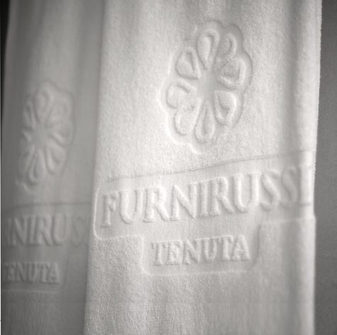
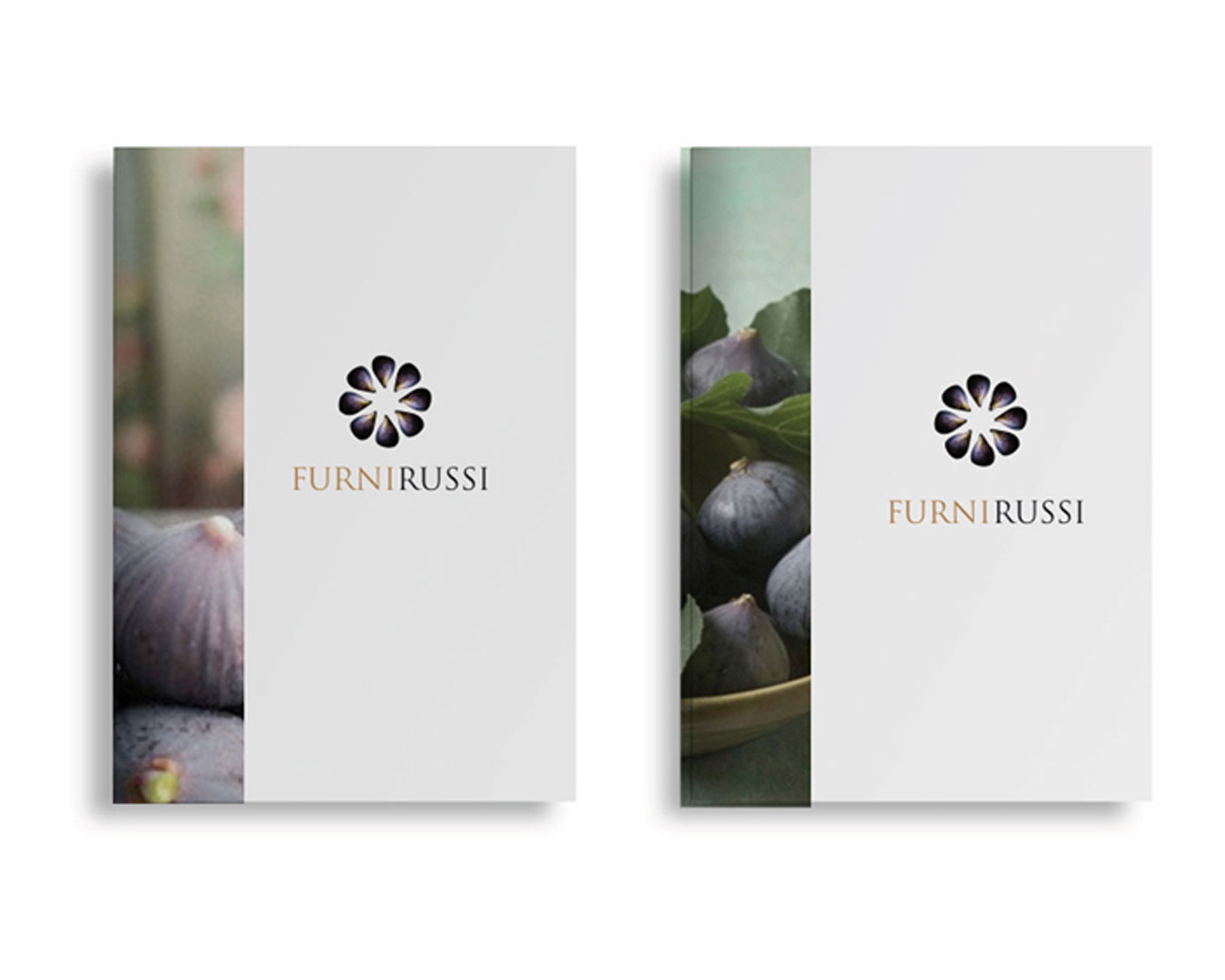
The Furnirussi logo is a sunburst of figs, designed with a treatment that recalls the company’s signature product and serves as a visual element to express the various facets of the brand. The sunburst also evokes the symbol of the sun, representing prosperity and growth. Its circular composition alludes to the traditional structure of the furnieddhi—the small stone huts from which both the place name and the brand name derive—once used for drying figs. The furni also symbolize an integrated, sustainable, and traditional model of rural production. The logo’s regular, interlocking structure echoes the construction technique of the furni, forming a metaphorical composition where figs replace stones. Viewed more abstractly, the sign also recalls a star, symbolizing excellence, selection, and certification in both organic farming and sustainable architecture. The orderly arrangement further suggests cultivated land—an image of a virtuous system in constant exchange with its surroundings and its audiences. A complete and concise symbol, it integrates multiple layers of meaning into a unified visual identity.