
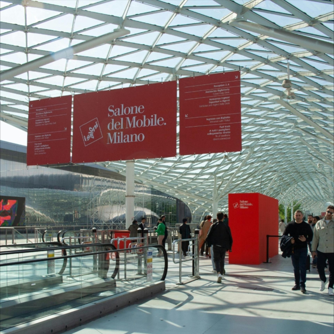
Milan Design Week is a showcase of potential and leadership recognized worldwide. It is rooted in a unique vision of design—specifically furniture design—that has developed historically within the very fabric of the city. Since 1961, this has been represented by the Salone del Mobile, the international furniture fair, and since 1990, by the FuoriSalone, a city-wide network of events initiated by Interni magazine.
“The real question today,” comments Antonio Romano, “especially in an edition where the industry must also grapple with tariffs imposed by Trump, is how to strengthen the identity of the Salone del Mobile and define the role that Design Week is meant to play. Looking ahead, we cannot limit everything to furniture design (and its closest derivatives), particularly at a time when the word design is one of the most widely used adjectives in every vocabulary… even the philosopher Luciano Floridi defines his field as conceptual design! What truly concerns me is when success turns into self-celebration. That’s why Design Week must open up to the many dimensions of the discipline, exploring their interactions and building on Milan’s long-standing ability to attract creativity.”
How Can Milan and Design Week Stay Attractive?
“We need to rethink FuoriSalone without weakening Salone del Mobile. It’s essential to promote a city-wide program of events that go beyond what happens at the fair and the furniture sector—preserving the quality of Milan’s genius loci while embracing international experiences. Milan must remain in the spotlight by enhancing its appeal across different creative and industrial fields.However, if the event becomes too focused on spectacle or turns into mere self-congratulation, its future is uncertain. The key shouldn’t be the obsession with the present moment or the relentless pursuit of the ‘new & more new’ driven by likes and instant metrics.”
What does Milan represent for Inarea?
“We opened our Milan offices in 1988: Enichem had become an important client, and we needed to ensure a near-daily presence. Shortly after, Snam and Union Carbide joined, and with the latter, we began a collaboration at a European level. Because Milan at that time was also this: a design capital where you could meet international players. Our first foreign clients were gained precisely because of our presence here.
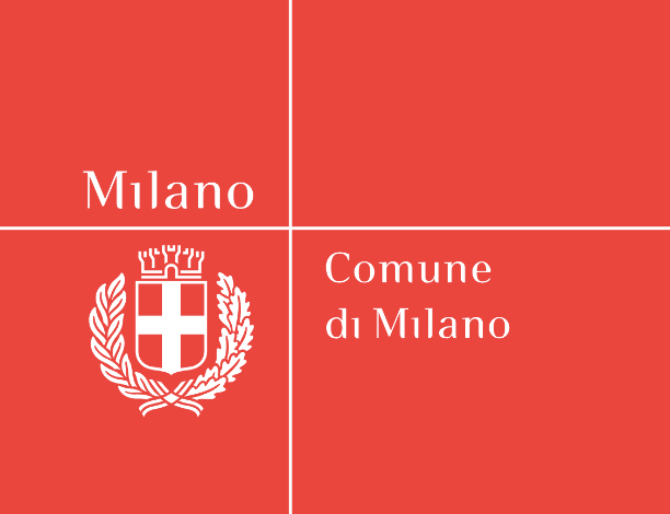
In 1999, we won the competition to redesign the city crest and reorganize the identity system for the Municipality of Milan. This project allowed us to capture the essence of the city at a critical moment in its history, highlighting the distinctive Milanese combination of a deep attachment to tradition and a passion for innovation. The new design of the crest quickly replaced all previous versions, but the core of the project was the intention to turn the word ‘Milan’ itself into a brand. After all, many businesses (starting with Prada) had already associated their brands with their Milan identity, clearly proving that the city itself was (and still is) an added value. We designed a new typeface – aptly named Milano City – and separated the word from the phrase ‘Comune di Milano.’ The project was halted when the Albertini administration ended; though it still exists, it has since been modified.
During these years of profound urban transformation, we also completed significant branding projects for real estate developments that reshaped the city’s skyline: Milano Santa Giulia, followed a few years later by Milano Porta Nuova, and later Pirelli RE (now Prelios). Staying within the realm of Milan-based institutions, it’s worth noting our rebranding work for Borsa Italiana and Edison. Additionally, in the energy sector, we also created the name and brand for the new Lombard multiutility, A2A.” Within the same broader field, though in more recent years, we’ve seen the rebranding of Snam and Italgas, and—just to name a few from memory—the brand identities of the Italian Infrastructure Fund F2i, Fondazione Cariplo, Fondazione Fiera Milano, the Milan Conservatory, Casa Milan, as well as many other projects that may have originated in Milan but were destined for broader horizons, such as the brand identity for the Venice Biennale, which certainly deserves to be remembered.
There are also long-term projects that directly impact the daily lives of Milan’s citizens—like the rationalization of ATM’s wayfinding system, which included a redesign of signage (the pictogram system) and the creation of a dedicated display typeface, Metro Type.