The ACI, Automobile Club of Italy, is the largest free association of Italian citizens, whose mission is to connect with institutions on tourism, transport, and environmental issues. Since its inception in 1905, the ACI has grown in parallel with the evolution of automotive growth in Italy from the 2,229 vehicles in circulation at the time, to tens of millions today.

Over a century of history and the will to grow not only its experience but also the range of services offered. In this spirit, the ACI launched an ambitious development scheme for a new identity suite. The starting point for Inarea in partnering the ACI on this journey was to understand the role of the association today since it is precisely its history that continues to make it a benchmark for today’s transport, not just for motorists but for the entire universe of people on the move.


For this reason, the “new” in the rebranding project is not given so much by the brand’s fundamental elements but by the latter’s ability to interpret the ACI universe of values. So we drew upon the association’s vast historical archive, which included the logo created in 1975 (becoming a signage icon for Italian and foreign motorists over the years); the gear, already present in the FIA (Fédération Internationale de l’Automobile) structure; and lastly the lozenge that forms the base of the composition and is a reference to the Club’s first brands.


In terms of form, the composition that inspires the design can be defined as contemporary heraldry, since the combination of these elements acquires significance chiefly in its historical dimension. The ACI logo, on the other hand, breaks the symmetry of the system and is connected to the gear through a slight curvature of the letter “I”.
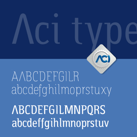
An integral part of the new identity system is the bespoke “ACI Type” font, presented in institutional blue and distinctive for its very defined elements such as the condensed line and the close proximity of the signs. The range of association activities is promoted through constant allusion to the logo as the only symbolic and organizational reference.

In conclusion, novelty lies so much in the constituent elements of the brand but in its ability to interpret the ACI universe of values, an authentic heritage from which to draw the guidelines for development.


More recently, ACI Radio was established with the aim of broadcasting institutional and promotional content produced by the ACI and group companies. The editorial approach includes service communications related to the vehicle sphere (due dates, license renewals), awareness campaigns, and promotion of products for members and non-members (insurance, car competitions). There is no shortage of news from the transport world, reports of sports competitions promoted by the ACI, sport, music, and podcasts.


The design of the new symbol starts from the ACI brand, which becomes the centre from which the radio waves propagate: it is the autograph of the station’s influence and its ability to circulate news and be close to its listeners. “Radio” becomes a simple descriptor of the activity and is rendered in the proprietary “ACI Type” typeface.
