When the Future Honors the Past
The New Treccani Identity
Antonio Romano
In everyday conversation, “it says so in the Treccani” means there can be no doubt about a statement because it is ‘certified’ by the most important cultural institution in the country. For us Italians, Treccani is not just the famous Encyclopedia or the Dictionary, but something much broader, familiar enough not to need further explanation. The term branded refers to anything that needs no other argument than the name (of the brand). From these simple observations, it follows that the Treccani brand is recognized, loved, respected, remembered, and therefore chosen. It is, in short, a brand. However, as we all discover over time, identity is not a static dimension; it is not something fixed once and for all. It is a process, requiring constant updating. There is a demand for contemporaneity that applies to each of us and is not only for individuals but also for organizations (which, in turn, are made up of individuals).
Five years remain until Treccani’s centenary. The Istituto della Enciclopedia Italiana was founded in Rome on February 18, 1925, with the vision of its founder Giovanni Treccani and Giovanni Gentile, who was involved in the initiative. The goal of publishing the Encyclopedia and the Biographical Dictionary of Italians was to provide Italy with its own cultural identity, following the example set by other great nations. Although somewhat delayed, our nation-building found its highest expression through this project, bringing together the greatest minds of the time.

The first edition of the Encyclopedia was published in 1929, and the 35 volumes it consisted of (plus one index volume) were completed in 1937. The publication turned out to be a success, and since then, the work became an “indoor monument”: professional studies, public offices for top management, and homes of the middle class displayed the volumes as a true status symbol, able to communicate implicitly and immediately the cultural and social prestige of those who owned them. Over time, other works were added to the Encyclopedia, always produced thanks to the efforts of the best scholars in their respective fields. An extraordinary quantity and quality of content were effectively disseminated on the pages of these prestigious volumes, all signed by Treccani. Since 2009, much of that content has explored an alternative channel, the digital one: the Treccani Portal reaches 600,000 unique users per day.
But the changes go beyond just this. New thematic areas are being explored to engage audiences that would otherwise be distant from the traditionally understood world of Treccani. Other companies or branches are being acquired to enable effective development of these new activities. Treccani Reti, Treccani Scuola, Treccani Arte, Treccani Libri, Bottega Treccani… these are all initiatives that align with the development plans put in place to secure a future for this prestigious history. In these almost hundred years, Treccani has changed, is changing, and will continue to change, all while remaining true to the spirit with which it was founded. Therefore, thinking about a renewed identity representation has meant revisiting this history and aligning it with the vision of the future that is intended to be established. To achieve this, a process was started involving a steering committee with resources from the various companies and areas of activity. This approach allowed the needs of each unit to be evaluated, while also finding pathways for a shared convergence.
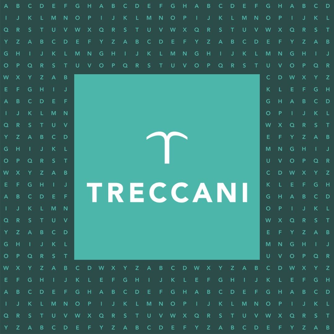
Treccani is now a unified brand, capable of representing even very different areas. In terms of design, it directly derives from the previous one created by us in 2005, ensuring continuity in its identity. The ‘tree’ or ‘source’ T (as it is called) has been modified to improve readability, even at very small sizes. Similarly, the Treccani name has been restructured, shifting from the classic Bodoni font to a more modern, yet very simple, typeface: Avenir. Avenir is a Sans Serif font, meaning it lacks serifs, making it easy to read even when displayed in very small text sizes.
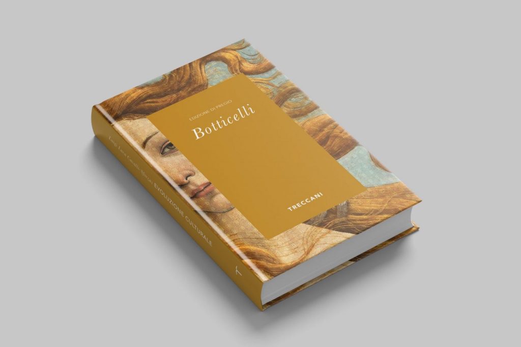
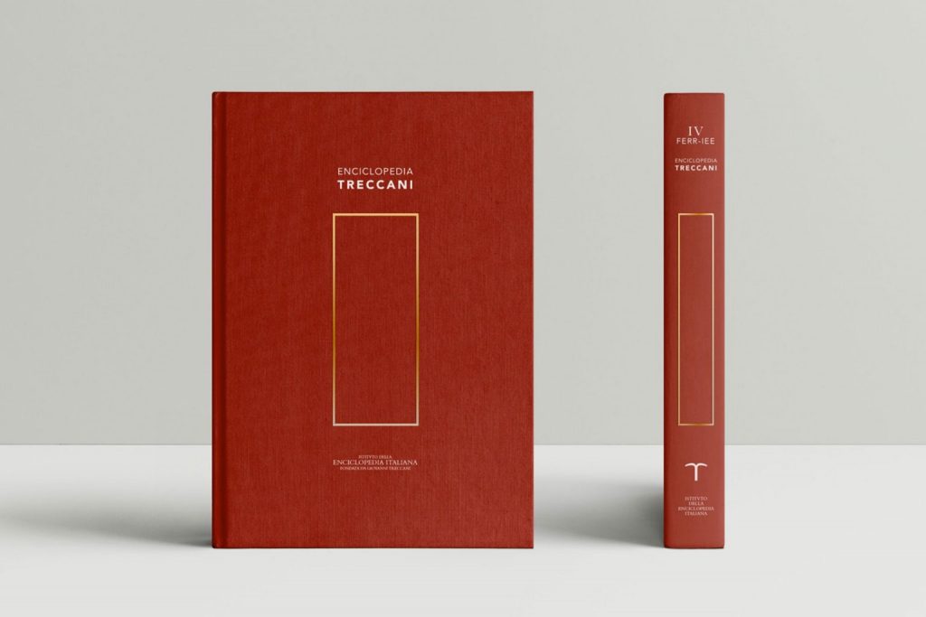
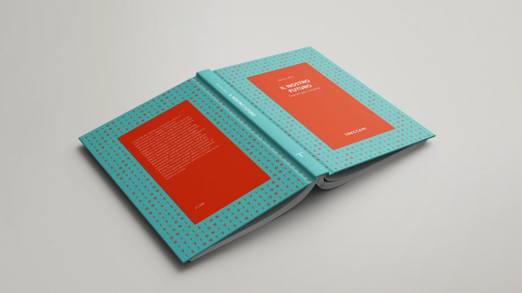
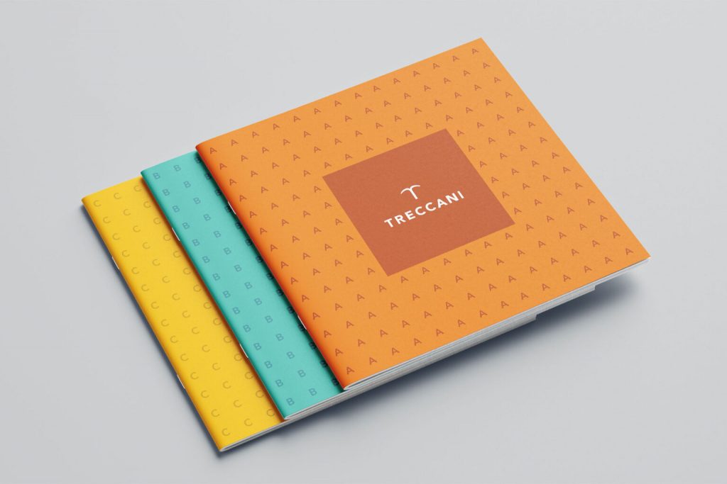
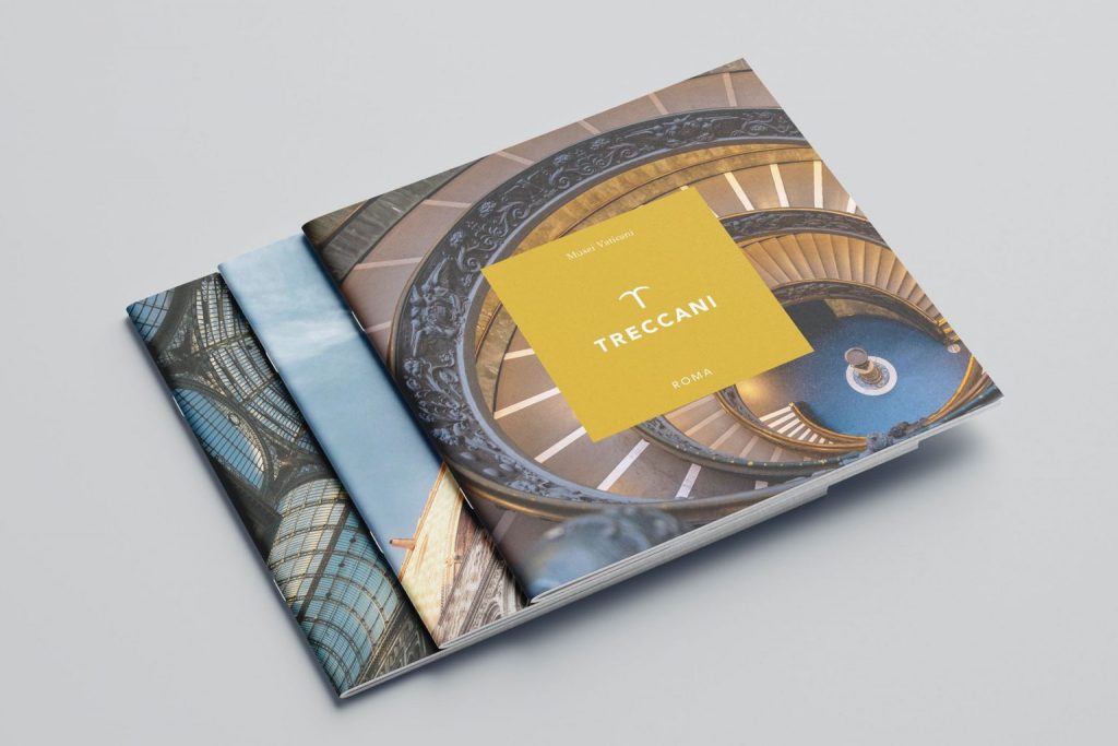
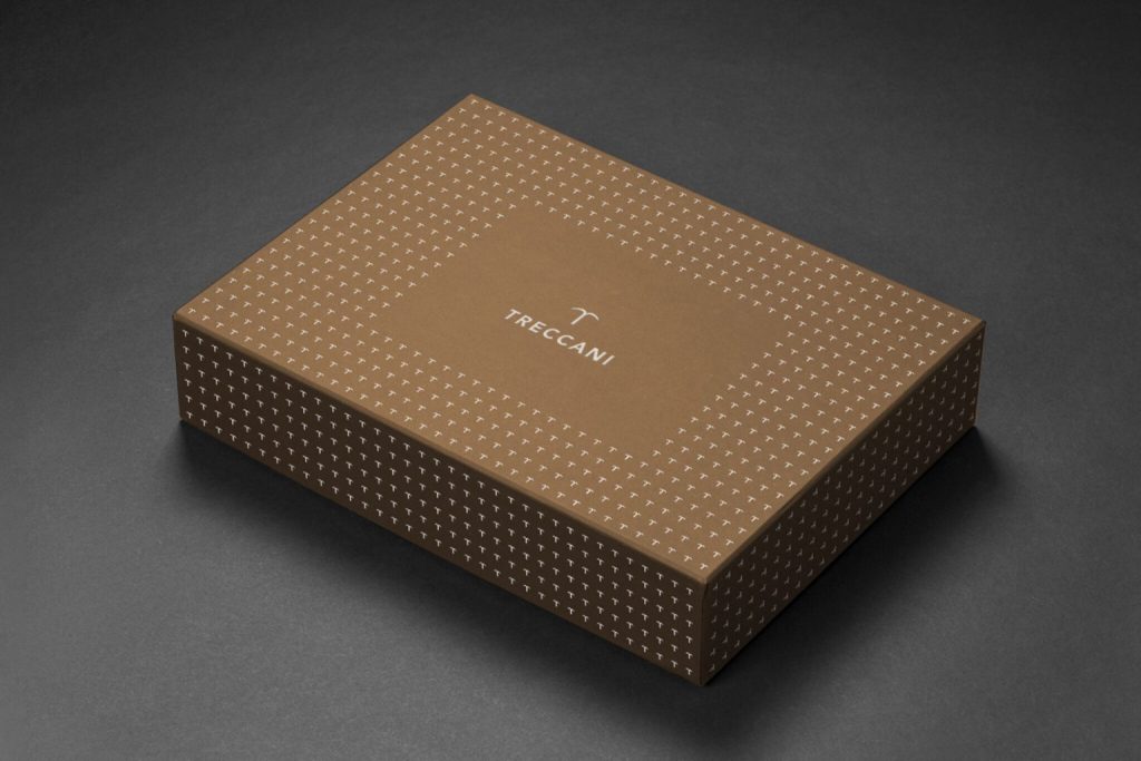
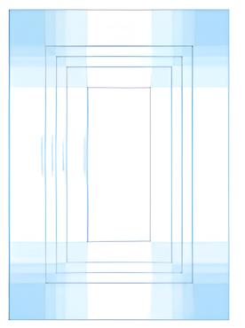
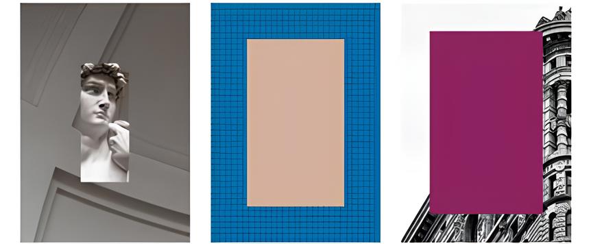
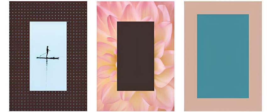
The reason for these design choices comes from the fact that we are increasingly reading on ‘glass’ and less on paper, and while smartphone screens are bright and have stunning definitions, they are still small in size. Unlike the previous one, the new brand will be presented as a single signature for the entire system: it will not be used in association with the names of the various companies or areas of activity. These, in fact, serve an organizational function, which is not of interest to the public, whose priority is instead being part of the Treccani world, regardless of the choice of a particular product or service. The brand plays its signaling and symbolic role all the more effectively when it is part of a homogeneous and coherent ecosystem, and in this sense, the project has drawn heavily from the history of the Institute. All the volumes of the great works have in common the presence of frames on the cover and spine, almost always embossed and in gold: this almost constant feature sparked an association of ideas, summarized in the concept ‘Treccani, the frame that encloses Italian culture.’ A compositional scheme (a format, as it is called) was therefore developed to host any message. Since it is no longer just the book that conveys content, the concept of the frame has also been extended to that of a ‘window onto contemporaneity and the future’: a portrait closely aligned with the new Treccani, called to face the complexity of this era. To ensure variety in the compositional scheme, a detailed palette was selected, composed of sixteen colors plus black (the typographic color par excellence), allowing for an extraordinary number of combinations, both of different colors and of colors and images (photographs and illustrations). One last defining linguistic element is the use of letters from the alphabet, composed in a pattern: a tribute to typography as a reference to the original Treccani, the holder of ‘written’ culture. The monogram patterns complete the representation kit of the new identity, and the combination of all these elements will determine, with progressive extensions, the recognizability of every touchpoint, even before the content it carries. The project, in any case, is still in the application phase and will require time to become visible and tangible. Beyond the summary description made so far, it has an ambitious goal: to transform every product or service offered into the ‘Treccani experience for the customer,’ according to the logic of our time. In this sense, the new identity can be interpreted as renewed leadership or, if preferred, the design of leadership. Treccani retains and strengthens its position as a point of reference for contemporary knowledge and, thanks to this gift, is capable of inspiring its interlocutors. They are the true center hosted by the famous frame.