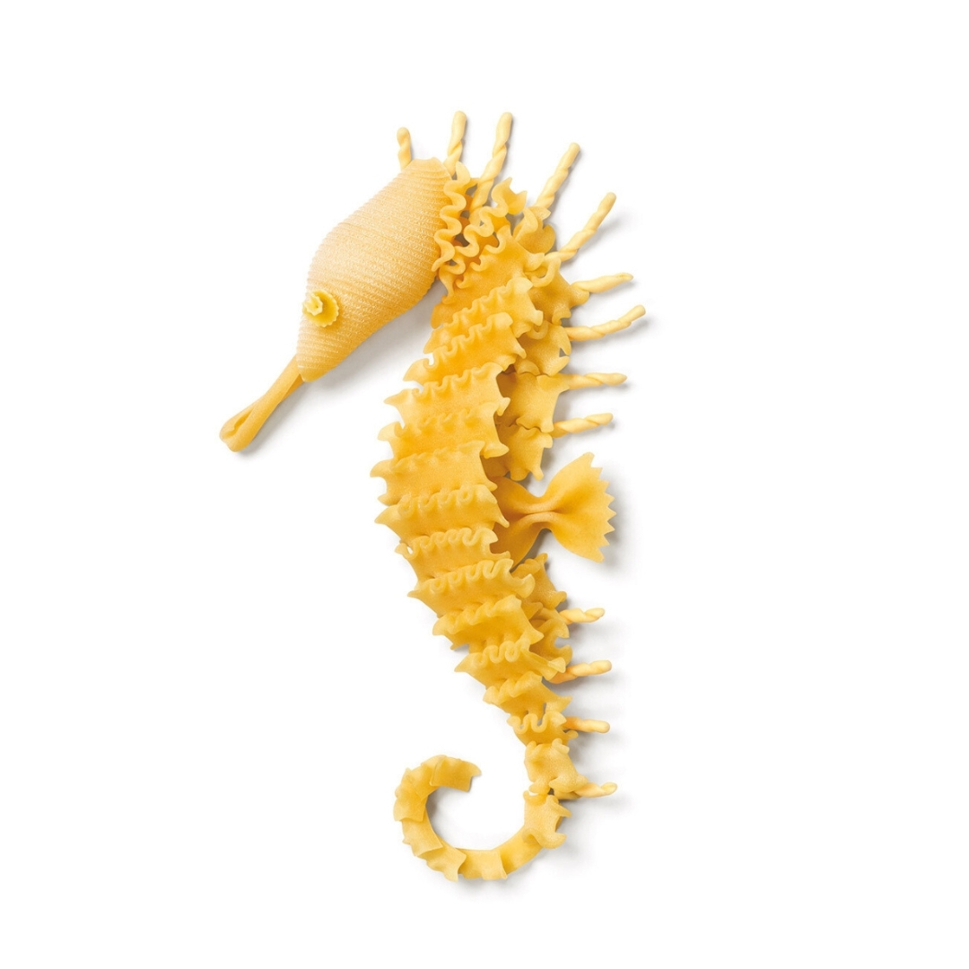
With a poetic and ironic language, the Inarea Calendar has been capturing contemporary themes for over thirty years, addressing topics such as sustainability and interpreting aspects of everyday life, from our relationship with pets to the tools of various trades—contrasting with the unstoppable digital dematerialization.
Yet, despite its ability to be a synthesis of thought and lightness in expression, the Calendar’s production process is anything but simple: each edition involves approximately seventy preparatory sketches, thirty semi-final drawings with material indications, over twenty mock-ups to be photographed, numerous photo shoots with post-production (cut-outs, retouching, two or three layout proposals, and print tests), as well as packaging and shipping.
The theme is conceived at the beginning of the year to be released at the end of the same year. A dedicated team of around ten designers, the same ones year after year, ensures continuity and depth of understanding in this complex project. If in 1991, the first Calendar was sent to approximately 1,500 people, by its twenty-fifth edition in 2016, it had reached 16,000 recipients worldwide.
Irony and Surprise: The Secret Ingredients of the Calendar
The Inarea Calendar pursues an uncompromising standard of quality, reflected in its format (48.5×34 cm), white background, and high-end typographic printing.
“Surprise is its key element,” says Monica Solimeno, Project Director at Inarea, who has been overseeing the project for over fifteen years.
“The unexpected effect comes from semiotic play and the decontextualization of everyday materials in the creation of each subject. The figures emerge from the formal correspondence with these materials or from the composition of multiple elements. The more essential the shape, the more effective the result.
This visual language is rooted in a systematic communication method, first developed in the 1980s, which organizes images through ready-made abstraction.
The Calendar embodies synthesis, essentiality, and meticulous attention to detail—qualities that form the very DNA of Inarea and its interdisciplinary approach (known as plural design). For example, despite the different visual outcomes, the essential shape of the tulip in the Sara Assicurazioni logo follows a similar use of metaphor and sign abstraction, surpassing the conventional language of its industry.
How Can the Calendar Evolve?
Considering that in over three decades, the Inarea Calendar has built a strong and loyal following, can this project be reinterpreted through new tools without losing its identity?
If the mock-ups are still crafted by hand, could artificial intelligence assist in this phase or facilitate the creative layout process?
“A few years ago,” Solimeno continues, “we experimented with objects like mugs and placemats featuring some of the calendar subjects. However, these designs live best on a white background, printed on high-quality paper with top-tier typography. Transferring them onto plastic supports did not yield the same result.”
The only successful adaptations outside of the Calendar itself have been notebooks and shopping bags, where the use of paper preserved the quality and visual impact.
Recently, an app was launched to showcase 34 years of work. For now, it serves as an image repository, but it has the potential to create an interactive and immersive experience for users—something that cannot be achieved on paper—thus bridging the gap with younger, digitally connected generations.
More than three decades of Calendar production have generated a vast archive of sketches, discarded subjects, work-in-progress mock-ups, and both analog and digital photographs.
A creative treasure trove that retains its ironic and playful essence, offering endless possibilities for new associations and interactions. Once again, everything is already there—just waiting to be rediscovered.

