Sonic Branding: The Power of Sound in Brand Identity

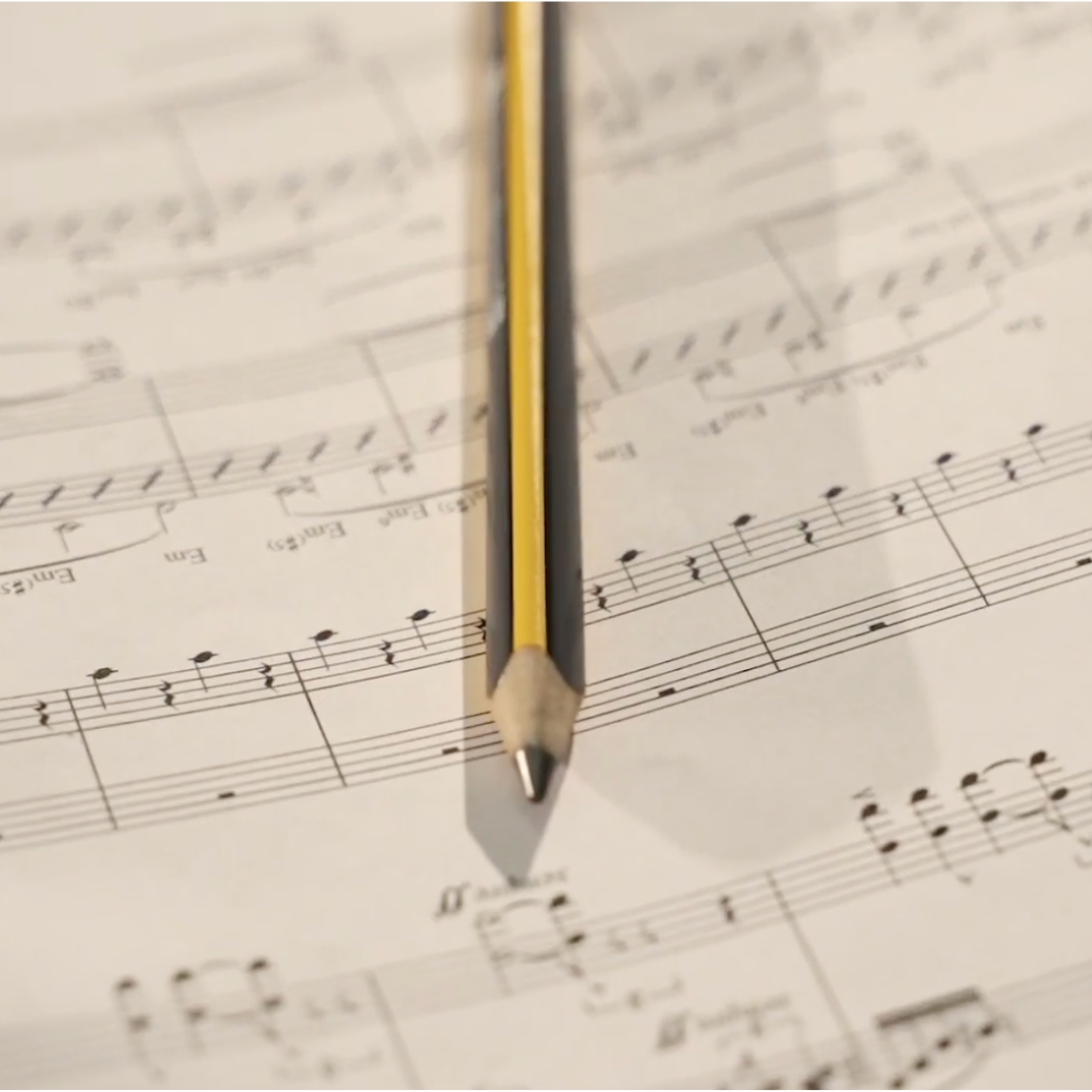
Who hasn’t experienced hearing a melody or a sound and immediately associated it with a brand? The concept of sonic branding has its roots in radio jingles, which helped connect music with a product in the absence of visual cues. However, in 2023, there was a 24% increase in investments of sonic brand identity by both local and global companies. This is a response to the rise of audio platforms, podcasts, voice assistants, as well as streaming services and digital communication channels. Consequentially, the touchpoints between brands and customers have multiplied, making sound a key element in enhancing brand recognition and recall. According to a Spotify survey (November 2023), 49% of millennials and Gen Z report paying and retaining more attention when listening than when watching something. This finding comes as no surprise, as sound is the element of the brand experience that interacts most directly with emotions. Inarea’s approach to sound design Inarea sound design combines creativity, technology, and acoustics, supported by neuroscientific testing in collaboration with BrainSigns, by-product of the University of Sapienza in Rome. These tests scientifically demonstrate how sound can influence emotions and brand perception. Through these processes, the audio concepts behind Inarea’s sound logos and brand themes are qualified and quantified through EEG, HR, GSR sensors, and Implicit Association Tests (IRT). Sonic branding is not an accessory element; it is a strategic lever for building a memorable and engaging brand identity. In an increasingly digital landscape dominated by audio content, companies that invest in a sonic brand identity are able to stand out, strengthening the emotional connection with their customers and leaving an enduring mark over time. Case Studies Bauli The sound logo and logo animation have a harmonious interaction with the visual and sonic elements. The logo animation focuses on the dot above the ‘i’ in the logo, accompanied and amplified by the A3 note at 440 Hz, known as the ‘chorister’ note because of how it harmonizes all other sounds and instruments. This note resonates and prevails, creating a strong element of recognition. FITP The track ‘Di Campo in campo’ (‘From Court to Court’) marks the first step in the construction of a sonic identity. Presented at the Grand Opening Show of the Nitto APT Finals in Turin 2024, it is an anthem of resilience and the will to overcome- qualities and characteristic of racquet sports. The concept is inspired by Nelson Mandela’s quote: ‘I never lose. I either win or learn. FIGC From the online world to the live atmosphere of the stadiums, this ambitious endeavor seeks to capture in sound the spirit, values, and attitude of Italy’s football culture. The brand theme ‘Azzurri’ features a driving, emotional progression built around just two notes, highlighted by the use of choruses and the soprano voice, evoking the Italian opera tradition.

When the Future Honors the Past – The New Identity of Treccani

When the Future Honors the Past The New Treccani Identity Antonio Romano In everyday conversation, when someone says “as Treccani states,” it means that there can be no doubt about a statement because it is ‘certified’ by the country’s most important cultural institution. For us Italians, Treccani is not just the famous Encyclopedia or Dictionary, but something much broader, and so familiar that it doesn’t need any further explanation. The term “branded” refers to everything that requires no additional argument other than the name (of the brand) itself. From these simple reflections, the Treccani brand is recognized, loved, respected, remembered, and thus chosen. In short, it is a true brand. However, identity, as we all learn over time, is not a static concept; it is not something fixed once and for all. It is a process, a constant evolution, and it requires continuous updating. There is an obligation to remain contemporary, which applies not only to individuals but also to organizations (which, in turn, are made up of people). In five years, Treccani will celebrate its centenary. The Institute of the Italian Encyclopedia was founded in Rome on February 18, 1925, with the aim of providing Italy with its own cultural identity, following the example of what had already been done in other great countries. Though belated, our nation-building found its highest expression by bringing together the brightest minds of the era. The new logo in the two possible configurations. The first edition of the Encyclopedia was published in 1929, and the 35 volumes it consisted of (plus one index volume) were completed in 1937. The publication turned out to be a success, and since then, the work became an “indoor monument”: professional studies, public offices for top management, and homes of the middle class displayed the volumes as a true status symbol, able to communicate implicitly and immediately the cultural and social prestige of those who owned them. Over time, other works were added to the Encyclopedia, always produced thanks to the efforts of the best scholars in their respective fields. An extraordinary quantity and quality of content were effectively disseminated on the pages of these prestigious volumes, all signed by Treccani. Since 2009, much of that content has explored an alternative channel, the digital one: the Treccani Portal reaches 600,000 unique users per day. The Guiding Framework of the New Treccani Frame and Its Application Methods The changes go beyond just this. New thematic areas are being introduced to reach audiences that were traditionally distant from the Treccani world. Additional companies or branches are being acquired to foster effective development in these new activities. Treccani Reti, Treccani Scuola, Treccani Arte, Treccani Libri, Bottega Treccani… these are all initiatives responding to development programs designed to ensure a future for the prestigious history of Treccani. Over these nearly 100 years, Treccani has changed, is changing, and will continue to evolve, all while never betraying the spirit with which it was founded. To think about a renewed identity representation means reinterpreting this history and embedding it in the vision of the future Treccani aims to establish. To achieve this, a process was initiated, involving a steering committee with resources from various companies and sectors. This way, the needs of each unit were assessed, and the guiding principles for shared convergence were found. Treccani is now a single brand capable of representing diverse fields: in terms of design, it directly derives from the previous version created by us in 2005, ensuring identity continuity. The ‘tree’ or ‘source’ T has been modified to ensure better legibility even at smaller sizes. Similarly, the name Treccani has been restructured, transitioning from the classic Bodoni font to a more contemporary, clean typeface, Avenir. It’s a Sans Serif font, meaning it lacks serifs, making it easy to read even in very small font sizes. The reasoning behind these design choices stems from the increasing trend of reading on screens (“glass”) rather than paper. While smartphone monitors are bright and offer stunning resolution, their small size remains a limiting factor. Unlike the previous approach, the new brand will serve as the single signature for the entire system: it will not be linked to the names of the various subsidiaries or business areas. These names are primarily organizational tools, irrelevant to the public, whose priority lies in being part of the Treccani world, regardless of a specific product or service choice. The brand fulfills its signaling and symbolic role more effectively when integrated into a homogeneous and coherent ecosystem, and in this sense, the project draws heavily from the Institute’s history. All volumes of Treccani’s major works have one common feature: the presence of frames on the covers and spines, often embossed and gold-leafed. This nearly constant element sparked an association, encapsulated in the concept “Treccani, the frame that encapsulates Italian culture.” A compositional framework (a format, as it is called) was then developed, capable of hosting any type of message. Since content is no longer exclusively conveyed through books, the concept of a frame has been expanded to symbolize a “window to contemporaneity and the future” — a depiction that aligns closely with the new Treccani, tasked with navigating the complexities of today’s world. To ensure variety within the compositional framework, a diverse color palette has been chosen, comprising sixteen colors plus black (the typographic color par excellence). This provides a remarkable range of combinations, both of colors and images (photographs and illustrations). Another linguistic feature is the use of letters arranged in a pattern, paying homage to typography as a reference to the origins of Treccani, which was the custodian of ‘written’ culture. Monogram patterns further complete the visual representation of the new identity, and the combination of all these elements will gradually ensure the recognizability of every touchpoint, even before the content they represent. The project is still in its application phase and will take time to become visible and tangible. Beyond the brief description provided, it has an ambitious goal: to transform every product … Read more

40 Years of Metaphorical Images

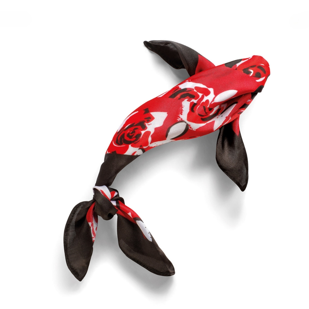
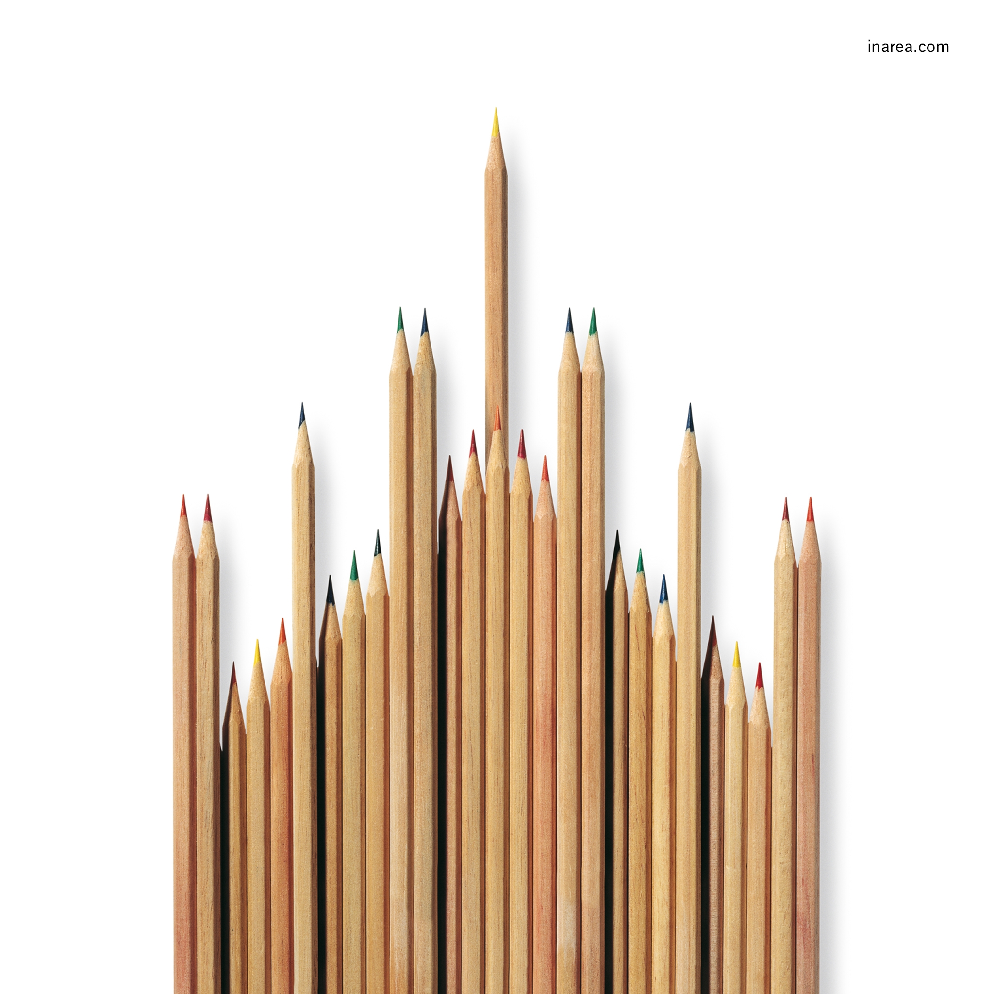
The defining characteristics of our Calendar can already be traced back to our early works in the 1980s: still-life photography, sculptural mock-ups made from everyday objects, a white background, and an effective, two-way relationship with words. Then as now, the project’s logic is based on subtraction, reducing elements to their purest form. Initially, many creative choices were driven by technical and economic constraints: the images were designed for billboard posters, solid backgrounds required an accuracy that printing houses of the time couldn’t guarantee, and the edges of figures had to remain within the margins to avoid trimming. Since 1991, when the first edition was released, we have established a recognizable language, always true to a principle of quality. The charm of our calendars still lies in the craftsmanship with which they are created and in their compositional structure—the mock-up, which reproduces something tangible rather than a mere combination of pre-existing, digitally reworked images. It is not just the impact of the forms that matters, but also the photogenic quality of the composition and its three-dimensionality—the magic of an image so striking that it tempts you to reach out and touch the page. The Calendar is a metaphor, or rather, a collection of metaphors. The first is conveyed through the images themselves; the second, more subtle, refers to the dedicated people who, with passion and patience, take on this challenge every year; the third represents the vision and mission that underlie our work. Our goal is to bring to life the idea of the future that a business, organization, institution, product, or service seeks to establish. Calendarea 2025. A Dive into Thought Aquarium is the theme of the 2025 Calendar: a deep dive into thought and exploration, searching for what best embodies a good omen for the future. A fantastical and visionary aquarium, where one can feel as comfortable as a fish in water—all year long! It is a visual journey through joyful, vibrant, and ironic icons, infused with life and serenity, just like the wonders found in seas, rivers, and lakes. Yet, beneath its surface, Aquarium holds a subtle metaphor in its name: in a world that constantly observes us, what if we were the fish in the aquarium? As with every edition, the distinctive language of the Calendar reveals Inarea’s guiding principle: the ability to see what already exists through plural design, to start from reality and recombine elements, generating unexpected associations that inspire new perceptions. DISCOVER OUR INAREA CALENDAR

The city, a longing for beauty

Warning: realpath(): open_basedir restriction in effect. File(/var/www/domain/inarea.com) is not within the allowed path(s): (/var/www/virtual/inarea.com:/tmp:/var/lib/php5:/usr/share/php) in /var/www/virtual/inarea.com/htdocs/wp-includes/l10n/class-wp-translation-controller.php on line 106 Warning: realpath(): open_basedir restriction in effect. File(/var/www/domain/inarea.com) is not within the allowed path(s): (/var/www/virtual/inarea.com:/tmp:/var/lib/php5:/usr/share/php) in /var/www/virtual/inarea.com/htdocs/wp-includes/l10n/class-wp-translation-controller.php on line 106 Warning: realpath(): open_basedir restriction in effect. File(/var/www/domain/inarea.com) is not within the allowed path(s): (/var/www/virtual/inarea.com:/tmp:/var/lib/php5:/usr/share/php) in /var/www/virtual/inarea.com/htdocs/wp-includes/l10n/class-wp-translation-controller.php on line 106 The city, a longing for beauty.Antonio Romano Calendarea 2005, Inarea Square “Those who govern must hold he beauty of t he city at the heart of their concerns, for the delight and joy of visitors, and for the honor, prosperity, and growth of both the city and its citizens..” Constitution of Siena, 1309. Writing about beauty is always a challenging task. There is already an extensive body of literature on the subject, as it touches upon the existential horizon of both the individual and society. Its subjectivity is undeniable; however, there are shared codes within homogeneous social contexts, and the criteria that define it are, in turn, subject to temporal variables. Nonetheless, I must express my own point of view, and to do so, I try to distill my experience as a designer. The “forward projection” contained in the word “design” is nothing but a promise of the future, the very one that gives meaning and direction to life itself. As human beings, once our basic needs are met, we feel alive because we desire, but desire implies awareness of what is lacking. Beauty, therefore, is the missing part we long for, capable of astonishing us, surprising us, and above all, completing us.   We are compelled to confront reality, yet we prefer its representation. Thus, our constant desire for beauty leads us to clothe our thoughts in the most fitting words, to have the clothes we wear, the homes we live in, and their furnishings speak for us… In other words, we assign to every point of contact with others a mark of our identity, whether implicit or explicit, one that can represent us in our relationships.   This collective form is our personal promise of the future, as it is precisely on the duality of representation/relationship that our civilization has been built. Its most visible and tangible expression is the city. Architecture, on the other hand, is the organization of space, and it is this organization that, in turn, generates relationships.   When we look, even with distracted eyes, at the built environment of any urban reality, we easily grasp the implicit message that its inhabitants have sought to convey throughout the ages: they were and are their promises of the future. It is no coincidence that “civis” unites citizen and civilization, because the city has always been the place of ideas, the space designated for debate. Does not politics, after all, stem from the word polis?   The “space full of time” (Bob Wilson), formed by our cities, allows us to read the narrative of centuries and often millennia that our ancestors have passed down to us, and that we, in turn, must preserve and pass on.   But alongside the “noble” notion of the beauty of the city, there is another, seemingly less significant, one, with which we come into more direct contact as we walk on foot or move by means of transportation. It is the city of streets and sidewalks, horizontal and vertical signage, shops and their signs, traffic lights, cars and public transport, both in motion and stationary, parks, flowerbeds, urban furniture, intercoms, and mailboxes…   This too is a narrative, though fragmented and heterogeneous, capable of allowing us to grasp almost immediately that sense of promise for the future, inherent in the desire for beauty.   I recall the railing of an apartment building on the outskirts, scattered with about thirty mailboxes, each one different from the other, arranged with no logical order. A trivial episode, certainly, but evocative of an absolute lack of dialogue among the unfortunate inhabitants of that building: without communication, there can be no relationship, and thus, no recognition.   As long as we are able to make and receive promises, we are at the very heart of life; the elderly, the sick, and the disenfranchised lose their desire for beauty because, in the absence of promises, they feel they are instead at the periphery of their own existence.   Extending the concept to the city, when the sense of periphery, in its most detrimental form, begins to infiltrate even the central areas, the perception of decay becomes tangible.   In this sense, when it is said that Rome is a beautiful city, it is impossible to disagree. However, it is a synecdoche, as the reference is limited to the historic center, to the built environment immediately adjacent to the Aurelian walls, and to other neighborhoods or urban “fragments” of excellence.   The architectural atrocities that have followed since the 1950s have caused such a theft of beauty—first from the landscape, and then from the city—that the rampant urbanization has turned into a true contagion, spreading from the outskirts to the center.   Via Sistina, for example, is a thoroughfare envisioned by Pope Sixtus V to ideally connect the Pincio and Trinità dei Monti with Santa Croce in Gerusalemme, passing by the Basilica of Santa Maria Maggiore. A Renaissance gem, designed by Domenico Fontana, overcoming a topography reminiscent of the streets of San Francisco: a series of rises and falls that create beautiful perspectives, enhanced by the quality of the architecture and the presence of several monuments.   Along the street, there were once grand hotels, art galleries, jewelers, and high-quality shops. Fortunately, at least in the upper part, near Trinità dei Monti, there is still a sense of unity that reflects the quality of the past. However, as you descend towards Piazza Barberini, the nature of the commercial activities degrades into doorless shops selling one-euro souvenirs, minimarkets open until the early hours, where minors can buy alcohol, clothing stores offering counterfeit brands, and tourist-oriented restaurants, complete with all the kitsch trappings of … Read more