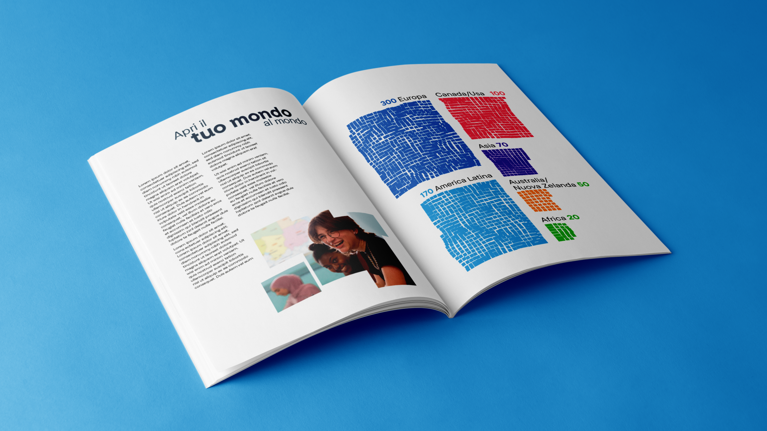
Intercultura is an NGO active since 1955, and part of the international AFS (American Field Service) network. It promotes intercultural exchange programs for teenagers, with the goal of shaping conscious, empathetic, and responsible global citizens. Intercultura does not merely support individual growth experiences, but aims to create deep cultural connections that can have a positive impact on the world.
Brand design. An autonomous and self-aware identity
The new brand marks an important step toward affirming a more autonomous identity in relation to AFS. The logo has been redesigned with an exclusive focus on the name ‘Intercultura,’ while keeping the AFS reference in a top but background position, to indicate both its origin and shared values, as well as the progressive independence developed over time. The payoff ‘Encounters that change the world. Since 1955’ has been removed—not because it lacks relevance, but to allow for a more dynamic narrative and to give the name ‘Intercultura’ itself a broader dimension that fully embodies the values it represents.
Type design. Authority and personality
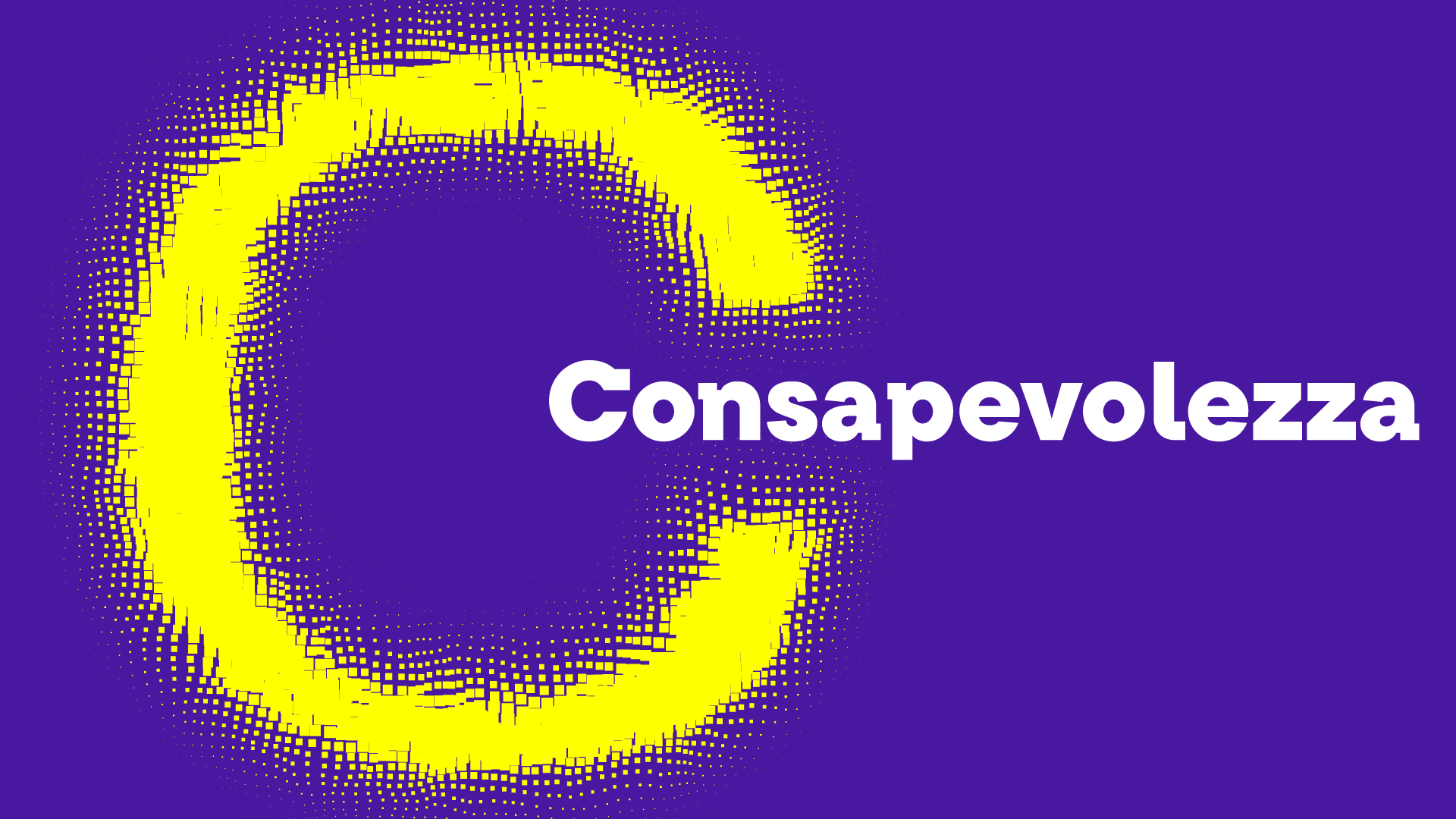
To highlight the centrality of the name Intercultura, a Slab Serif typeface was designed to combine readability and versatility with an authoritative character. The thick, sturdy serifs give the font a bold, modern, and distinctive look. Unlike traditional serif styles, this type design balances strength and legibility, offering a recognizable and coherent visual identity, suitable for both headlines and longer texts.
Communication design. New languages for a new narrative
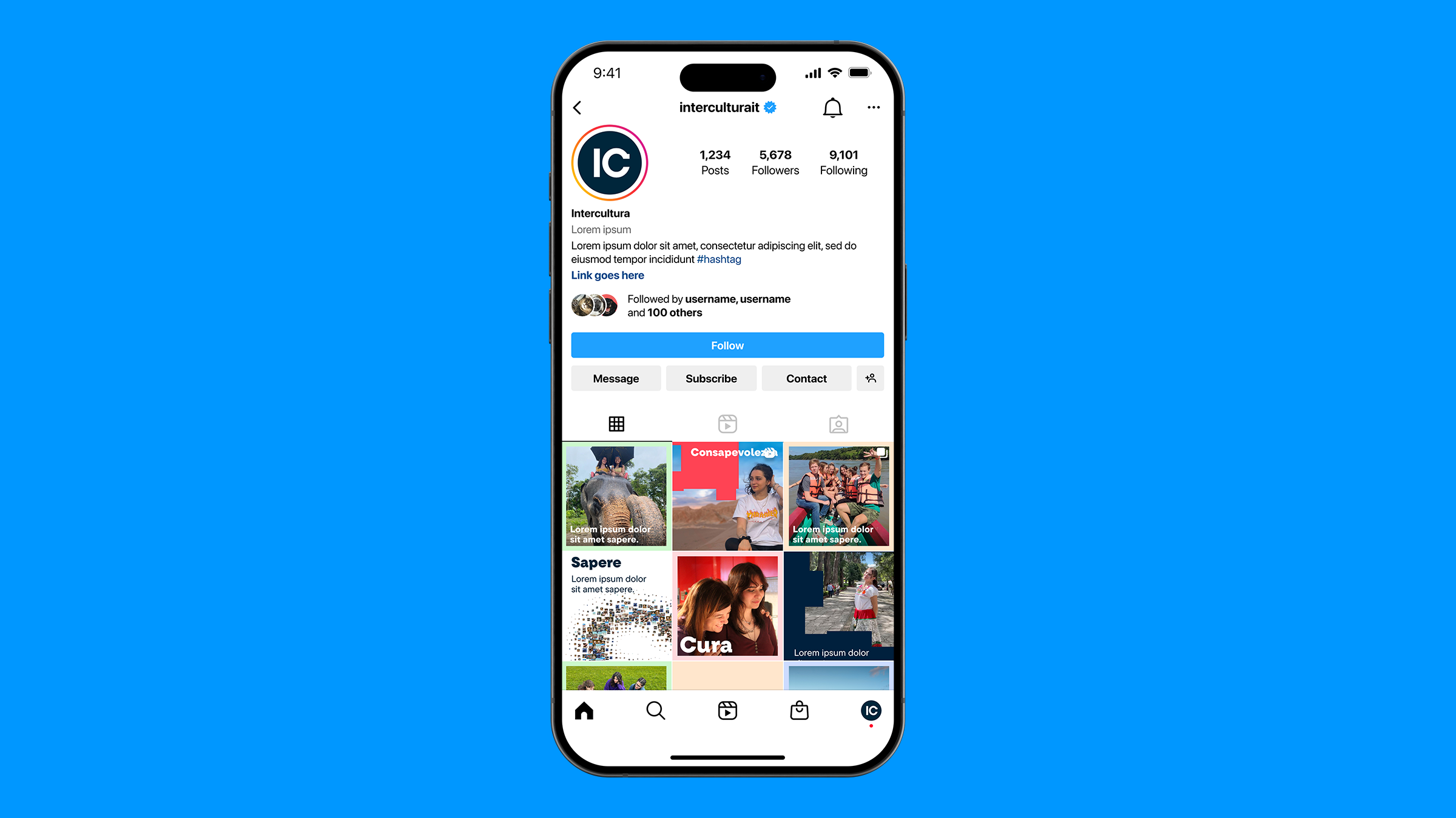
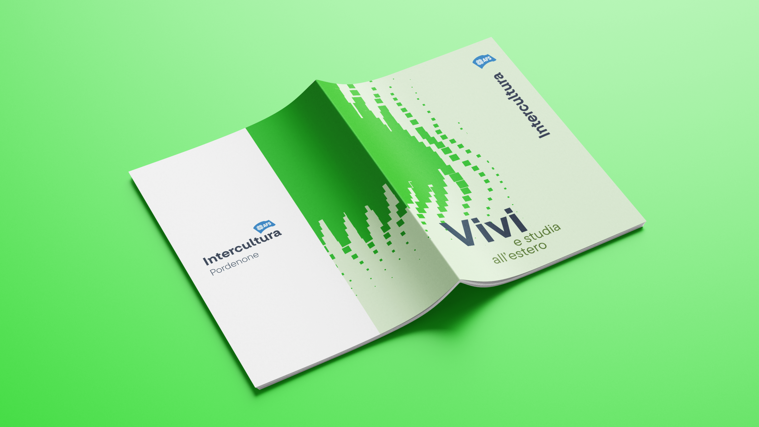
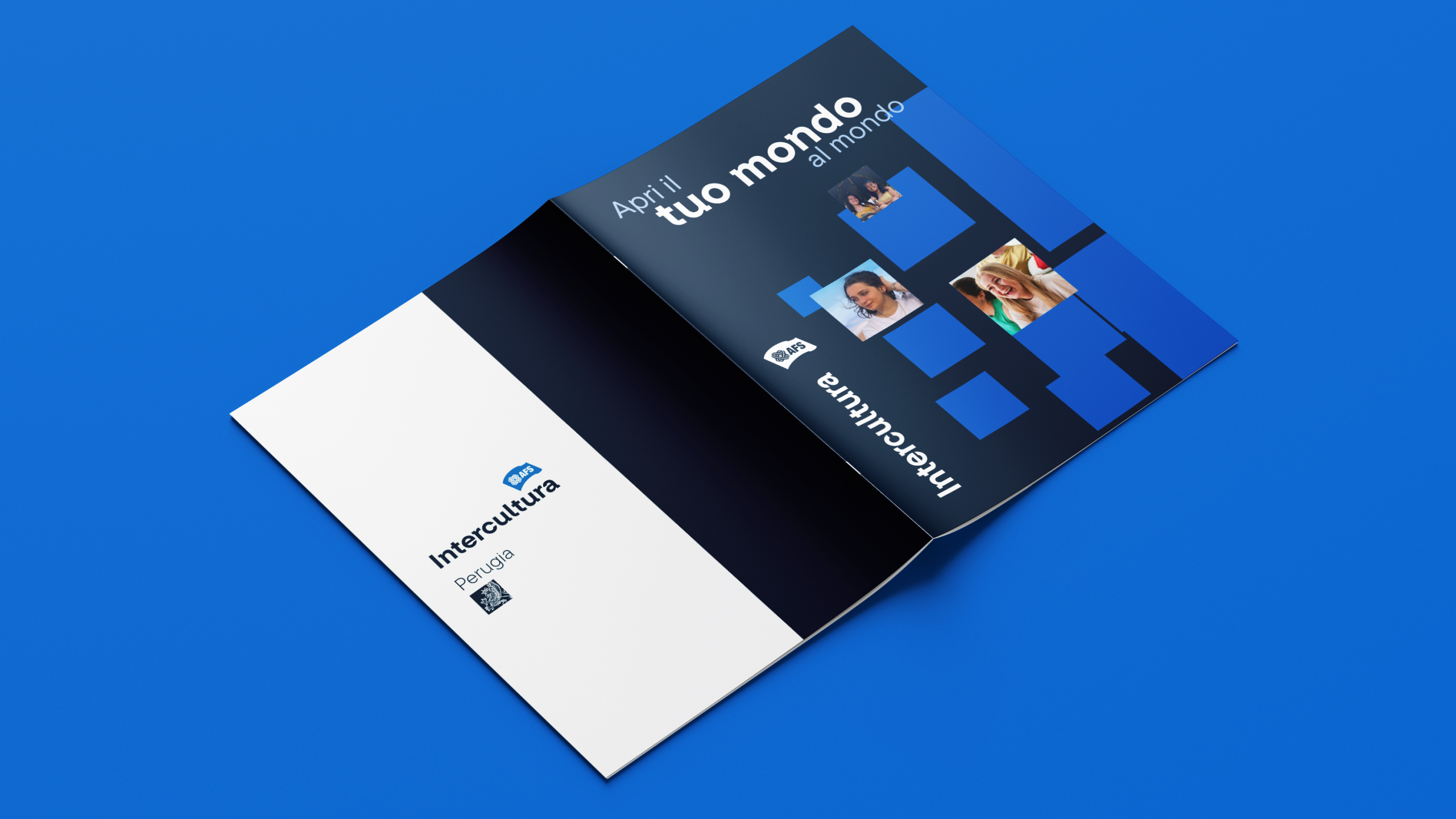
“Intercultura’s communication has been reimagined to better reflect the breadth of its vision. The color palette is built around two shades of blue—symbols of trust and openness—with red accents that introduce energy and passion. The Slab Serif font ensures clarity and consistency across all touchpoints: from the website to brochures, from presentation slides to social media. The photographic language favors portraits of students in exchange settings, conveying warmth, authenticity, and vitality. The goal is to position Intercultura both as a driver of self-awareness and as a witness to ‘a story for a lifetime’ in relation to the experience offered to teenagers. The tone of voice—direct and simple—together with the new sonic identity, helps tell the story of an organization that, for 70 years, has been ‘a teenager among teenagers.’