Autostrade per l’Italia (the name of the current corporate structure since 2003) was originally founded in the 1950s to contribute to the country’s post-war reconstruction. Today, it oversees highway routes and maintenance across 3,000 kilometers of network spanning 15 regions. The company employs over 9,000 people, manages 215 service areas, and operates more than 4,000 surveillance cameras. It plays a vital role in Italy’s economic and commercial framework, especially considering that 88% of goods are transported by road.
Brand Design and Brand Architecture: A Promise of Growth for the Country
In 2024, Autostrade per l’Italia celebrated the centenary of the world’s first motorway, the Milano-Laghi, and the 60th anniversary of the inauguration of the Autostrada del Sole. These two milestones became catalysts for a transformation of the company’s image. In light of the tragic collapse of the Morandi Bridge in 2018, a new identity was needed—one that could reflect values of history, innovation, sustainability, and engineering. A brand image that would convey future goals and ambitions, such as targeted investments to make Italy’s motorways more modern, efficient, and above all, safe—firmly rooted in the company’s heritage and expertise.
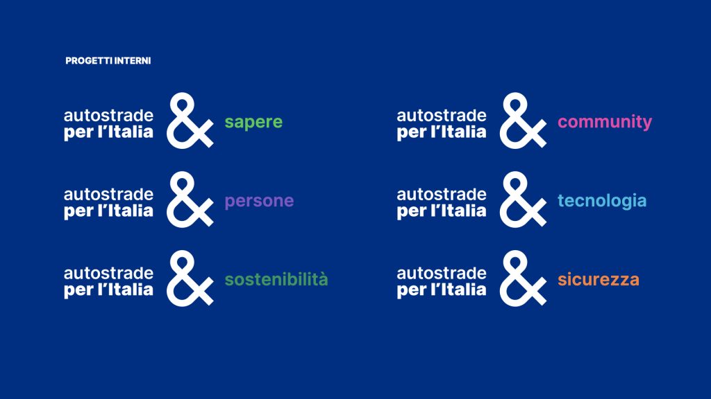
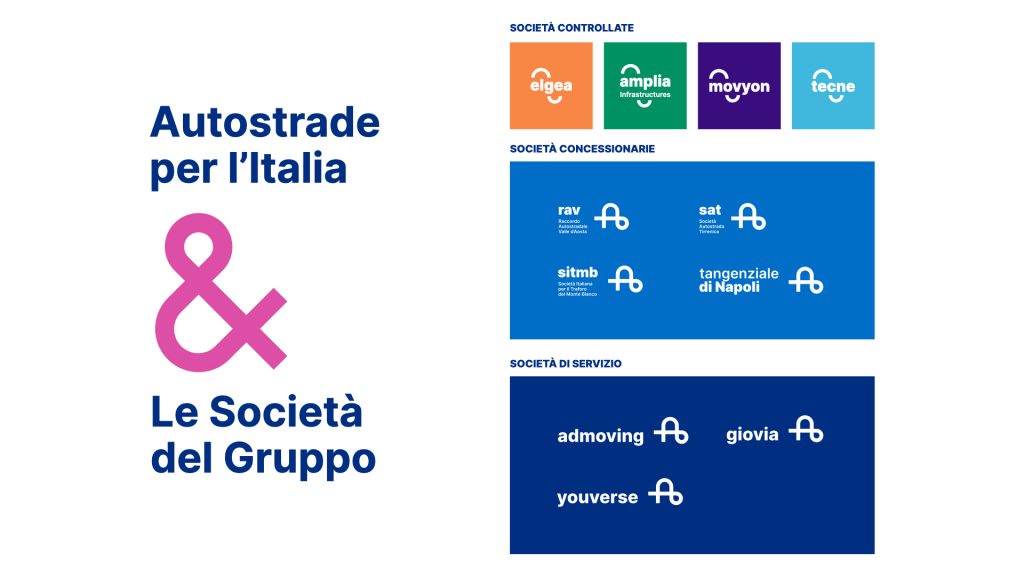
Thebrand design stems from the idea of a new journey—one that connects places and infrastructure, information and imagination, safety and progress, all within the horizon of tomorrow. The logo represents a path that takes shape in the form of the letter “A,” the initial of the brand name, but is derived from the rotation of the ampersand (“&”), symbolizing dialogue and openness. It is a soft yet bold mark that highlights the interaction between space and time, places and works, humanity and technology. The logotype uses the Inter typeface and gives emphasis to “per l’Italia” by assigning greater visual weight to its letters. Yet, the name remains unchanged—a lasting promise and responsibility to the country. The brand language is simple and dynamic, evolving from the logo and expressed through a set of contrasting, vibrant colors with strong visual impact. These colors significantly expand the compositional possibilities of the institutional palette, allowing for more varied and flexible communication of services.
Communication and Editorial Design, Video & Motion Design: When Touchpoints Are Integrated
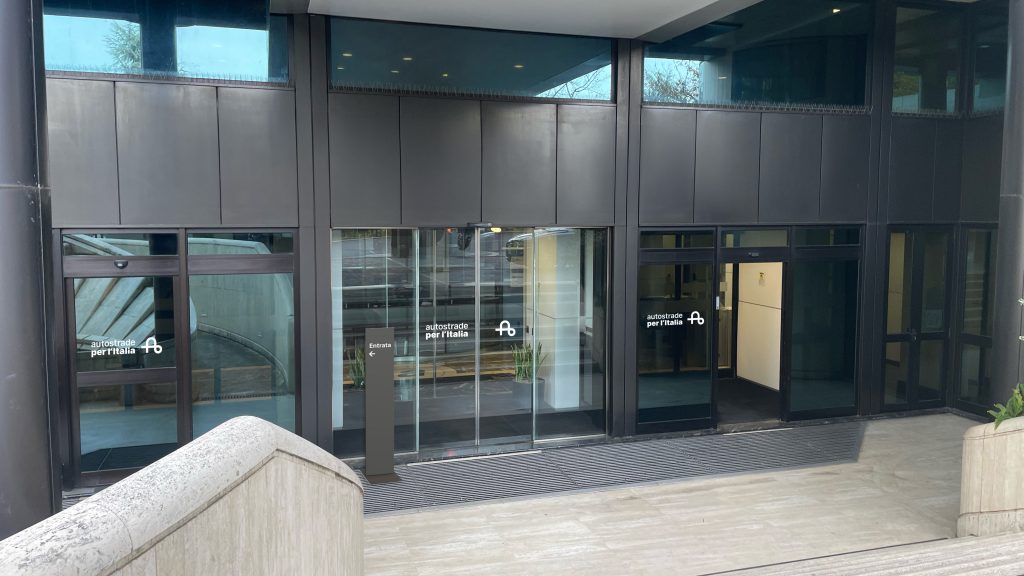
Inarea completes the communication strategy for Autostrade per l’Italia by curating every touchpoint with stakeholders and end users. Corporate publishing, video content and logo animations, as well as the design of signage and wayfinding systems in locations such as service areas, are fully integrated and visually consistent in both color and typography. Together, they reflect a clear commitment to innovation and to driving the transformation the country urgently needs—through major infrastructure projects.