The Giuseppe Verdi Conservatory of Music was founded by Napoleon I in 1807. Its name reflects the French counterpart, the Conservatoire, in the sense of a “school of music.” During the 19th century, several traditions emerged and took root—traditions that would go on to play a significant role in the institution’s history: public concerts, programs dedicated to contemporary composers, and a strong focus on the great figures of music history. The Conservatory’s mission is to train instrumentalists and composers by nurturing each student’s potential. For this reason, it embraces all musical languages, extending its focus to include research into the most innovative musical systems.
Brand and Type Design: A logo that expresses plurality
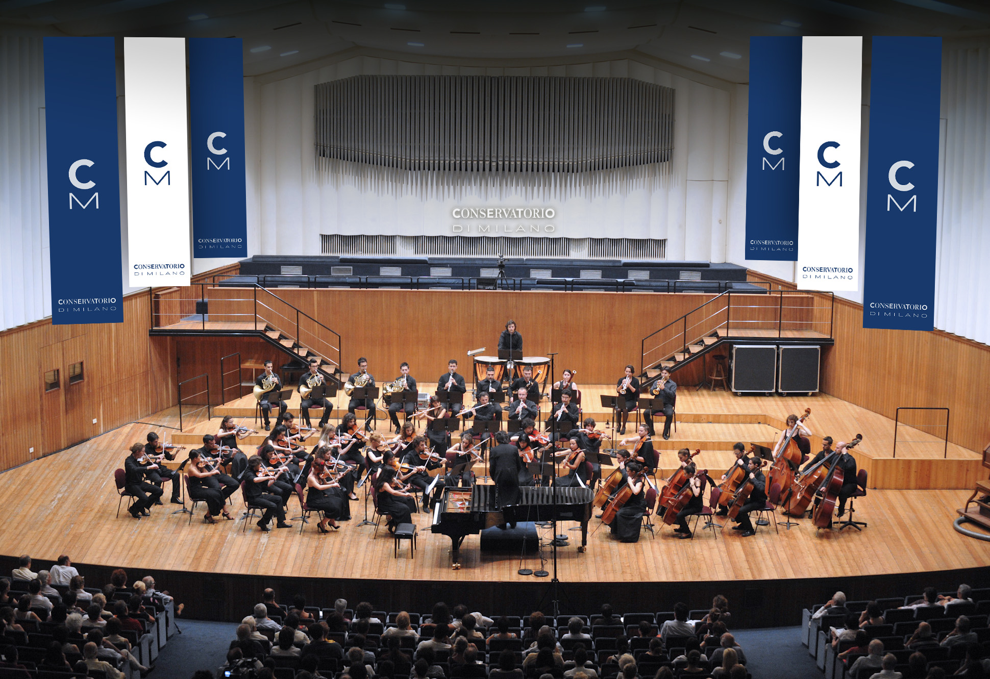
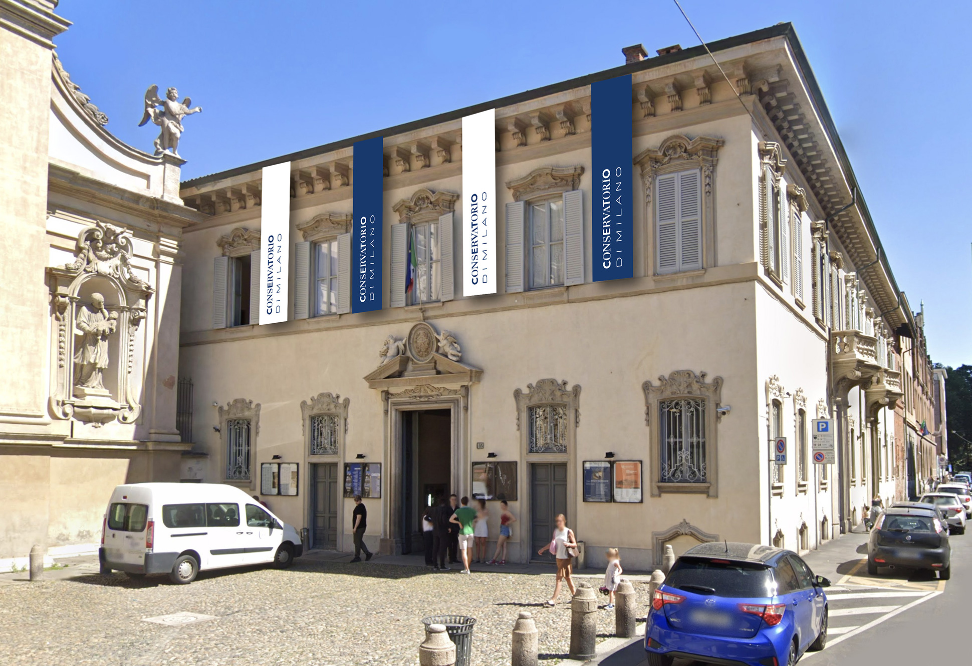
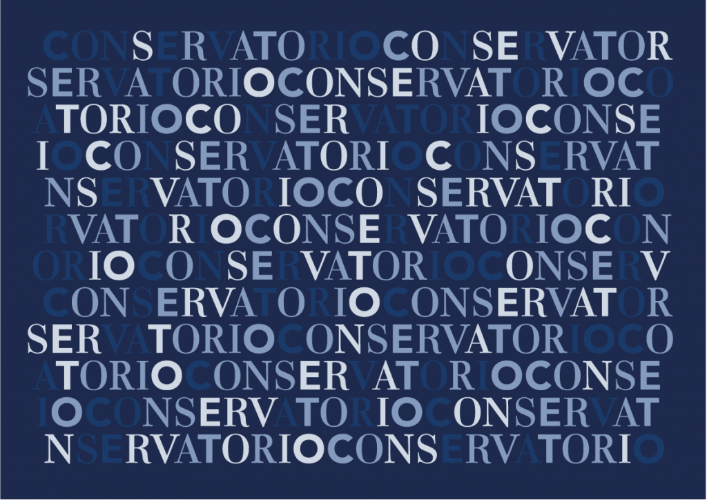
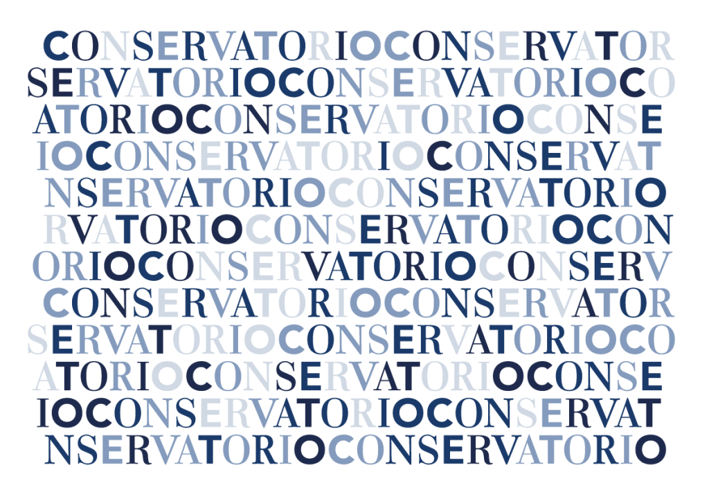
The Milan Conservatory was the first in Italy to expand its educational offerings to include all musical styles and languages. Inarea sought to translate this sense of plurality into a typographic composition that defines the logotype. Rather than using symbols, the design relies on the direct verbal impact of the name Conservatorio di Milano, playing with a variety of typefaces. The letters in the word “Conservatorio” are rendered in multiple typographic styles, serving as a metaphor for the musical diversity within the Conservatory’s academic programs. In contrast, the words “di Milano”—essential to the logotype for their role in expressing the institution’s identity—are set in a single typeface, emphasizing the geographical and cultural anchor of the Conservatory. The institutional color is blue, but the accompanying palette includes a range of tones that allow the logo to be used in negative, especially on digital platforms. As a result, there is no fixed color version of the logo, placing the focus instead on the richness of the lettering.
Video & Motion Design and the immediacy of the message
Each letter of the word Conservatorio is composed of four alternating uppercase typographic styles. Since music is also about rhythm and sound, Inarea developed a dynamic brand animation in which these typographic styles move and shift in response to audio impulses. The result is a single word—a generative, dynamic sign—in constant transformation, engaging in a visual dialogue with the phrase “di Milano”, which remains a fixed element. This grounding not only reflects the institution’s geographical identity but also its origins and prestigious history.